In 2021 Covid put a spanner in the works and cancelled a really exciting event we had been working on for the better part of the entire year. A music & good times festival called SPRINGTIME.
Well, we’re happy to say the Gold Coast festival is BACK for 2022!!! And thank gawd. Putting hundreds of hours into the branding and design roll out of the festival, only watch it gather dust in the dark corners of Google Drive was… hard to take.
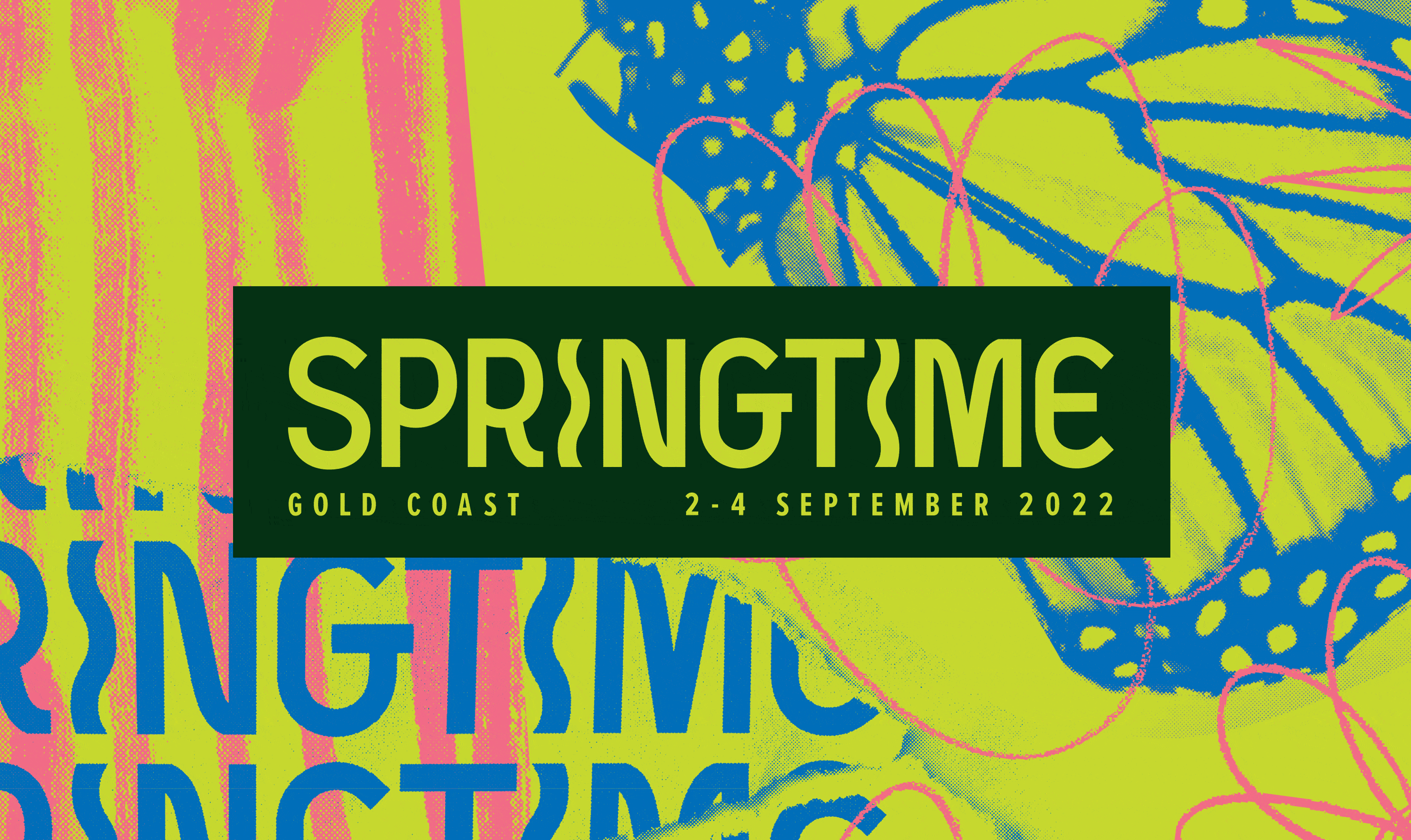
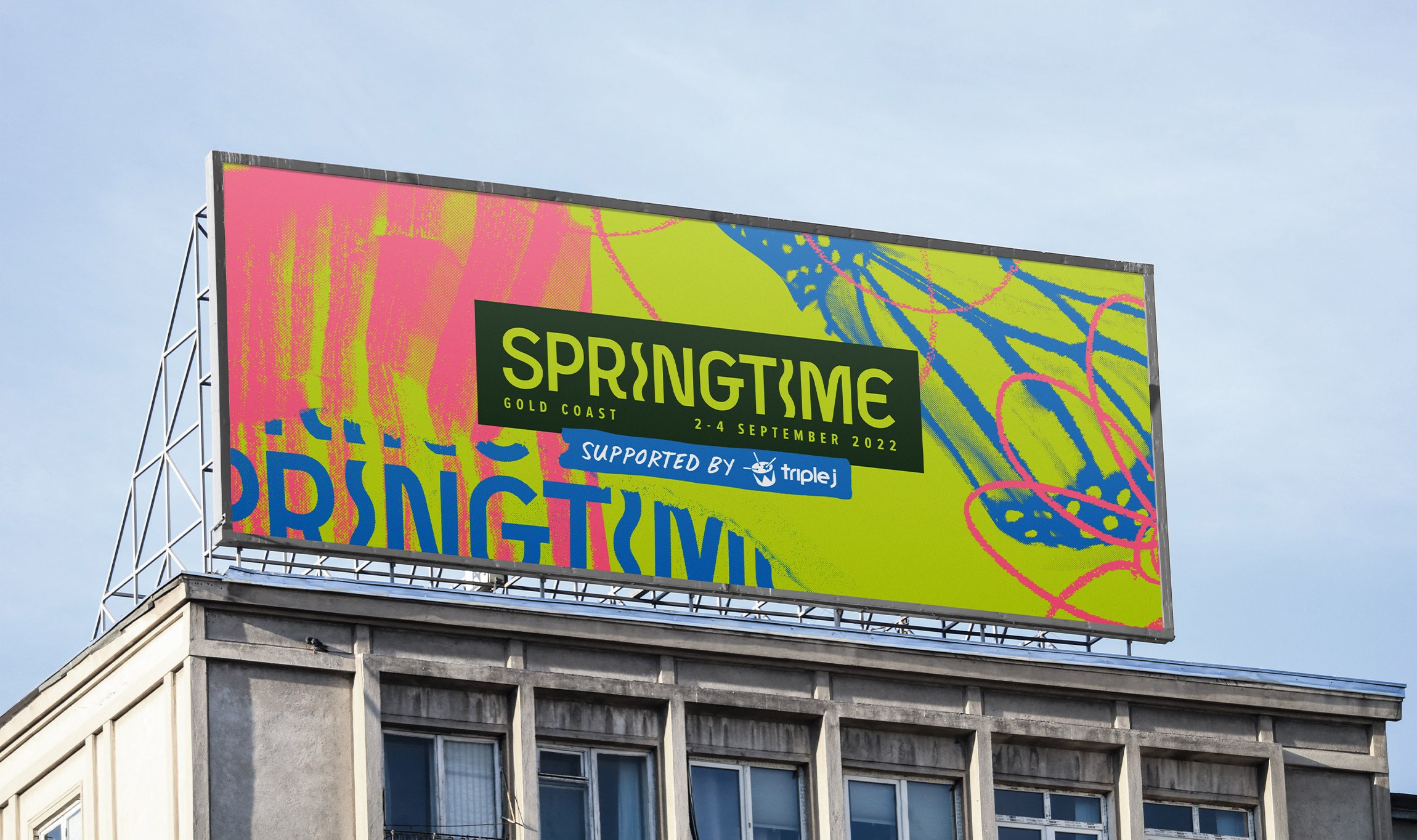
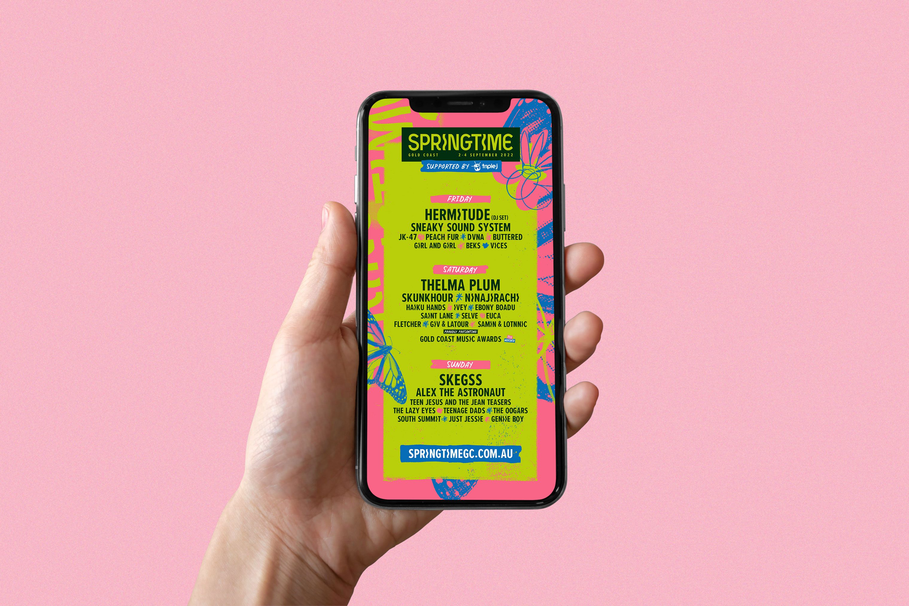
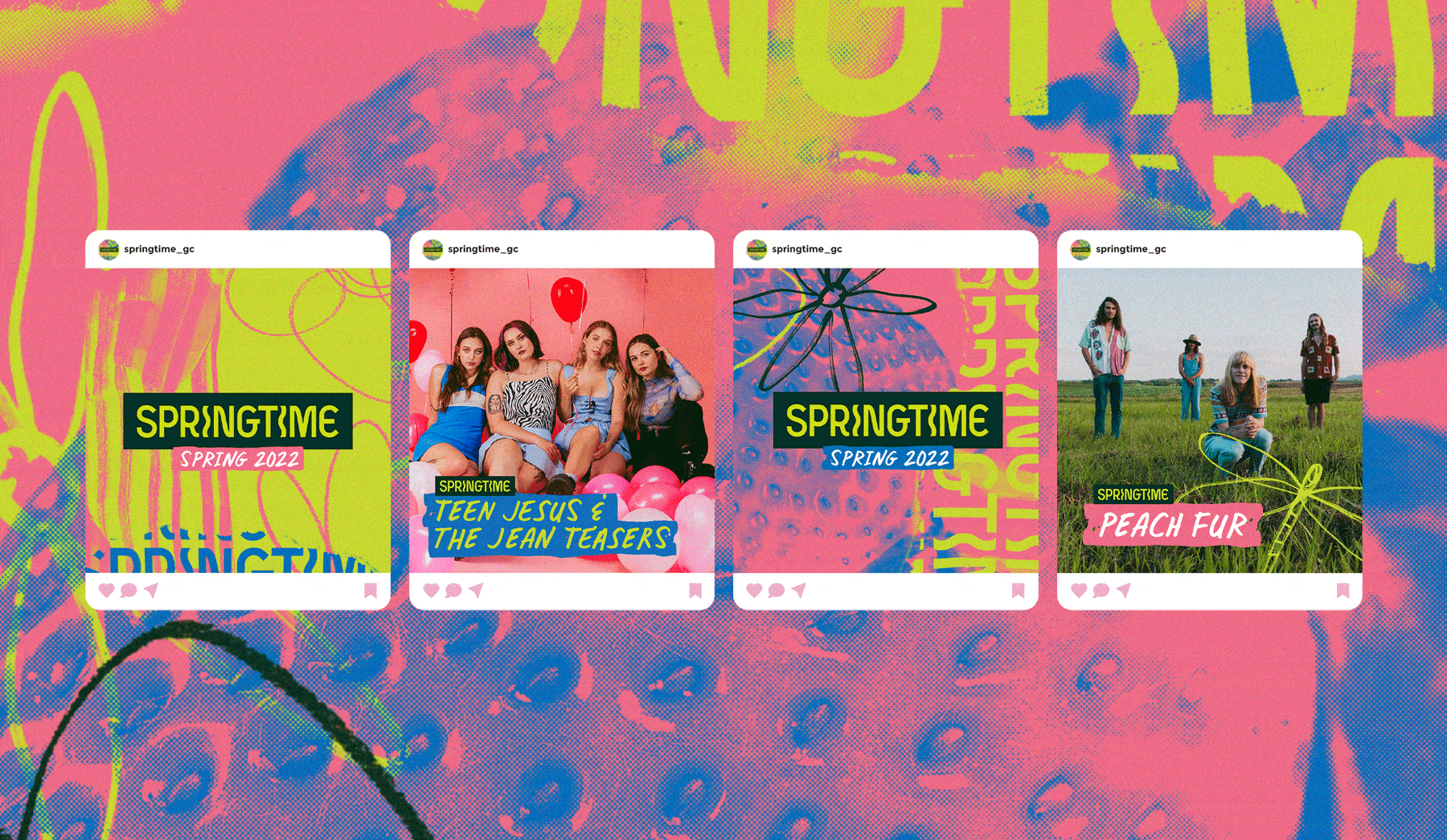
With 2022 on the horizon, event producers MEGC reached out to us to kickstart where we had left off. Still keeping within the realms of the look & feel from the previous year, we reworked a few elements to better suit the new lineup of artists which was more focused on indie-rock, pop and folk music. Here's a sneak peak into the 2022 look and feel:

WHAT TO CONSIDER WHEN BRANDING A FESTIVAL
This isn’t our first festival rodeo. We’ve been working with MEGC for a few years now on a bunch of different festivals. Having been involved at multiple points along the creative journey, one thing we'll say is making a festival actually happen is bloody hard work. And we're not even the ones running the thing!
So in light of this, we've jotted down five things to consider if you're a) part of a team of festival producers looking for a design team, b) on the receiving end of the creative brief, or c) hoping to get into this area of design.
1. How often do festivals rebrand?
It comes down to budget. Some major festivals can afford to rebrand each year, whereas smaller contenders will need to get a few years of wear & tear on their brand before they're up for new funding or a solid investment in a rebrand.
These smaller folk will often implement a strategic ‘stretch’ of their identity. Pushing the lifespan from 1 year to 2 or 3. This helps them save some buckeroos so when a full rebrand is on the table, there'll be a bigger budget to work with.
These smaller pals really value when a design team takes this into consideration. If you’re engaged to develop branding for a festival, do some mental hula-hooping to think about how parts of the identity could be refreshed year on year, between now and the next big rebrand. What elements could be retained, and what aspects might be replaced or refreshed without reinventing the wheel?
2. The two components to festival creative; the master art and the roll out.
Master Art. Sound fancy? Cos it is. It’s the coolest part of the design gig to work on.
During the master art phases, the look & feel is set. The colours are chosen, fonts tried & tested. Hero graphics, textures and patterns are created. Layouts are done, and then pressure tested. This phase is where a library of design elements and layouts is built that takes into consideration the huuuuuge number of applications that a festival is going to need.
Not only is master art about pulling together a single, cohesive look, it's also about providing examples on how the design style will work in practice. Without some comprehensive (and practical) application examples, there's a high chance the roll out phase is going to transform your creative, and not necessarily in a good way.
So what's the "roll out" phase all about? Once the master art is complete, it's time to "roll out" every other piece of design the festival is going to need. This might be brand collateral, social tiles and templates, advertising creative, marketing assets, billboards, event collateral, merch and signage.
3. Beware of roll out scope creep!
From our experience, roll outs have a high risk of scope creep. It makes sense; the more moving parts there are, the harder it is to keep a lid on things. And there are alot of moving parts when it comes to festival creative.
The best way to mitigate this, if you are the design team, is set a conditional budget. Conditional to changes in scope or deliverables, and reasonable revisions. You’ll find it pretty hard to land an event project that needs zero flexibility when it comes to deliverables, so agreeing to a conditional budget is a good way to serve you both.
4. Make it practical and dynamic. You'll thank yourself later.
If you’re going to create a brand identity for a festival, it’s going to have to work in MANY different sizes, shapes and formats. It’s not always going to be a neat A4 page, or a sexy simple square. It’s going to be in every imaginable shape and size, often packed with a lot of information, text and sponsor logos. Things can get real ugly real quick if you haven’t taken this into consideration.
Make sure what you create is dynamic: meaning, it can be broken down into smaller pieces and rejigged to suit multiple weird and whacky spec sizes.
5. Good times, good rewards
Working with people is cool, but working with people you like is better. So make an effort to make the relationship enjoyable for both you, and the festival team. Not only will it be worth it for the immediate benefits, it'll also bolster brownie points for the next possible design gig, and the one after that, and the one after that...
So be proactive on deliverables, play nice when "URGENT!#@&%*$&#@!!!" hit your inbox, and keep a solid record of all the moving parts of the project (pro tip: spreadsheet that sh*t).
Pssst... Interested to see how we do it? Check out some of our festival rebrands here, and here.