This week we're coming in hot with a snack-sized brand refresh case study for Hot Lips Hacienda; a delectable mexibar tucked away in the Melbourne 'burb of Highett.
The Brief
Owner and hospo visionary Steve, asked us to refine the Hot Lips' brand identity–especially in a social media context. With a new venue fit-out recently completed, Steve felt the vibe they were putting out on socials (their most engaged marketing channel) was too inconsistent and missing the mark–specifically for their desired target audience. He wanted something fun, original and a bit off-beat. But ultimately? Super consistent.
This wasn't going to be a giant rebrand, or a massive overhaul. Steve wanted something a bit more subtle than that... an evolution, rather than a revolution.
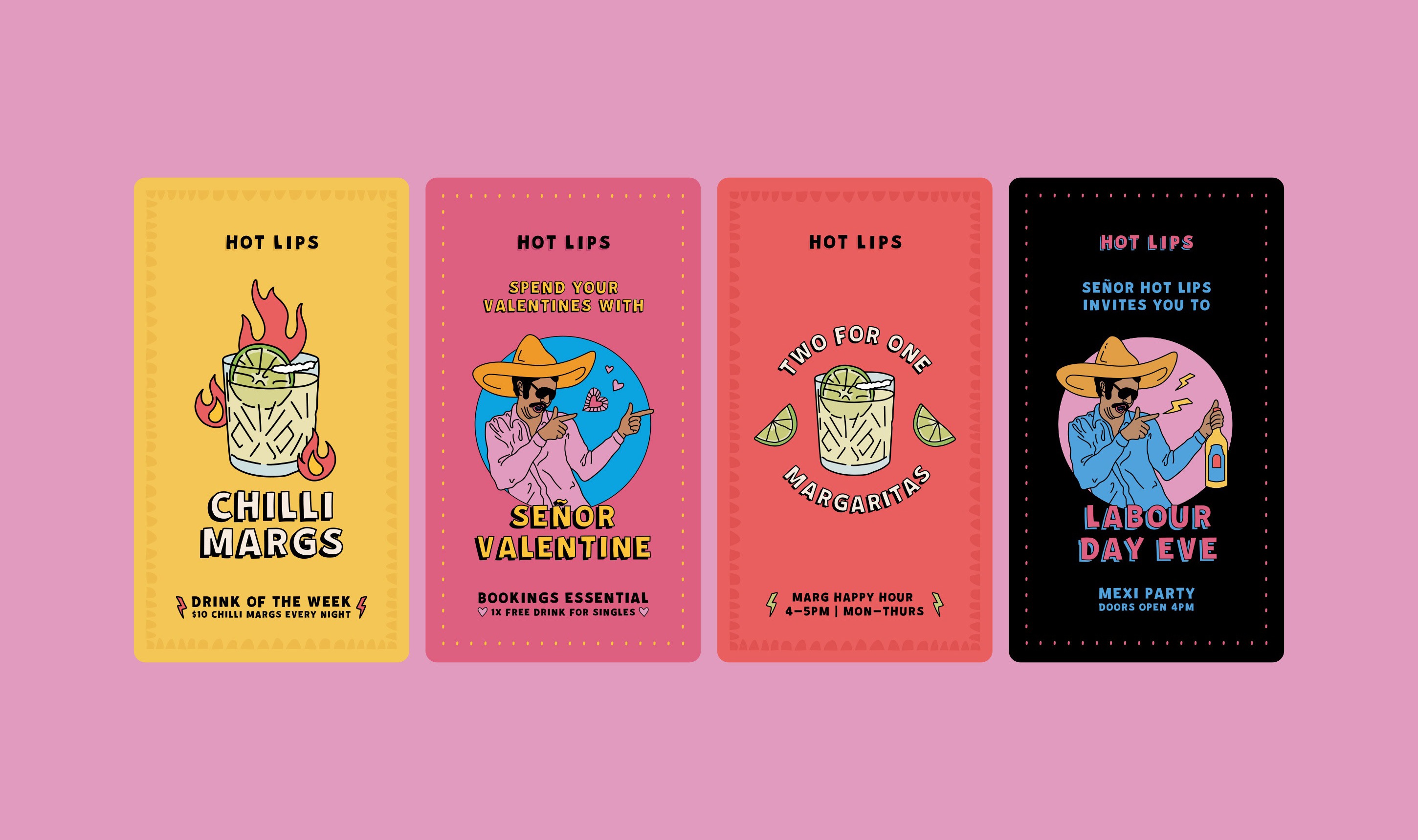
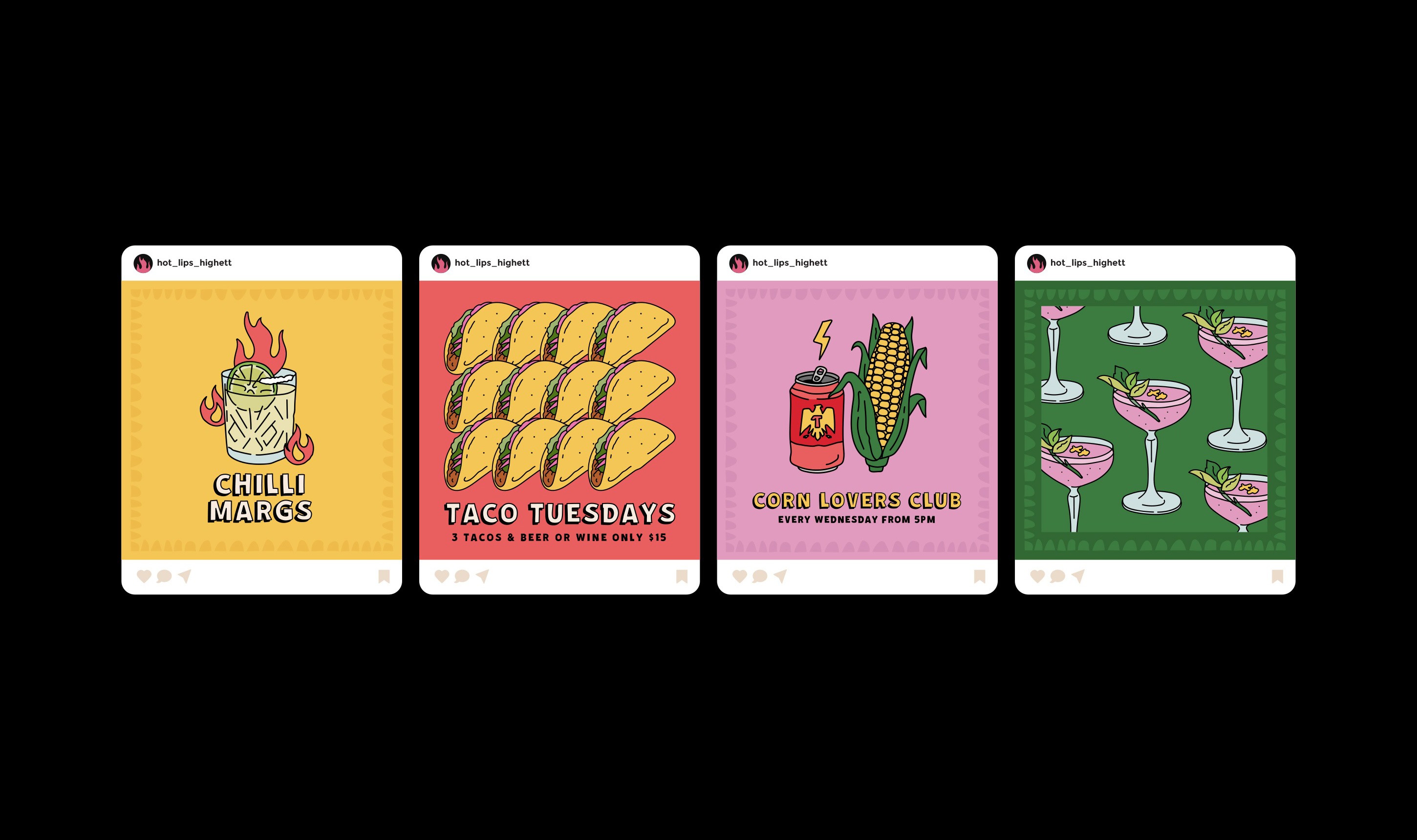
Deliverables-wise, we needed to build a brand package that would be super easy for his team to work with. A package that included everything they would need to run with the new identity–and keep it consistent. Primarily, a sweet bunch of social templates and a simple brand book for guidance. Plus any other assets we came up with to bring the new brand vision to life.
The Process
First off, we got to work defining what the Hot Lips team wanted to portray in the refresh. Looking at what the venue was transitioning to, whether that suited their patrons, and how that should come across in both design and brand language.
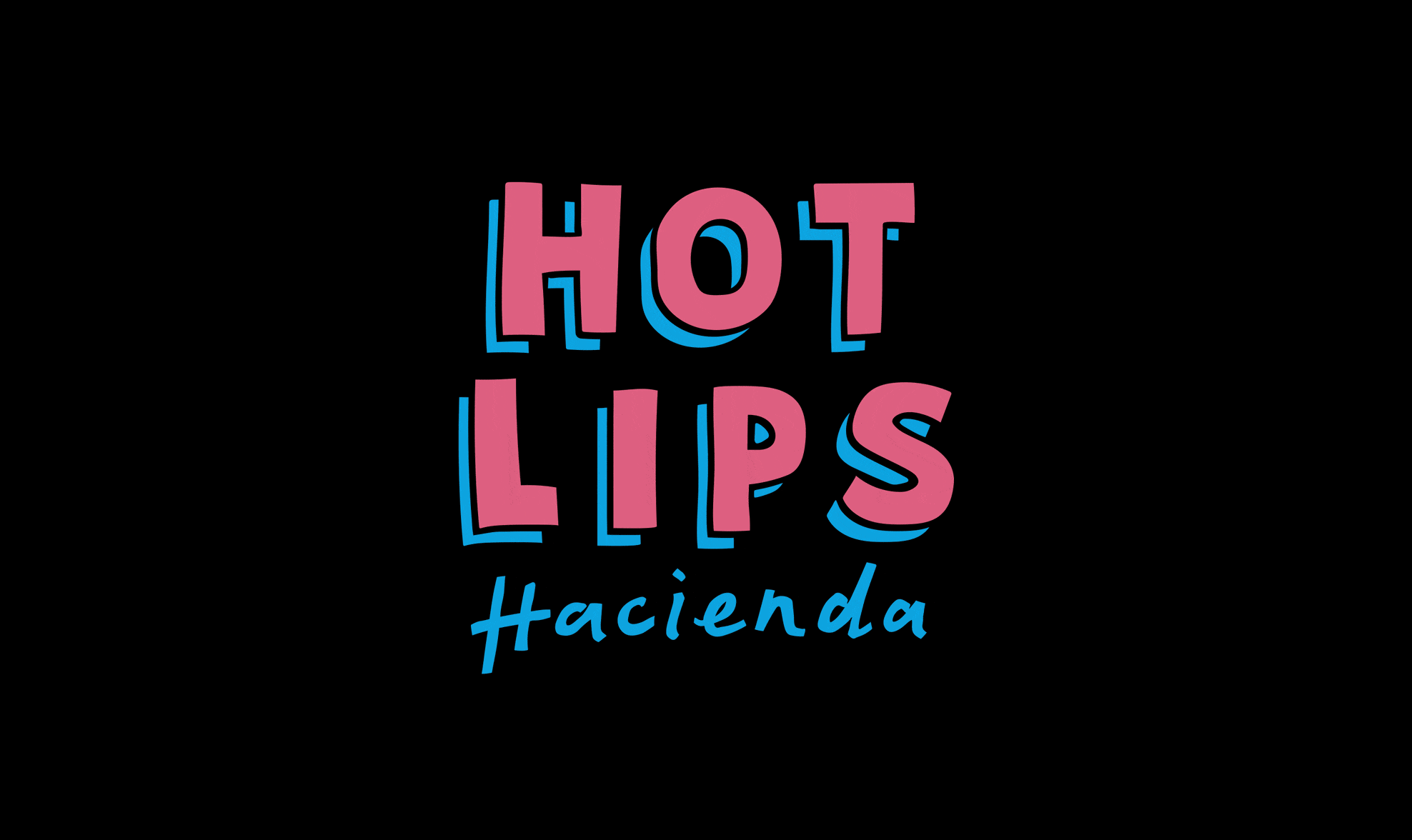
From there, we worked with Steve to identify parts of the identity he wanted to keep, and which ones he wanted to revisit. We took a few liberties at this stage, as the logo wasn't originally on the cards for a refresh. But, creative things happening as they do, we ended up presenting a new one anyway. And it won the team over.
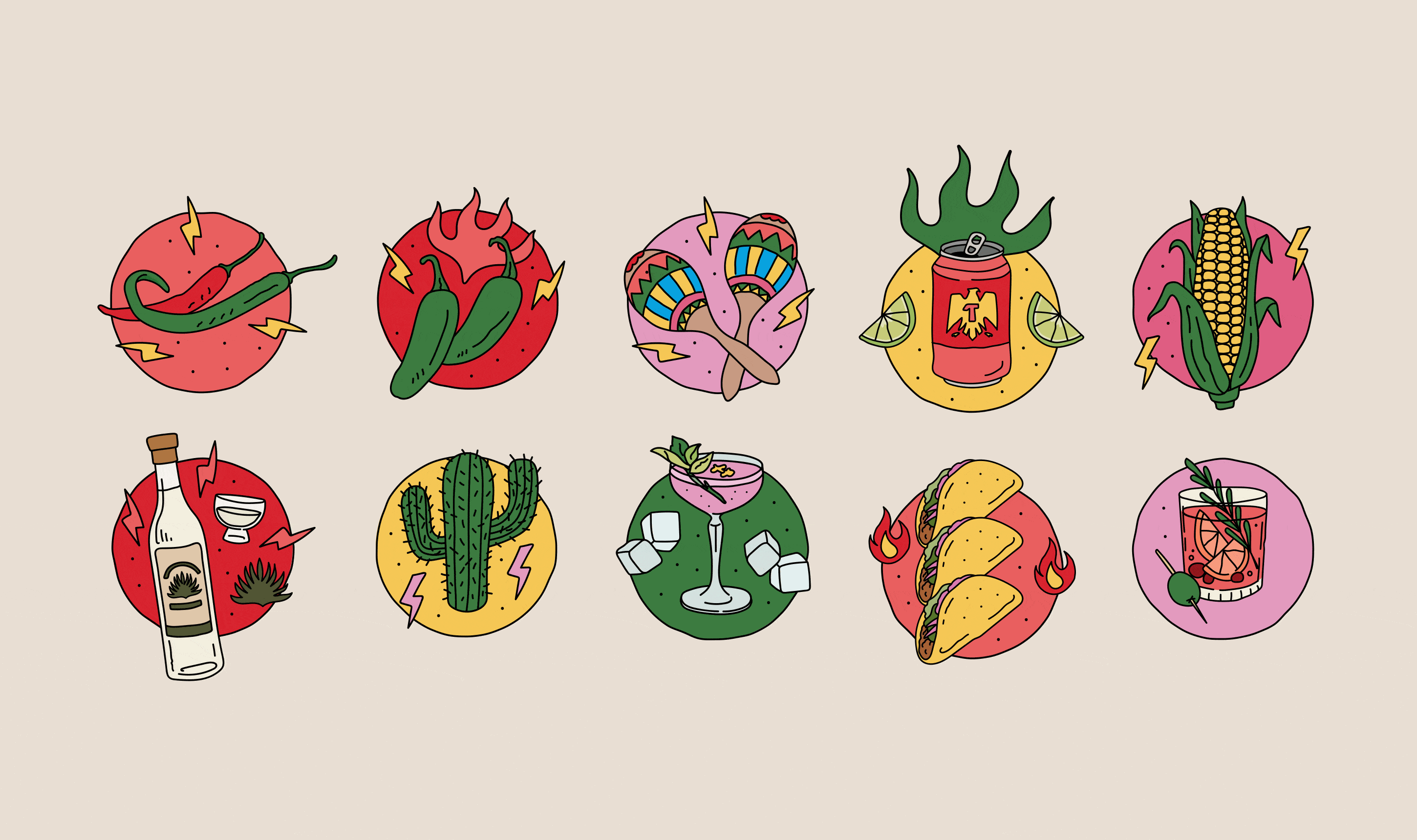
The rest of the refresh turned out pretty cool. An extensive library of quirky illustrations, a biiiig suite of social templates, a custom font for an extra punch of personality, and a brand book to tie it all together. A noticeable difference in how the brand looks and feels (especially in a consistency sense)–but not a radical jump to a new and unrecognisable look.
Check out some project snaps below!
![]()
![]()


Uuuuh... what's the difference between a Brand Refresh and a Rebrand again?
Going back to that neat little analogy that we slipped in before: a brand refresh is more an evolution, rather than a revolution.
A brand refresh normally means the core fundamentals of your business (like your values, offering, market position, or target market etc) aren't changing. Rather, it's all about revisiting how they are communicated (through visuals, brand language and the content you create).
Your current branding might have served you five years ago, but now? Perhaps things need a little fine tuning. A bit of love. A freshen up!
A rebrand on the other hand, is a much deeper operation. A rebrand is required when there is a big shift in your business fundamentals; ie if what you do, how you do it, why you do it, or who it's for significantly changes. In more business-y terms, this might look like: wanting to reposition where you sit in the market, targeting a new ideal audience, different business values, or changes to your business model and key offering.
A rebrand starts at the core (defining all those why's, who's, how's and what's) before working its way out to communication & design. Sometimes a branding studio will jump right in with you from the start (like we do), other times businesses prefer to do the strategy work in-house and approach us when they're ready to transform their ideas into brand language & identity design.
Want to see how more brand projects have turned out? We've got a stack of 'em over here.