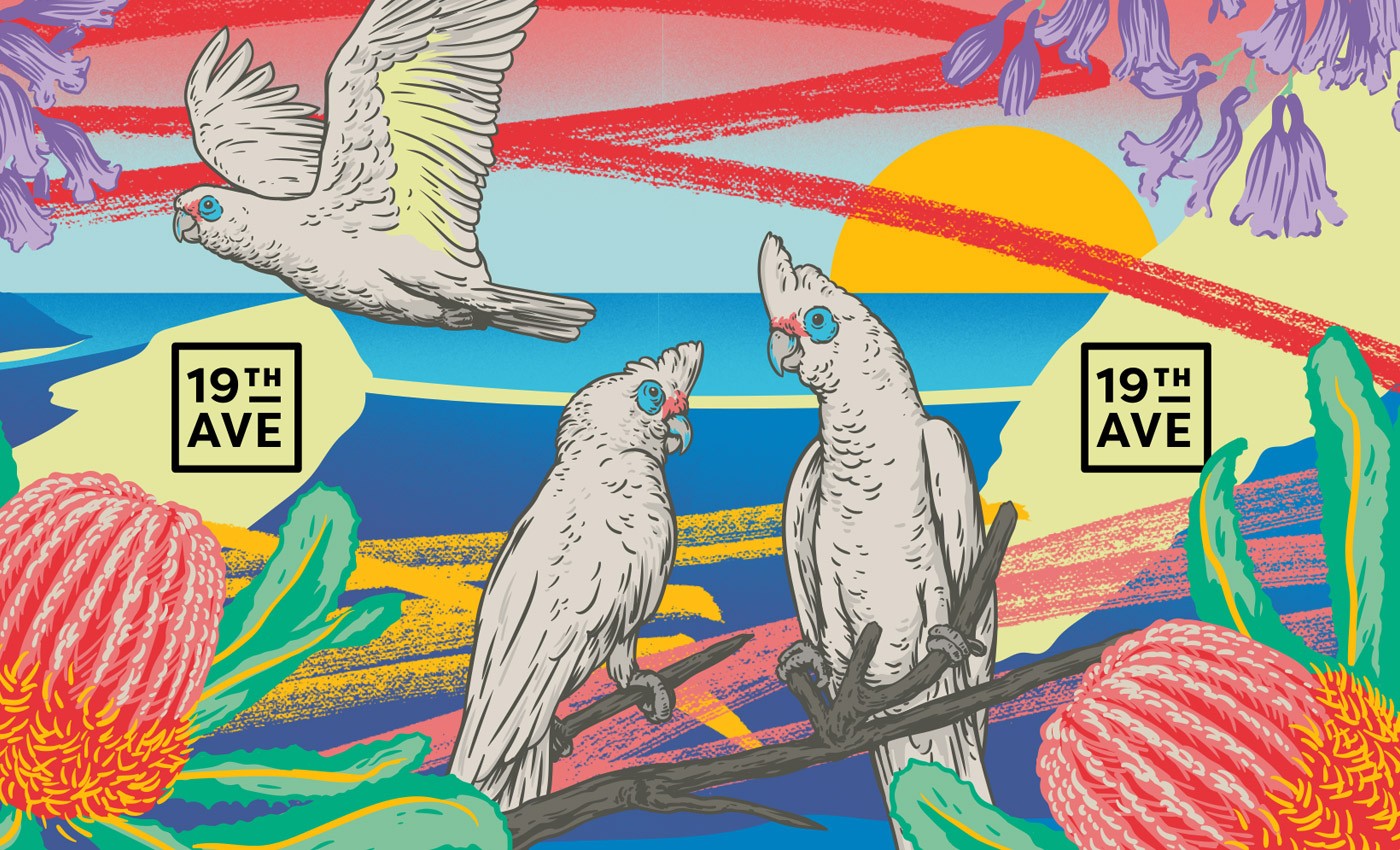
FOR THE LOVE OF THE PADDLE
FOR THE LOVE OF THE PADDLE
FOR THE LOVE OF THE PADDLE
FOR THE LOVE OF THE PADDLE
FOR THE LOVE OF THE PADDLE
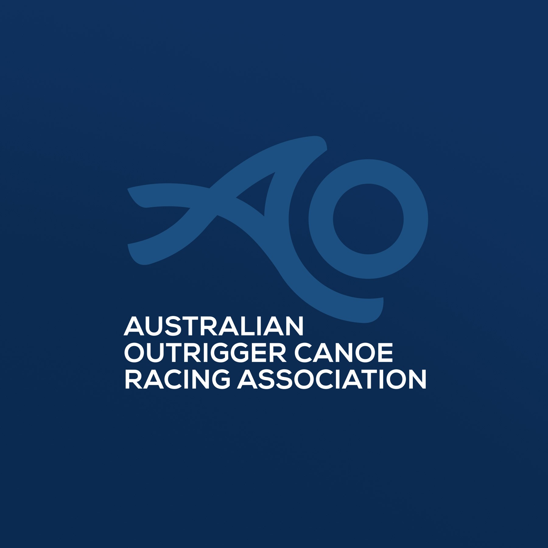
AUSTRALIAN OUTRIGGER CANOE RACING ASSOCIATION
AUSTRALIAN OUTRIGGER CANOE RACING ASSOCIATION
AUSTRALIAN OUTRIGGER CANOE RACING ASSOCIATION
AUSTRALIAN OUTRIGGER CANOE RACING ASSOCIATION
AUSTRALIAN OUTRIGGER CANOE RACING ASSOCIATION
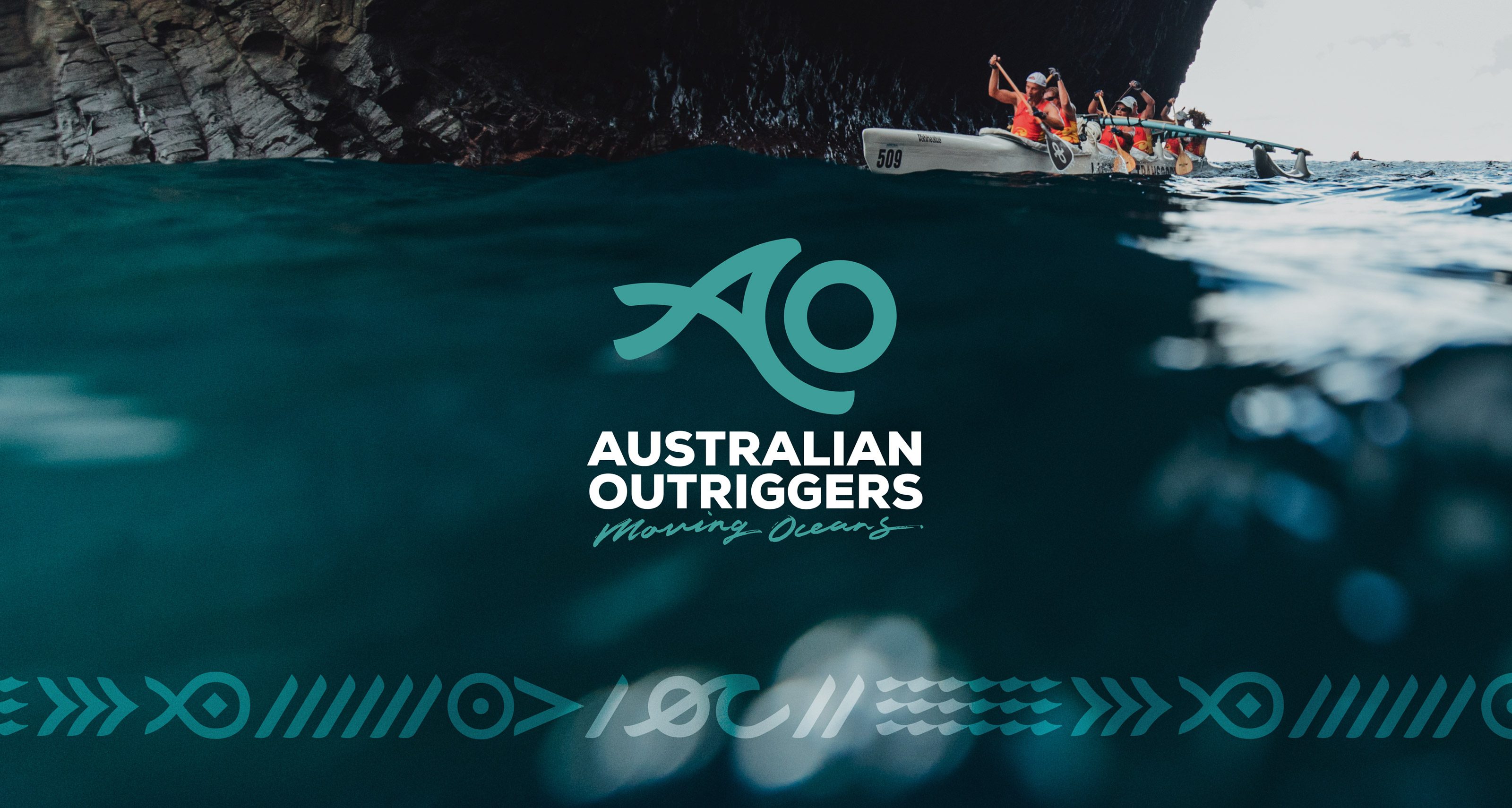
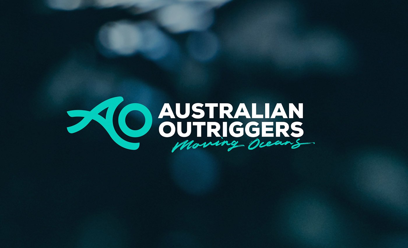
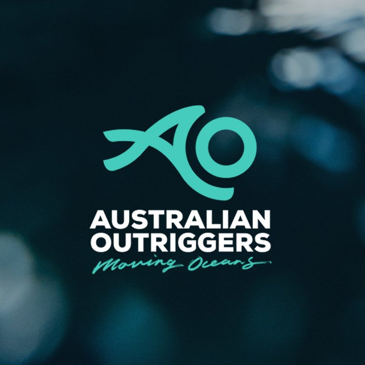
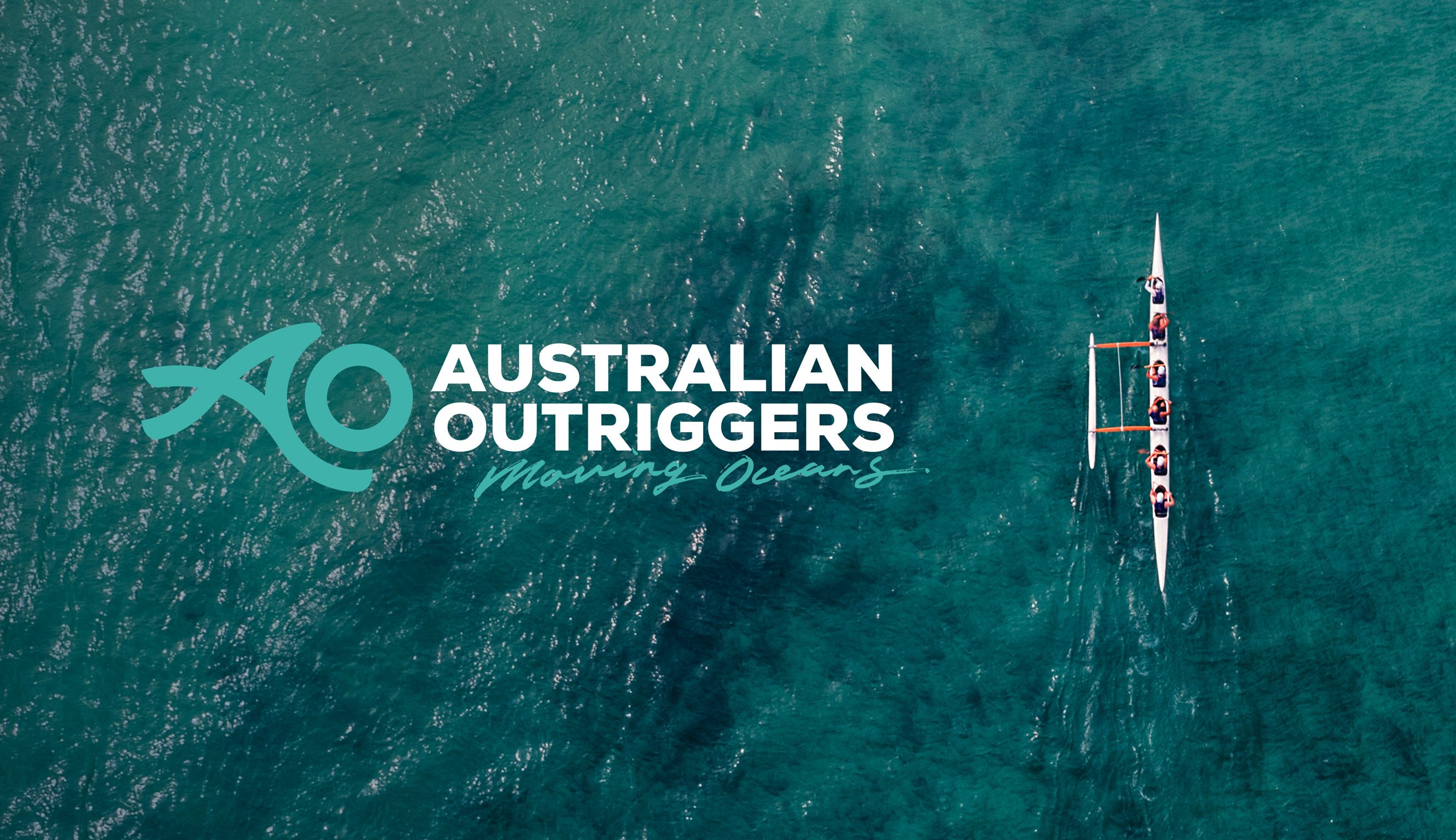
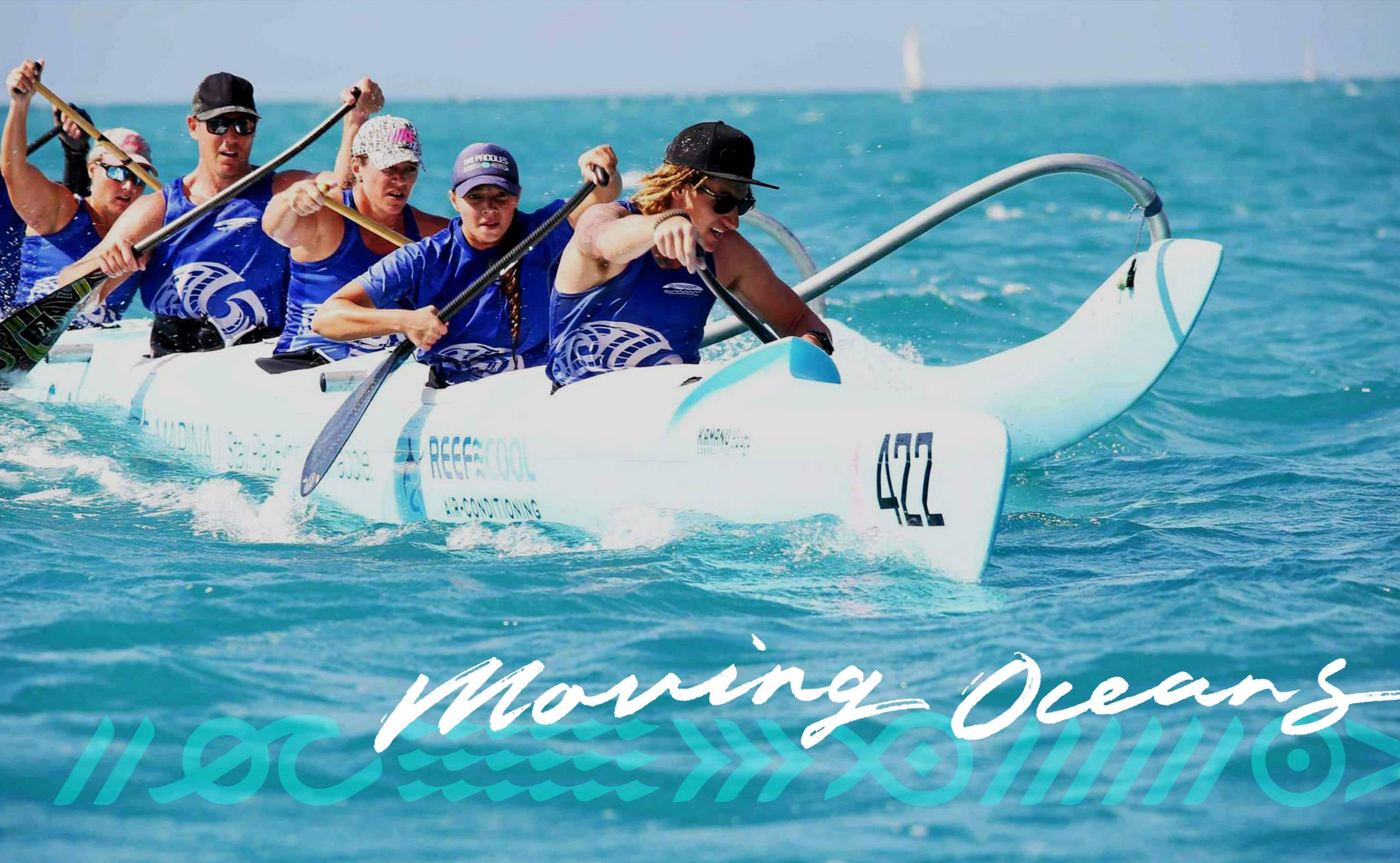
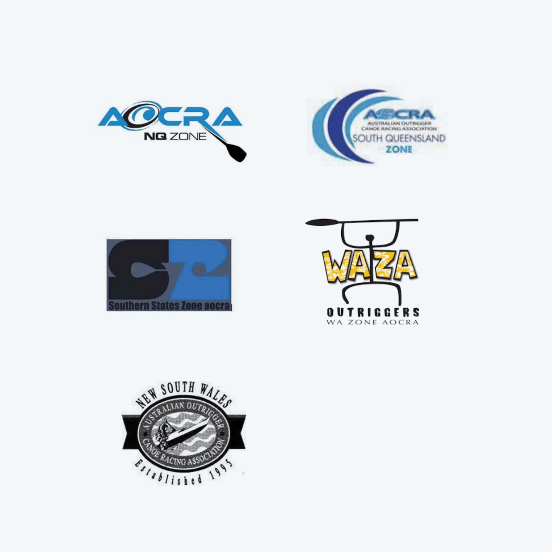
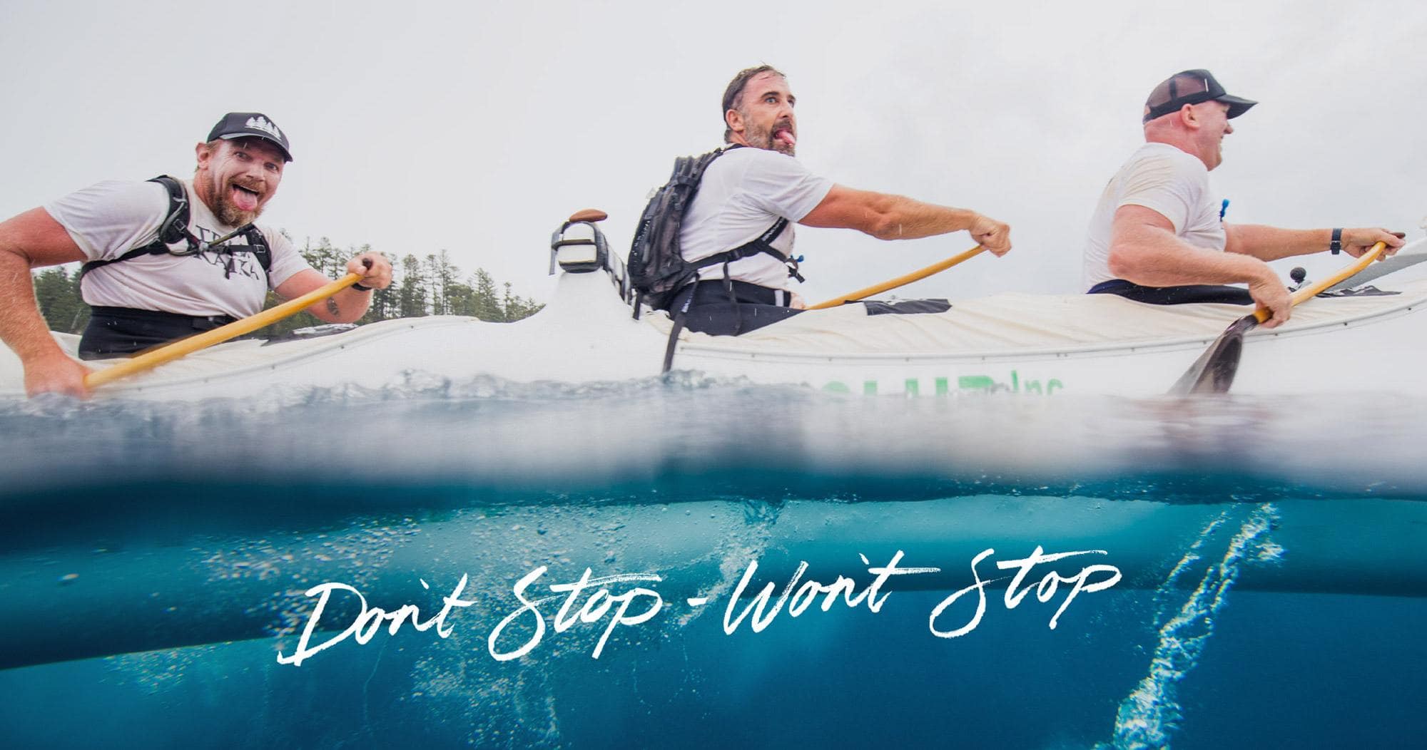
Australian Outriggers is a sporting community rich in mateship, respect and love for the ocean. With the main goal to better attract the Australian youth market and secure the future of their sport, AO invited us to pitch for the rebrand project that would encourage new member applications, consolidate regional team effortss and build a strong sense of national community.
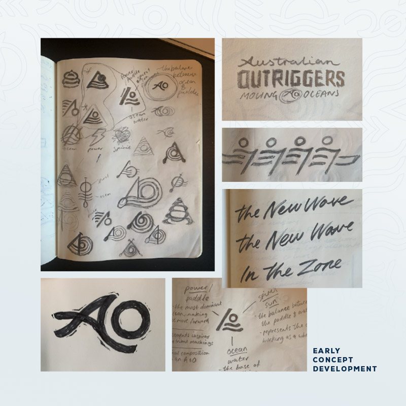
Starting with a deep-dive strategy session, we determined the Australian Outriggers brand would need to reposition in order to reinvigorate. With the possibility of a 'house of brands' on the cards, we started at the source, developing the hero brand that would act as a solid bedrock for further brand creation.
WHAT WE DID
WHAT WE DID
WHAT WE DID
WHAT WE DID
WHAT WE DID
Naming & Messaging
Brand Identity DESIGN
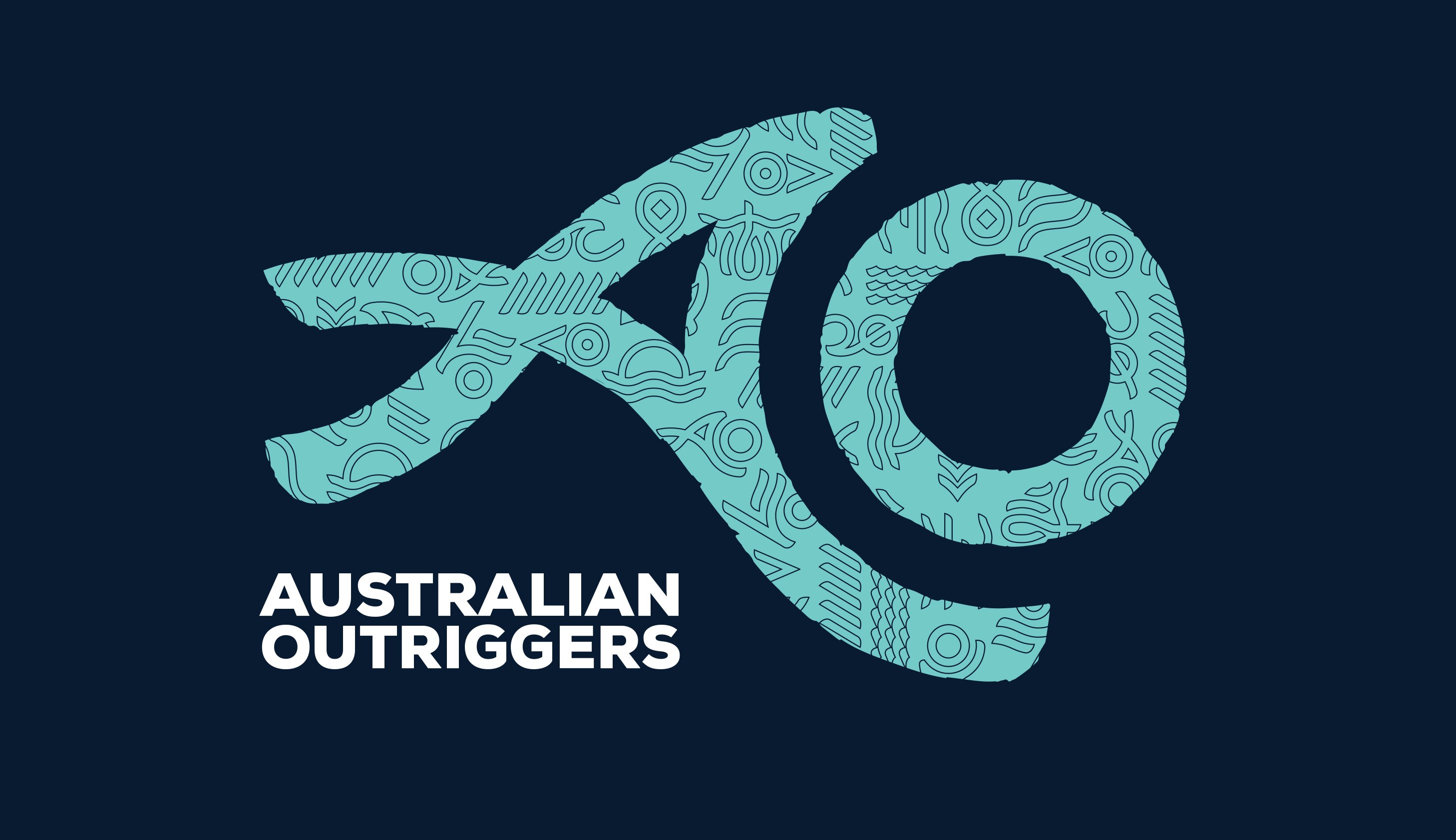
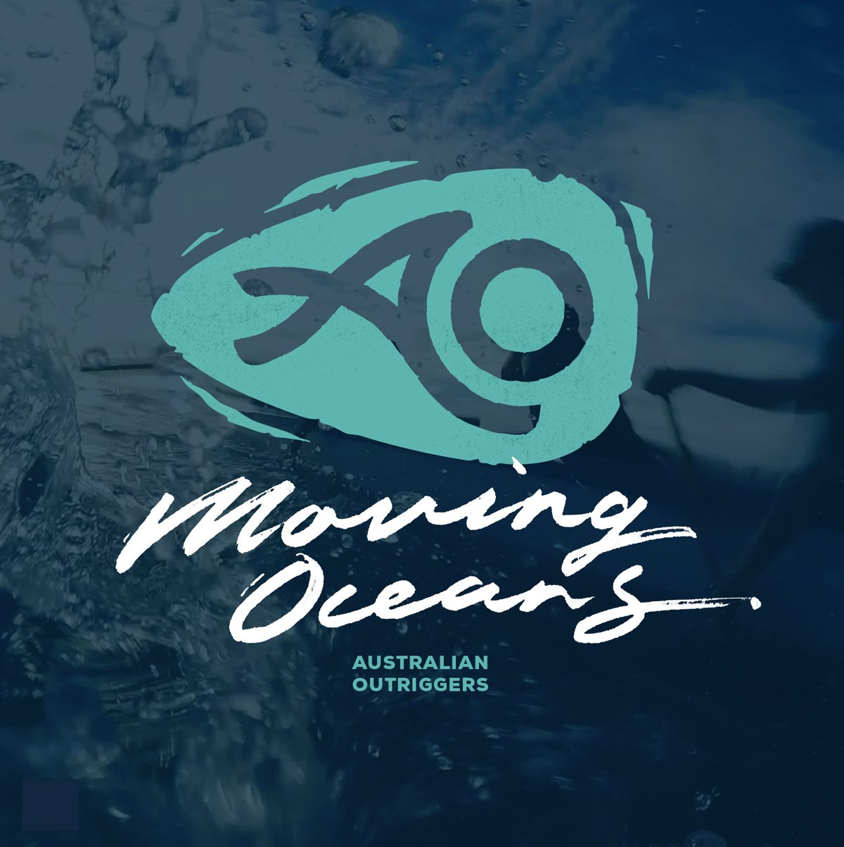
LOGO DESIGN
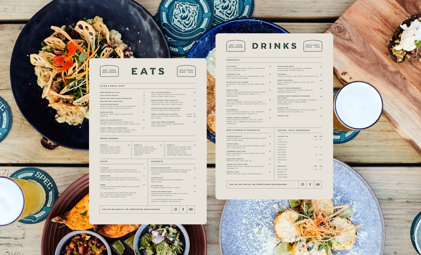
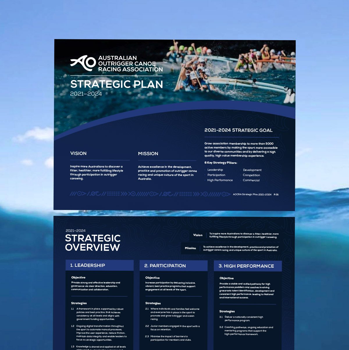
Print Communications
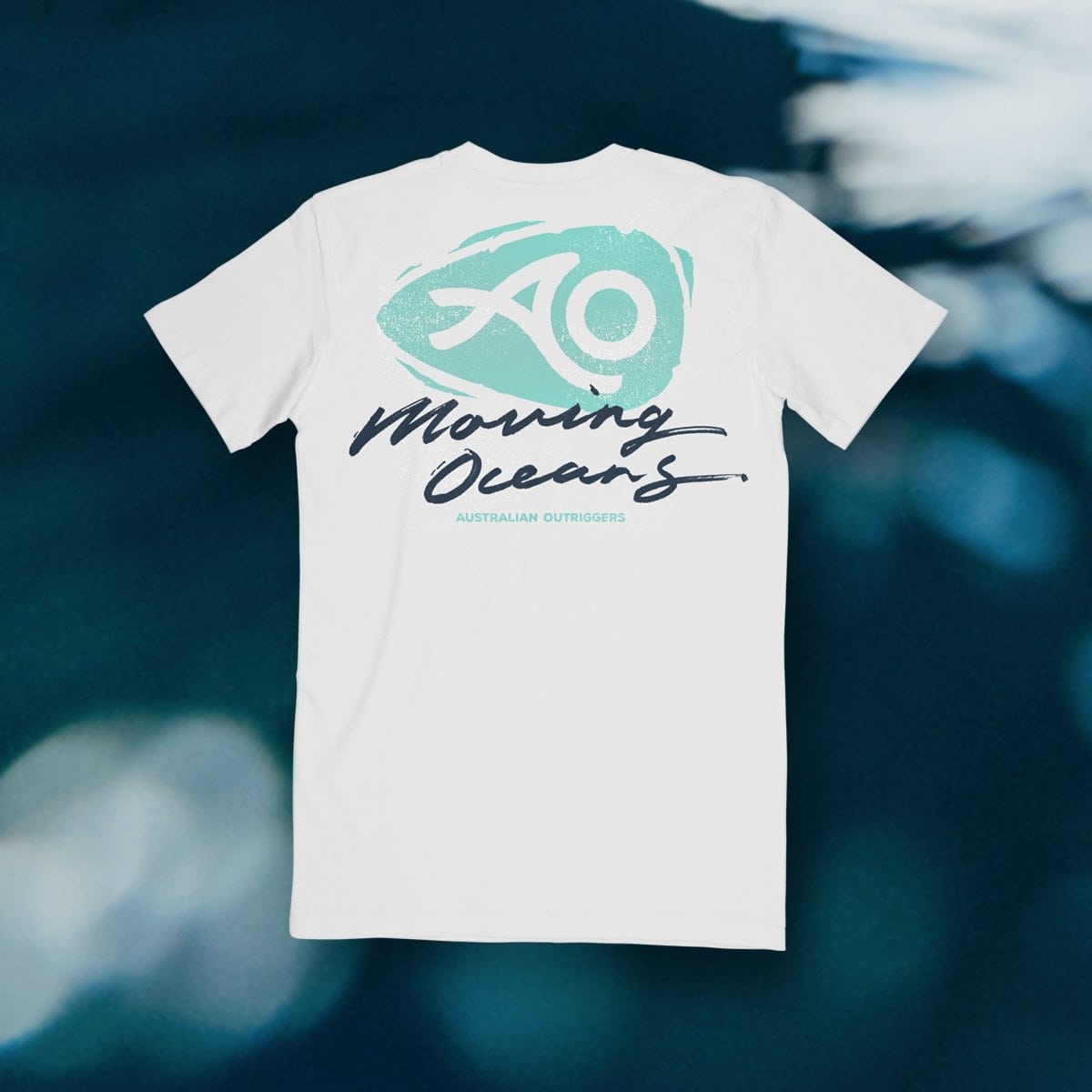
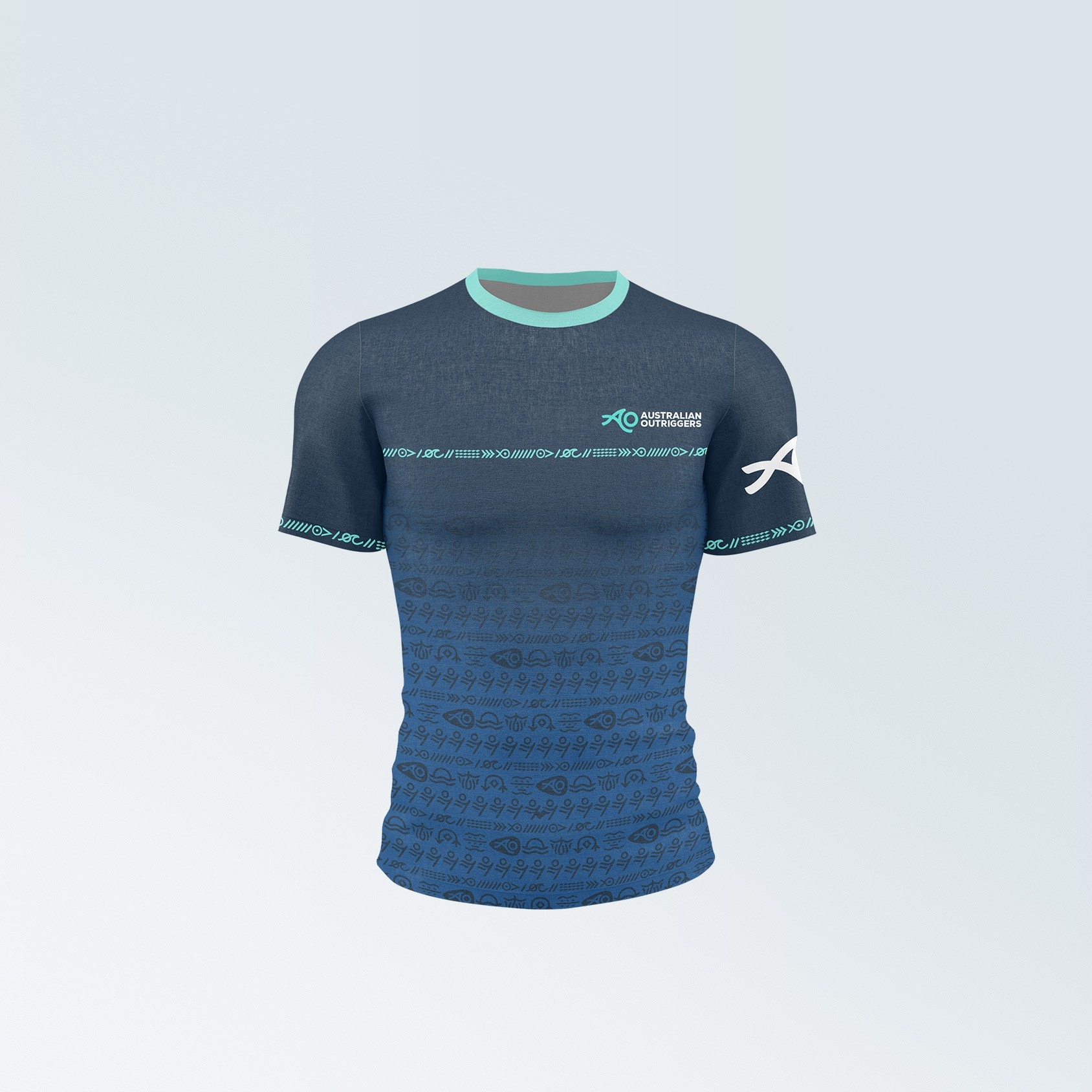
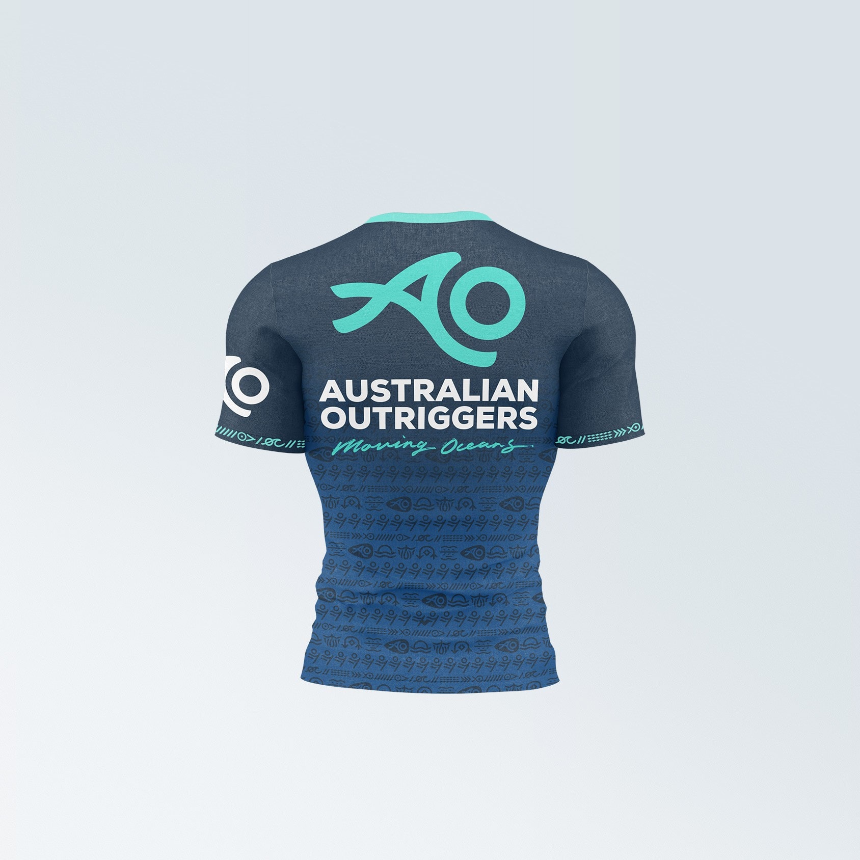
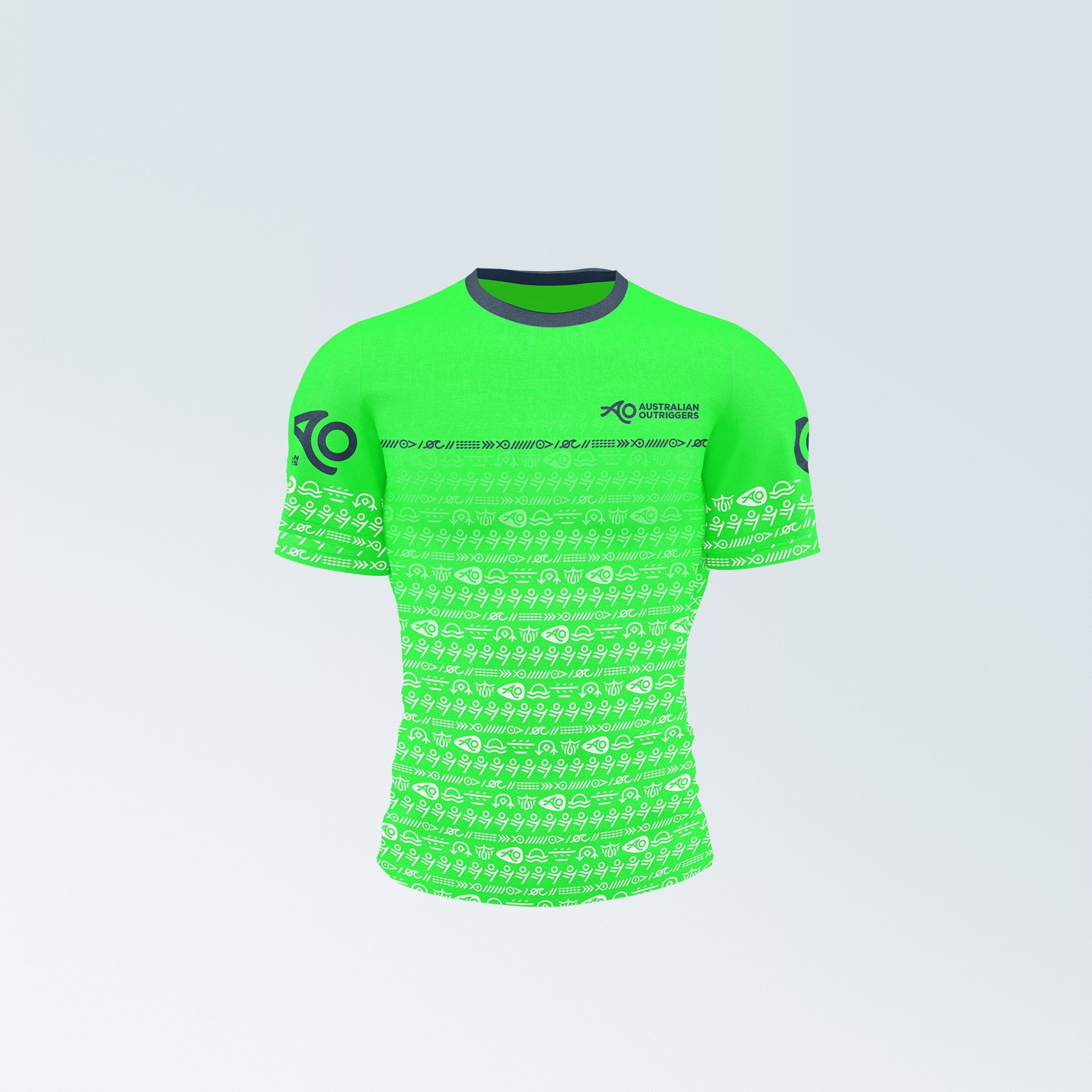
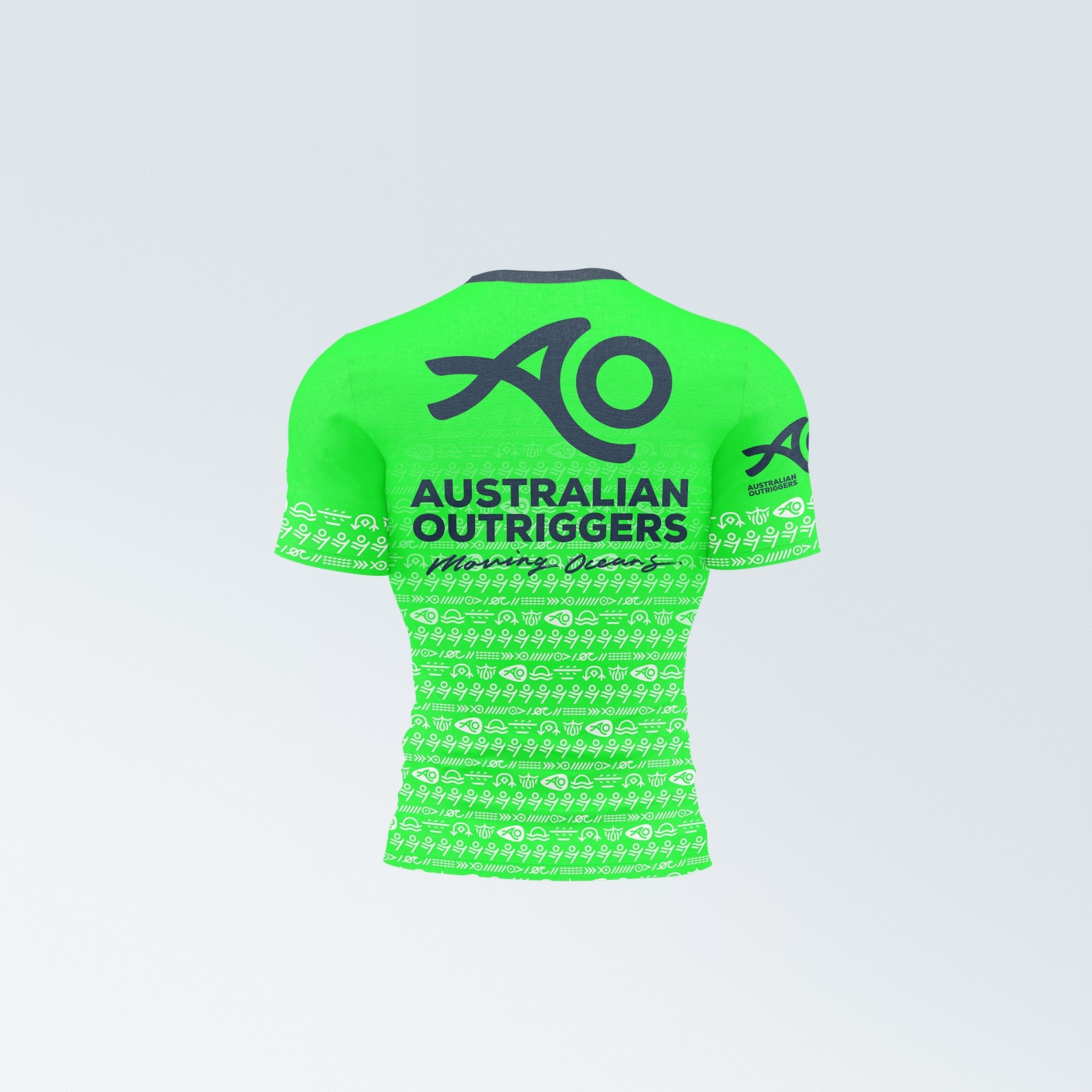
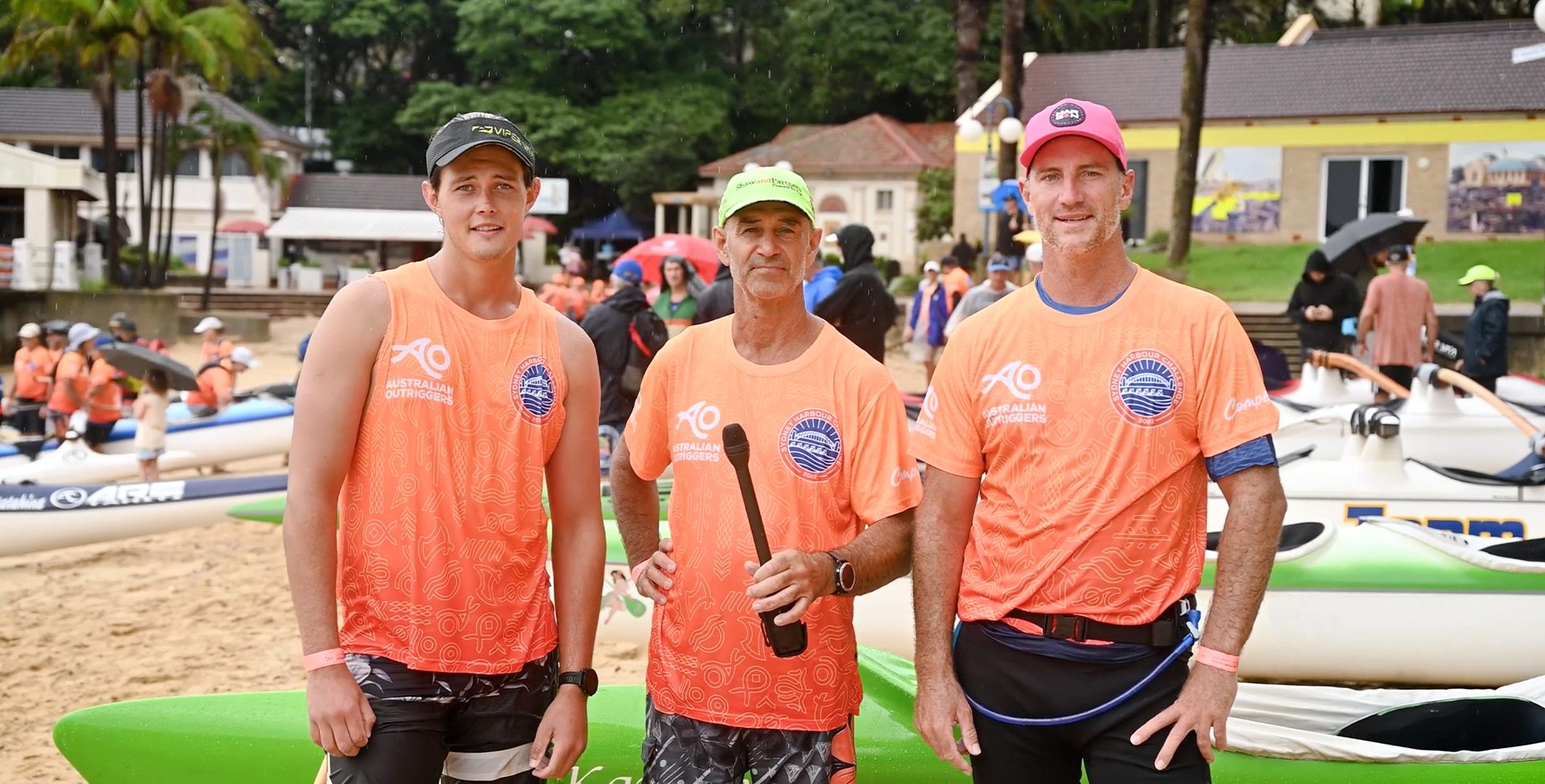
Merchandise & RACEWEAR
EVENT DECALS
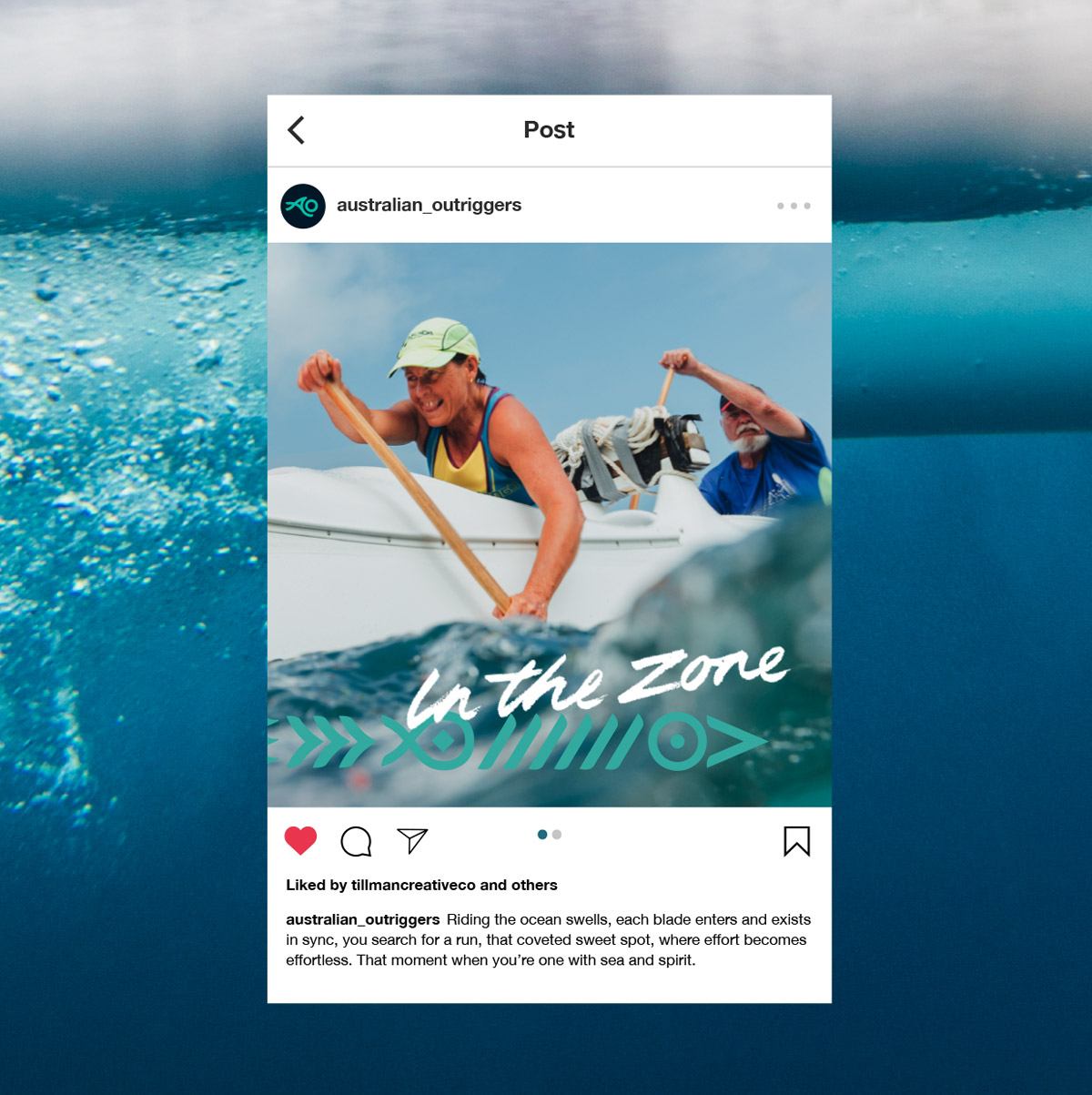
Social Templates
Discovery & Strategy
Naming & Messaging
Brand Identity
Print Communications
Merchandise
Social Templates
Discovery & Strategy
Naming & Messaging
Brand Identity
Print Communications
Merchandise
Social Templates
Discovery & Strategy
Naming & Messaging
Brand Identity
Print Communications
Merchandise
Social Templates
Discovery & Strategy
Naming & Messaging
Brand Identity
Print Communications
Merchandise
Social Templates
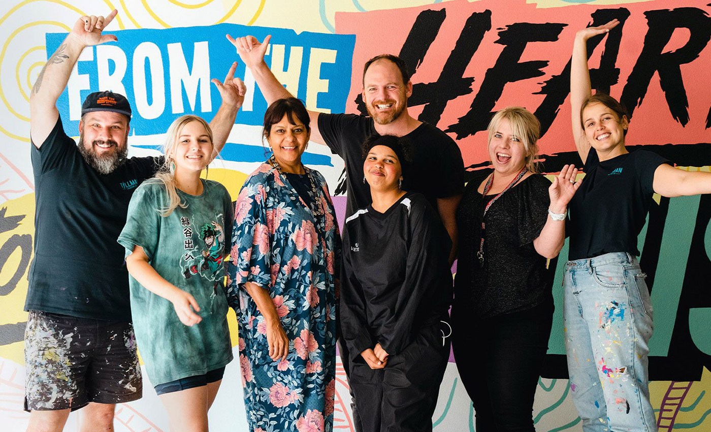
CONTRIBUTORS
CONTRIBUTORS
CONTRIBUTORS
CONTRIBUTORS
CONTRIBUTORS
Richie Edmiston
Richie Edmiston
Richie Edmiston
Richie Edmiston
Richie Edmiston
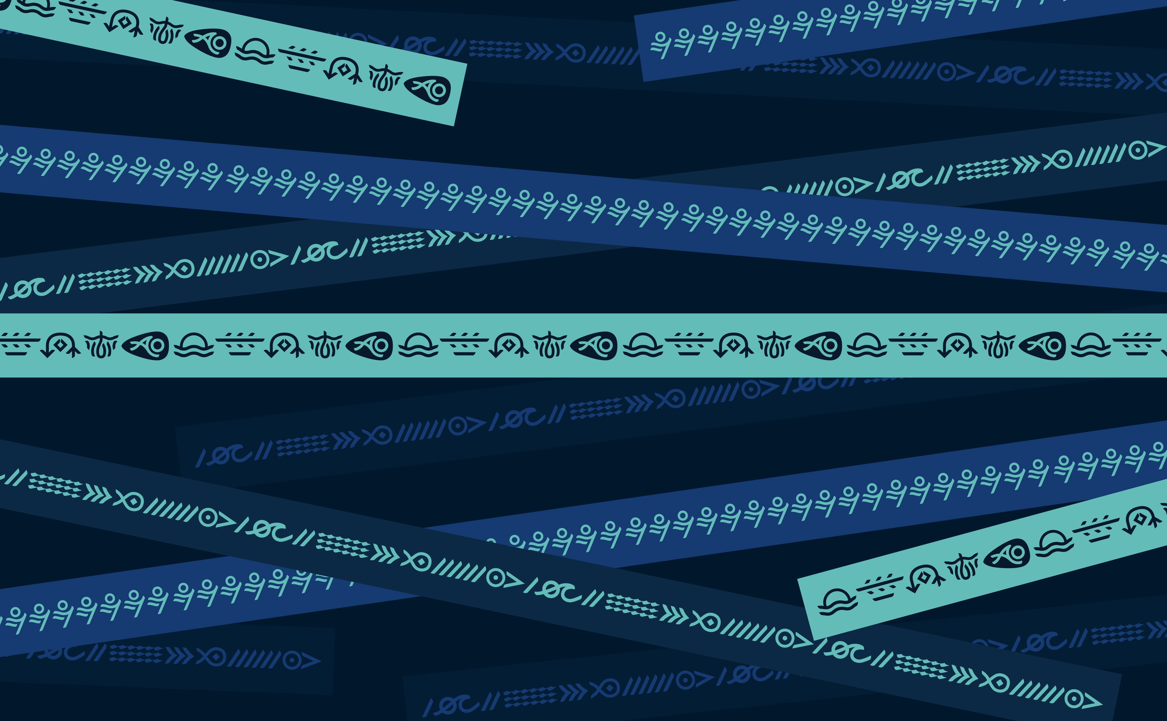
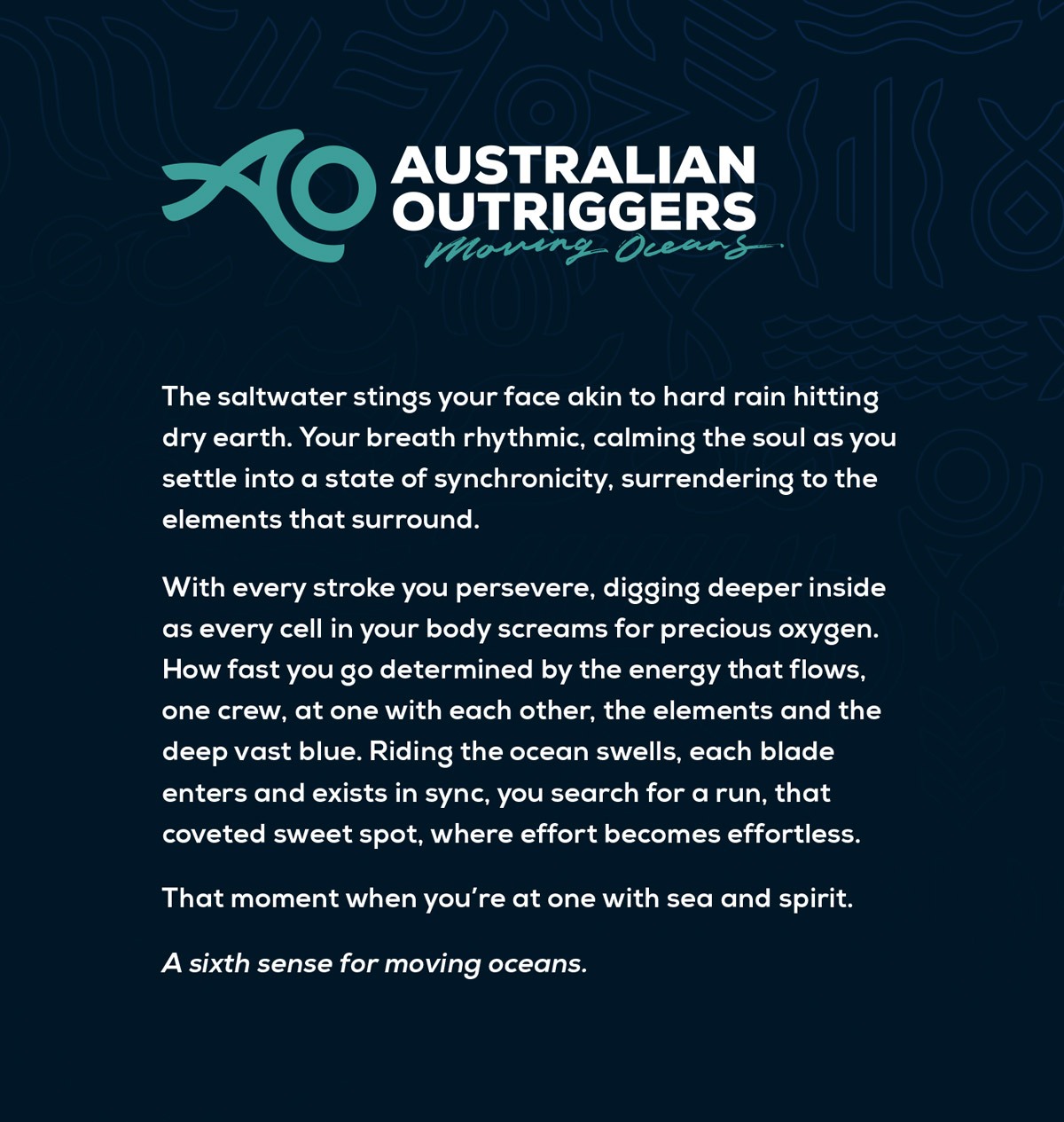
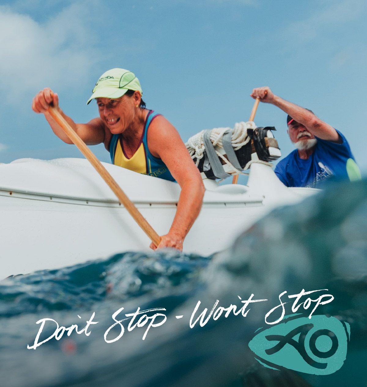
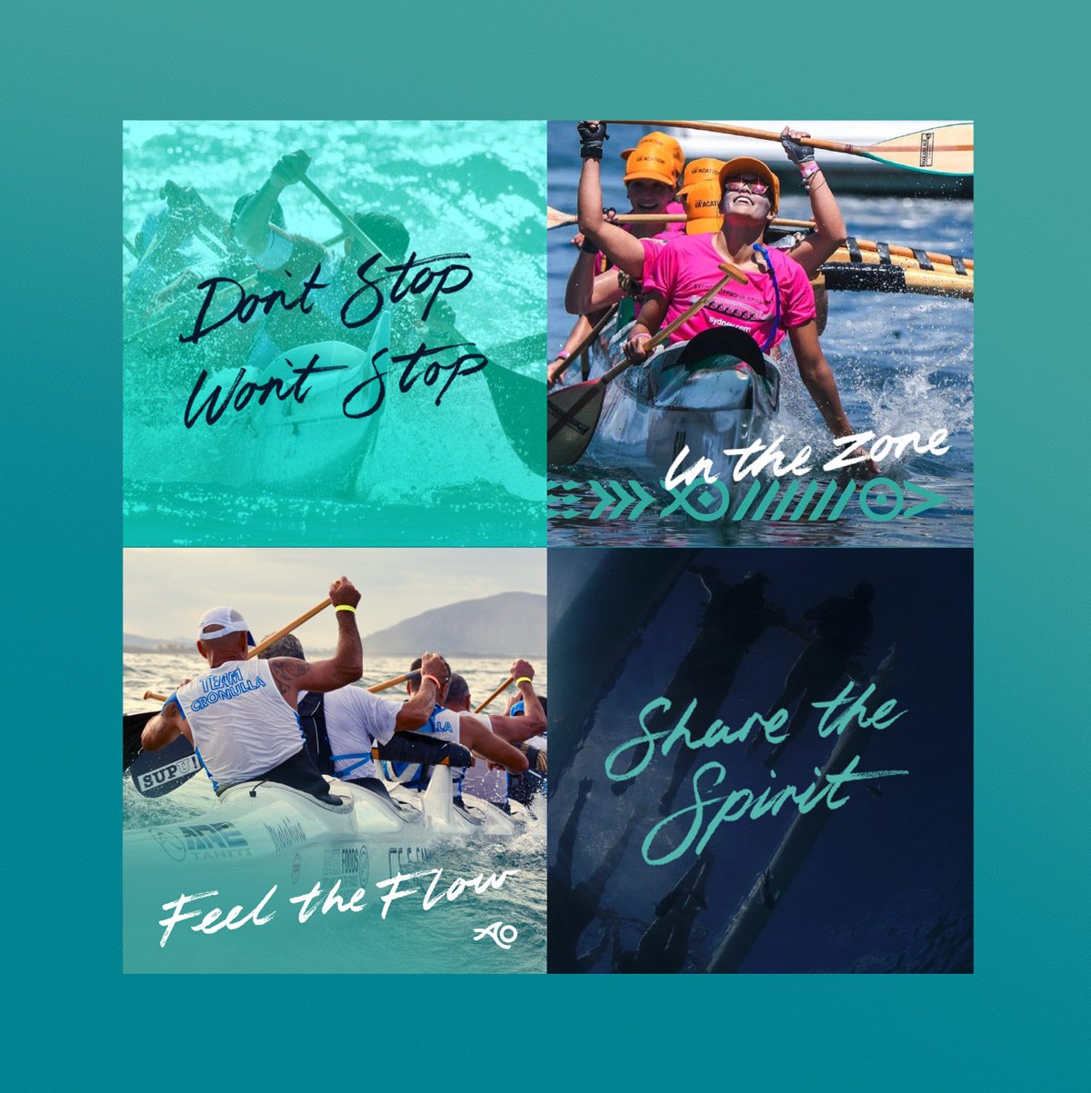
BRAND LANGUAGE & STORYTELLING
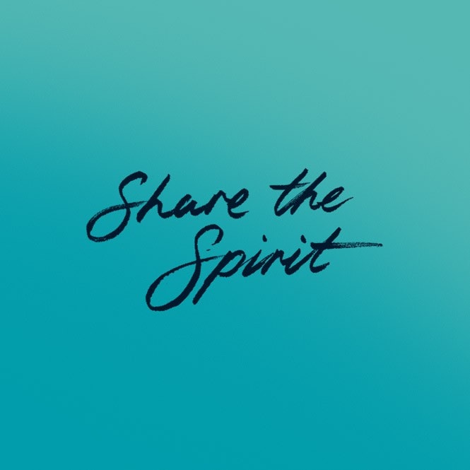
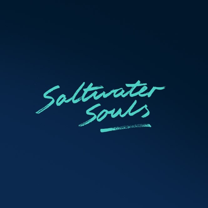
We needed a brand voice that would talk to the the passionate paddlers and saltwater souls. An identity that would stir up undercurrents of emotion and fuel the fire for long-lived community engagement. So at the core of the identity we instilled a strong sense of connection; connection to self, to the ocean, and to other comrade outriggers.
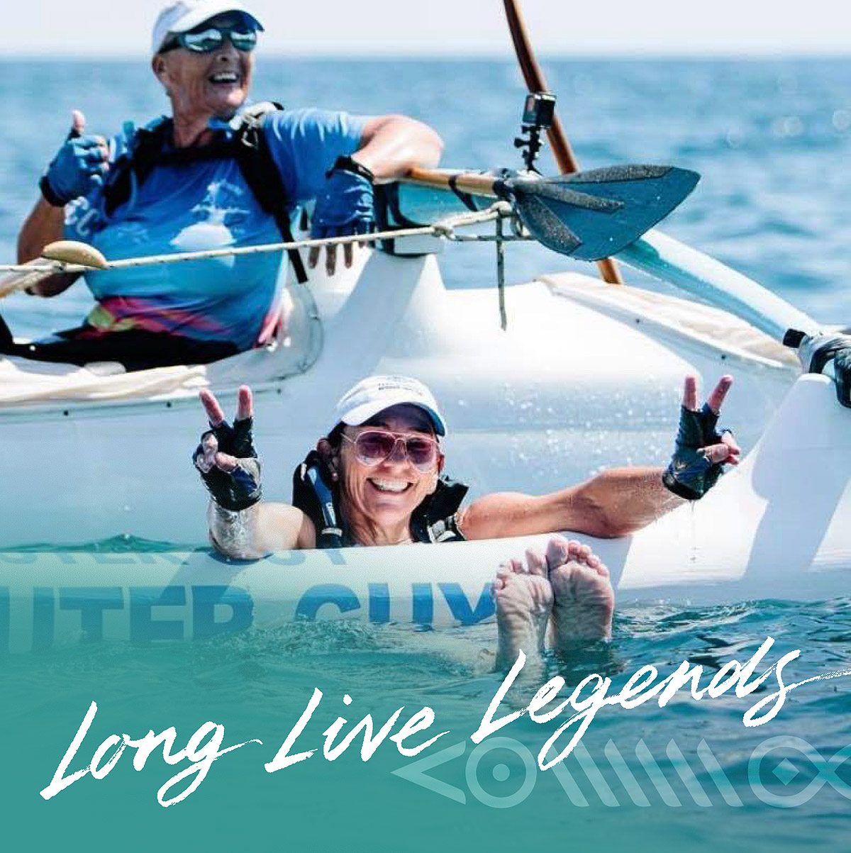
Once the brand voice was seeded from that initial core value, we developed a suite of messaging snippets and taglines to create a brand language that spoke from the heart.
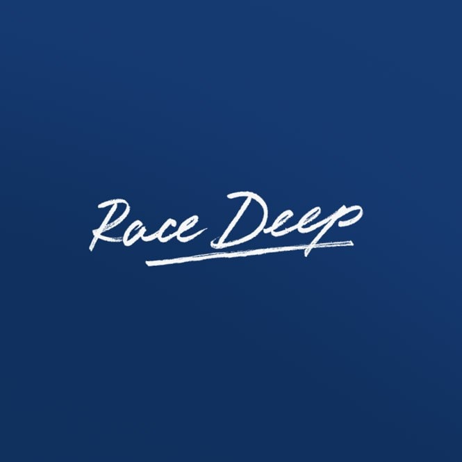
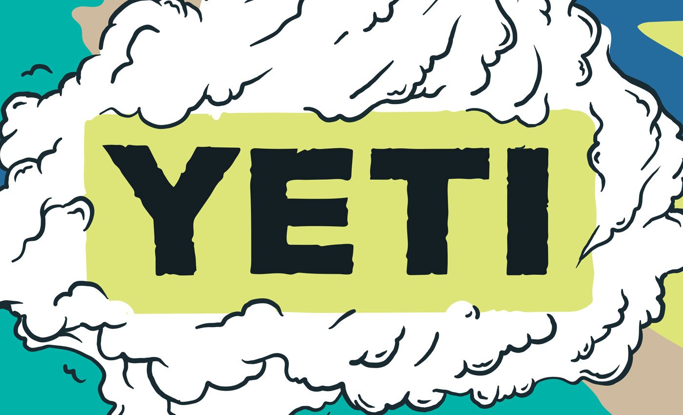
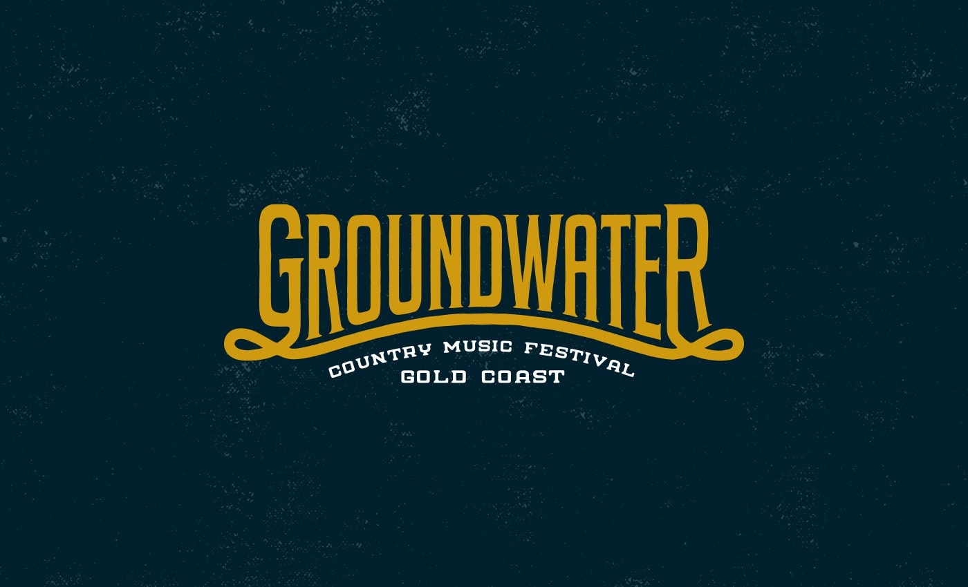
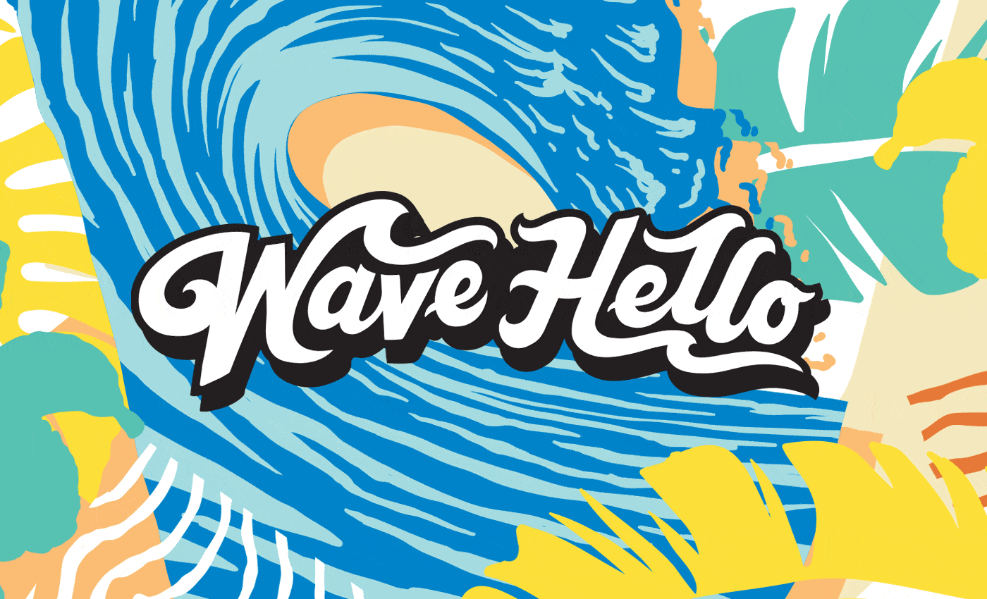
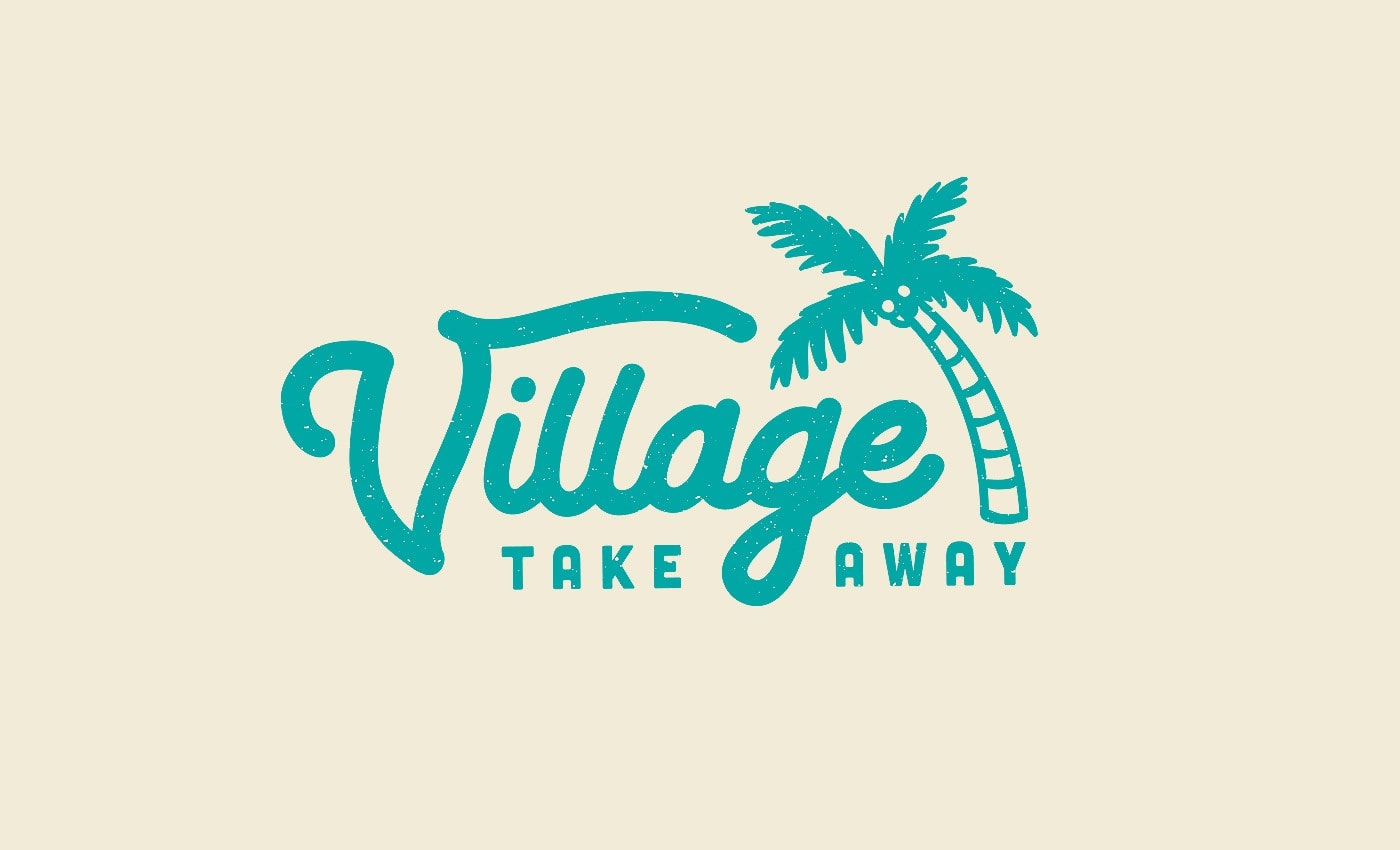
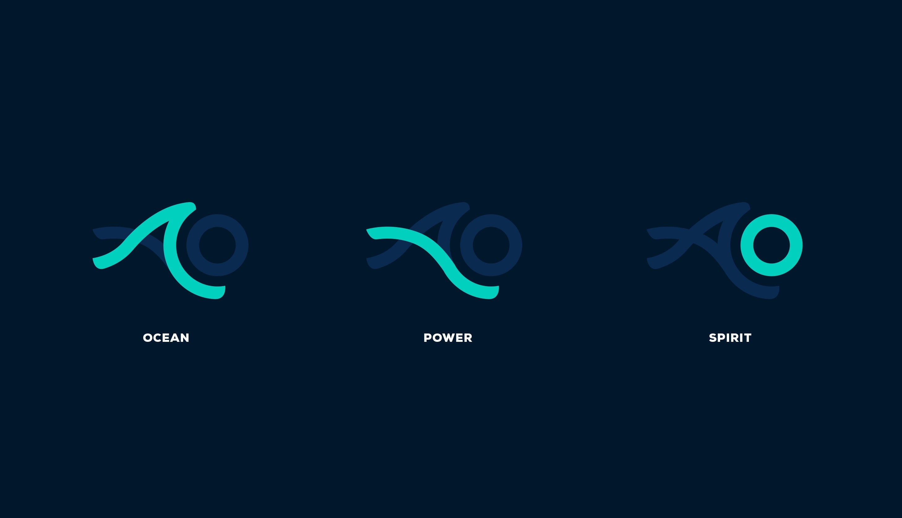
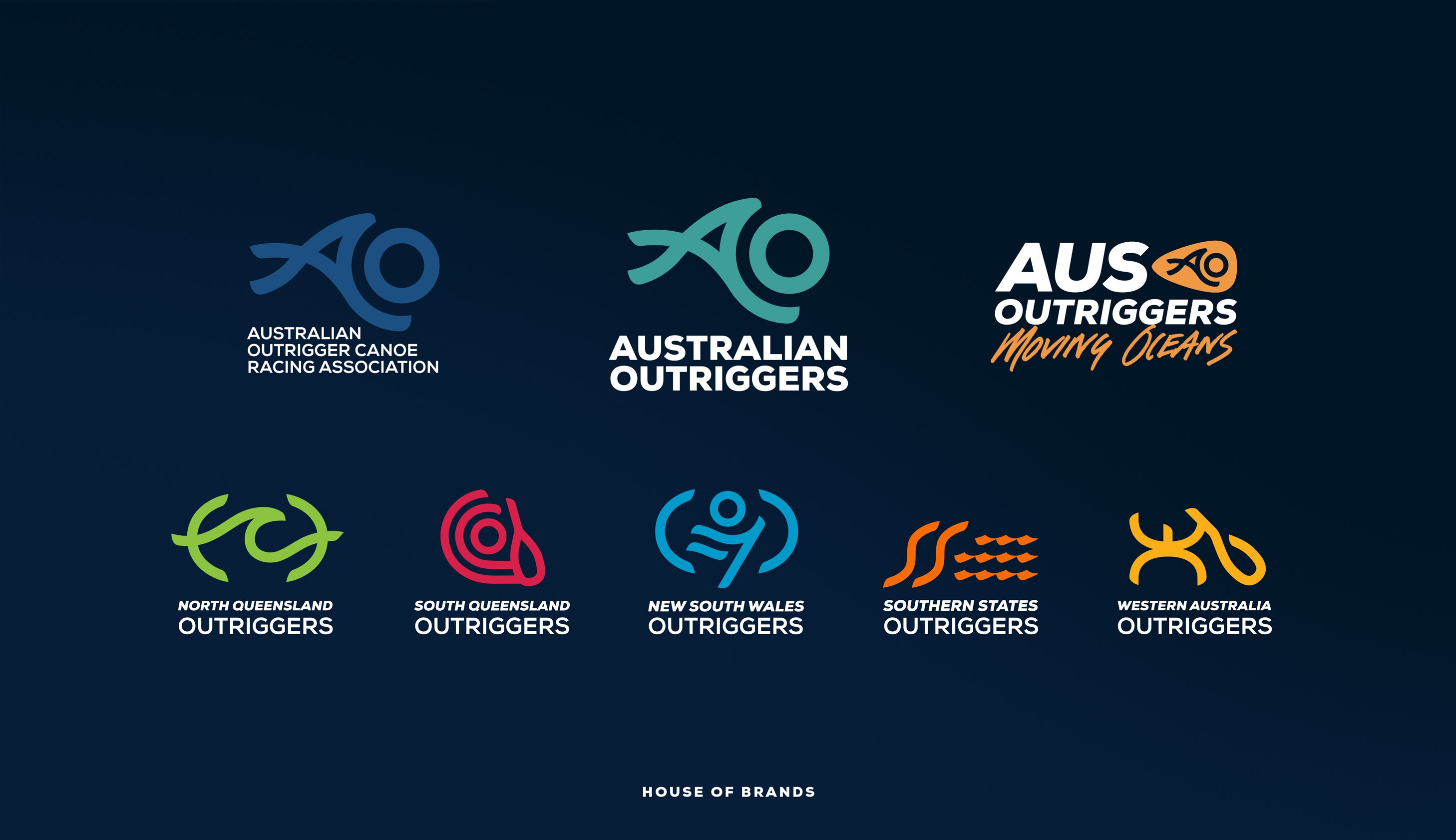
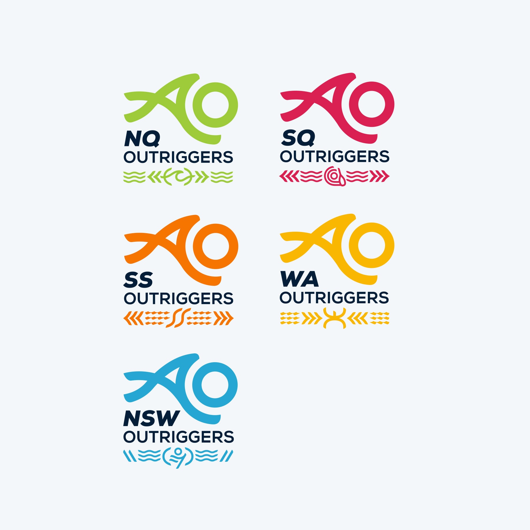
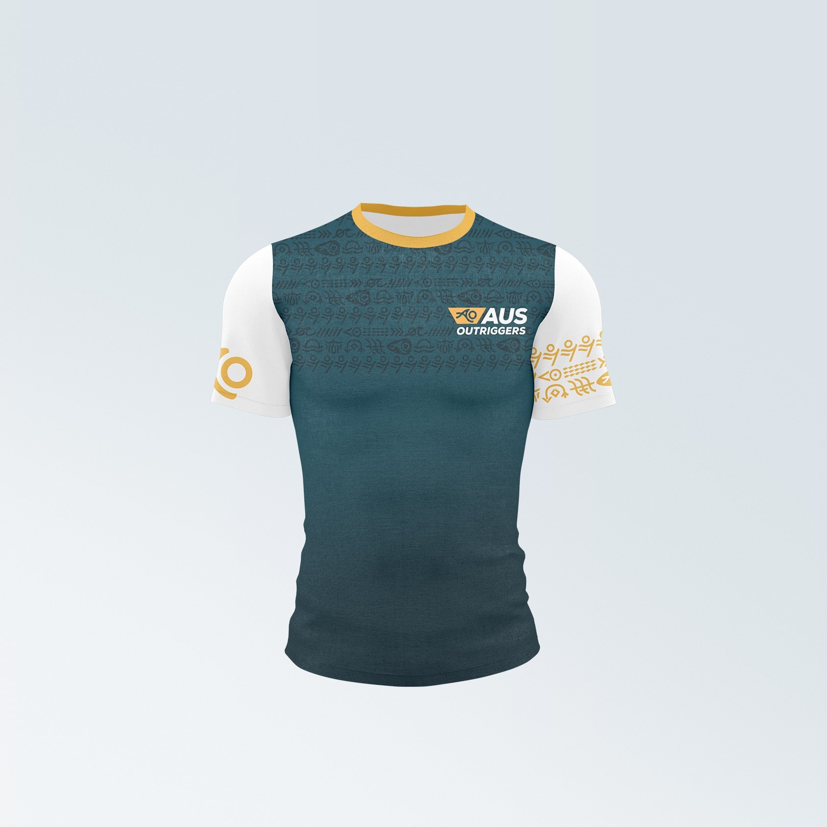
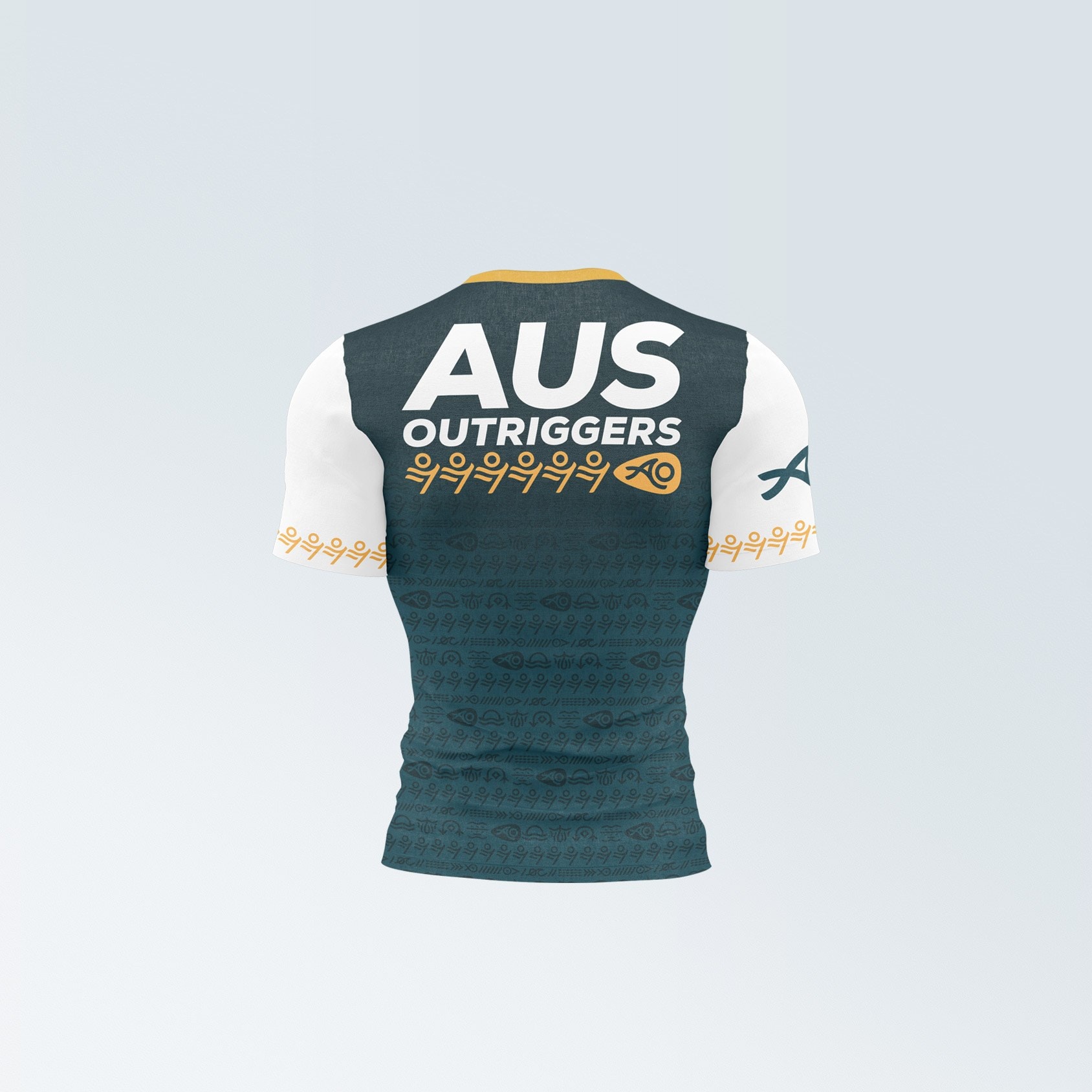
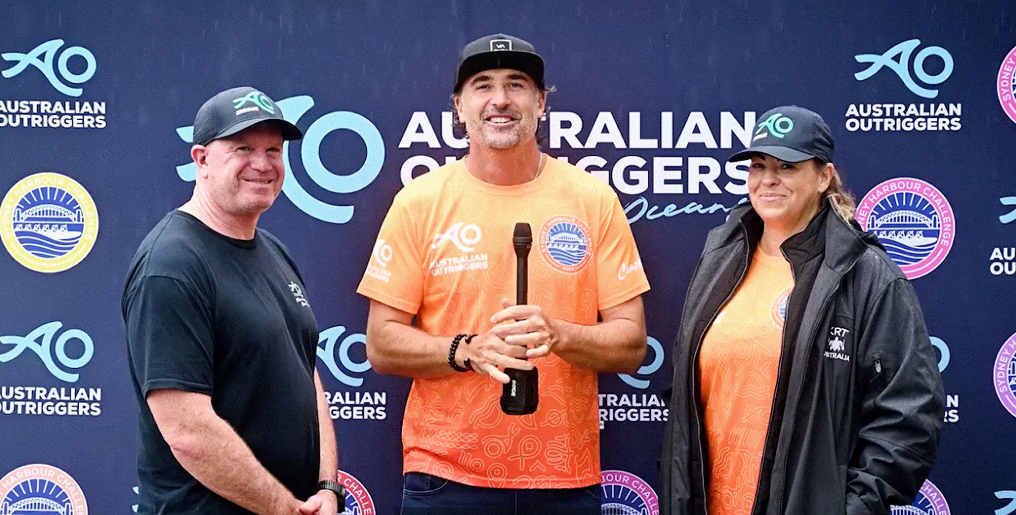
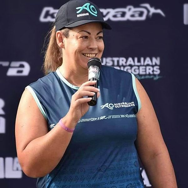
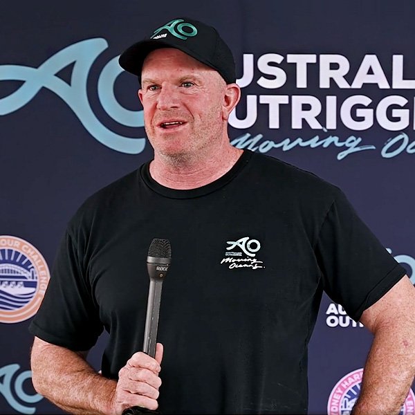
A HOUSE OF BRANDS
As a national organisation, the needs of the AO team stretched far and wide. It was decided the best way forward was to segment the AOCRA brand into 3 key areas, supported by 5 sub-brands for state-level teams. All identities would need to be easily distinguishable, but also easily identified as part of the whole.
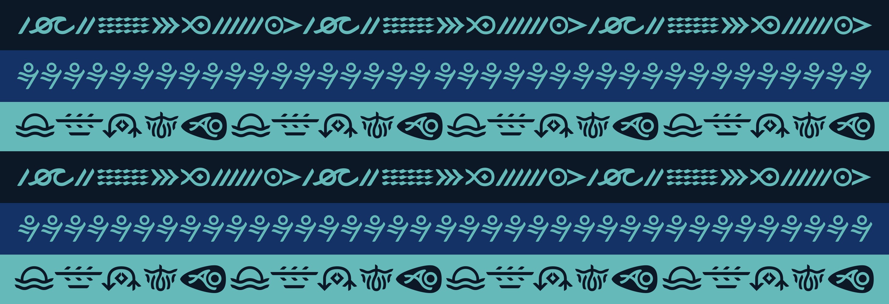
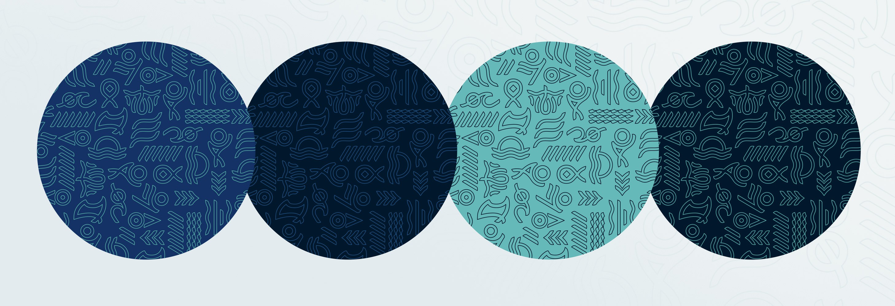
Each brand segment received a cohesive design package including brand guides, logos, patterns, image library, how-to guides and design templates so teams at all levels ( be that national, regional or local) could contribute to a unified marketing rollout and create branded materials for events and competitions as needed.
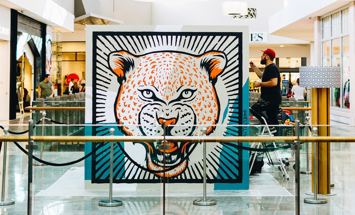
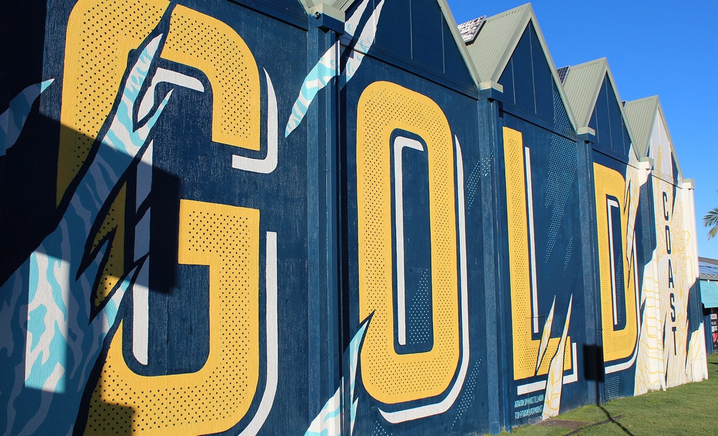
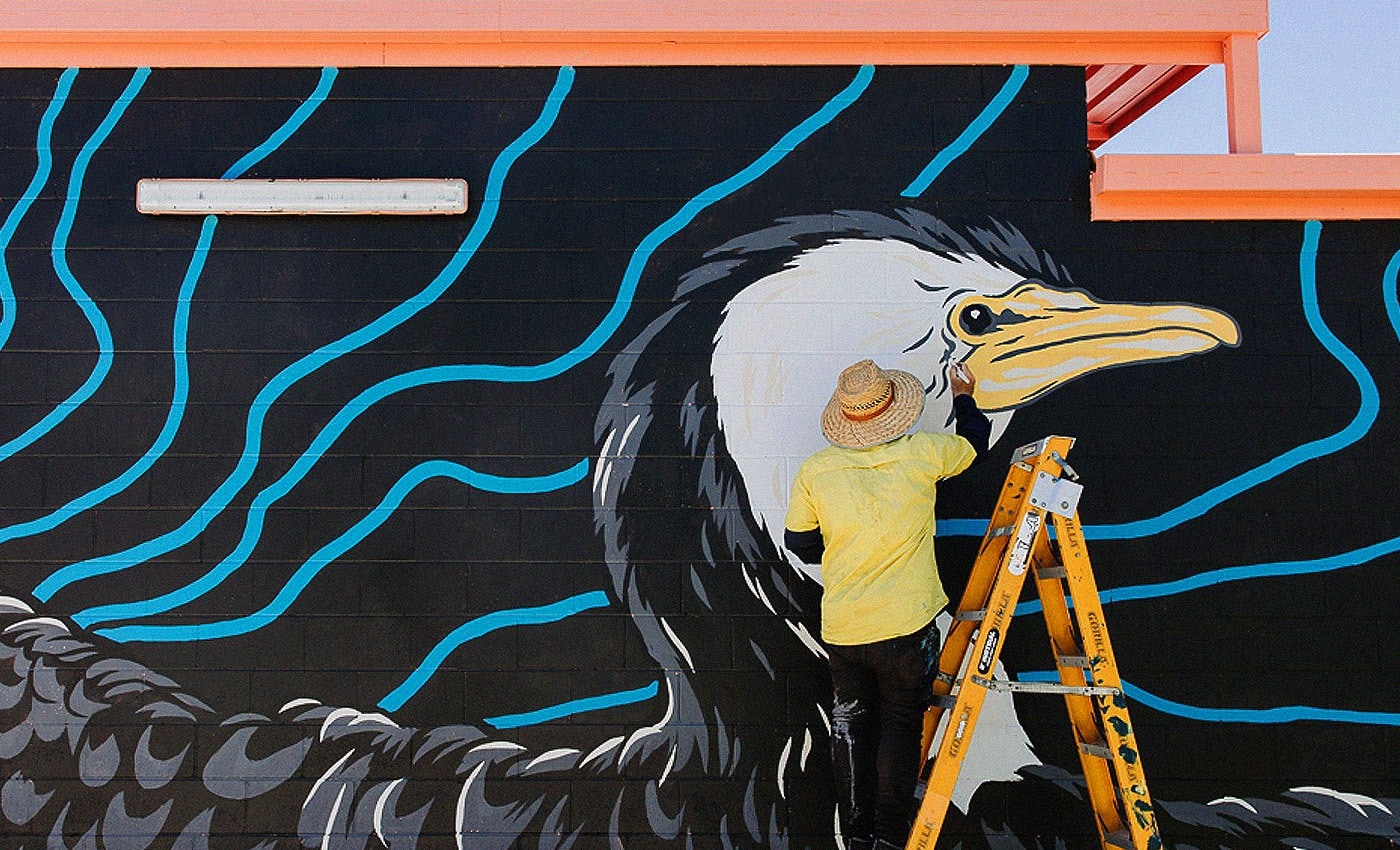
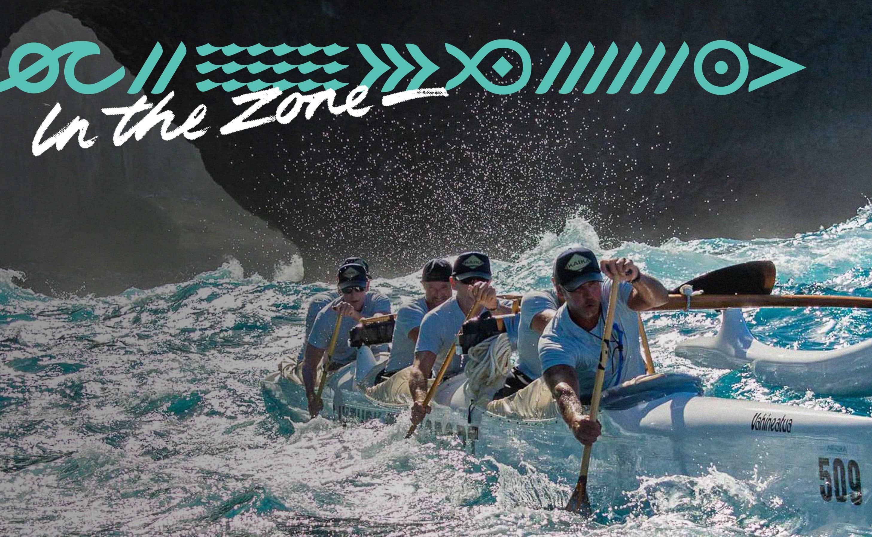
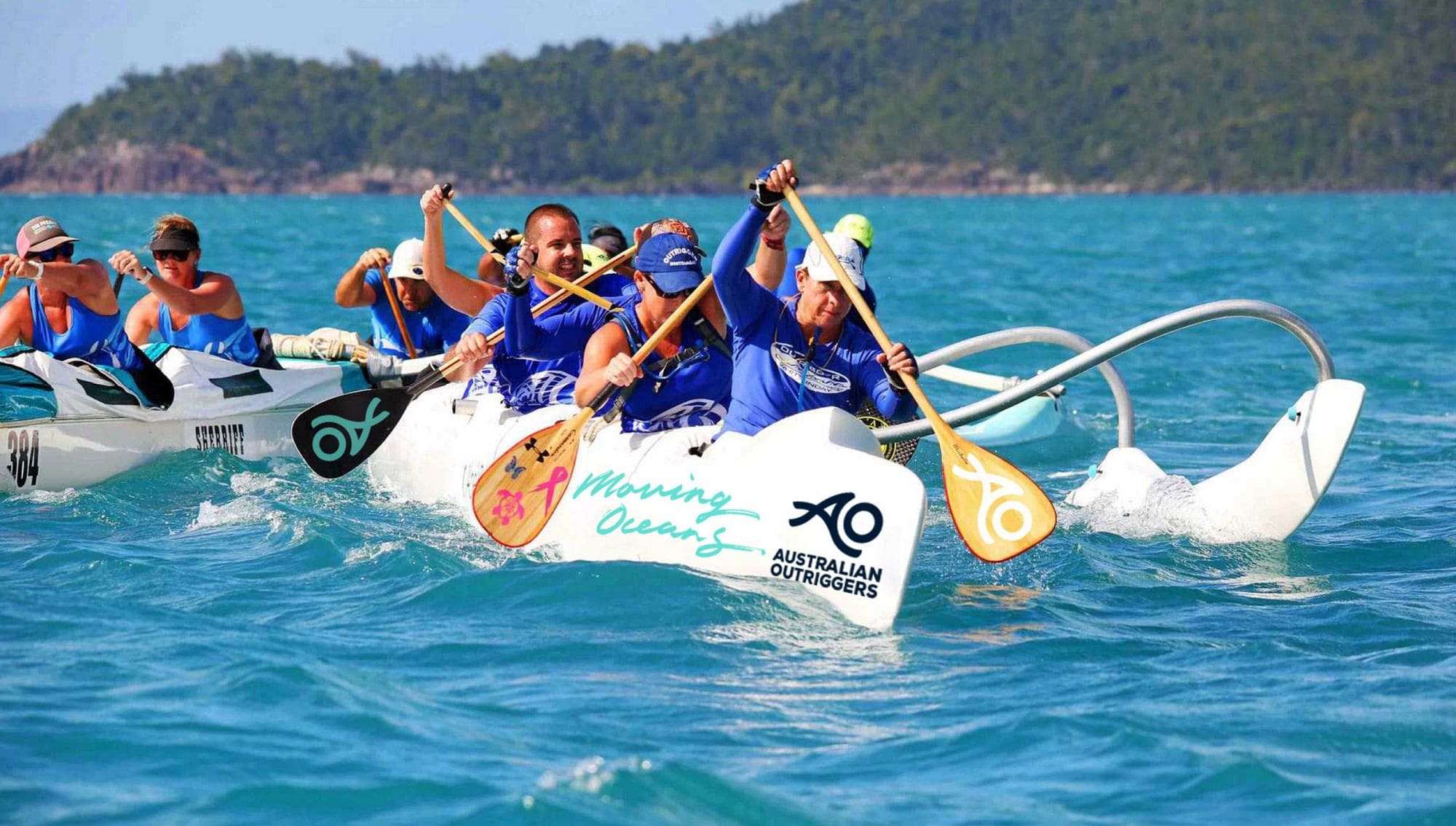
DESIGN ROLLOUT
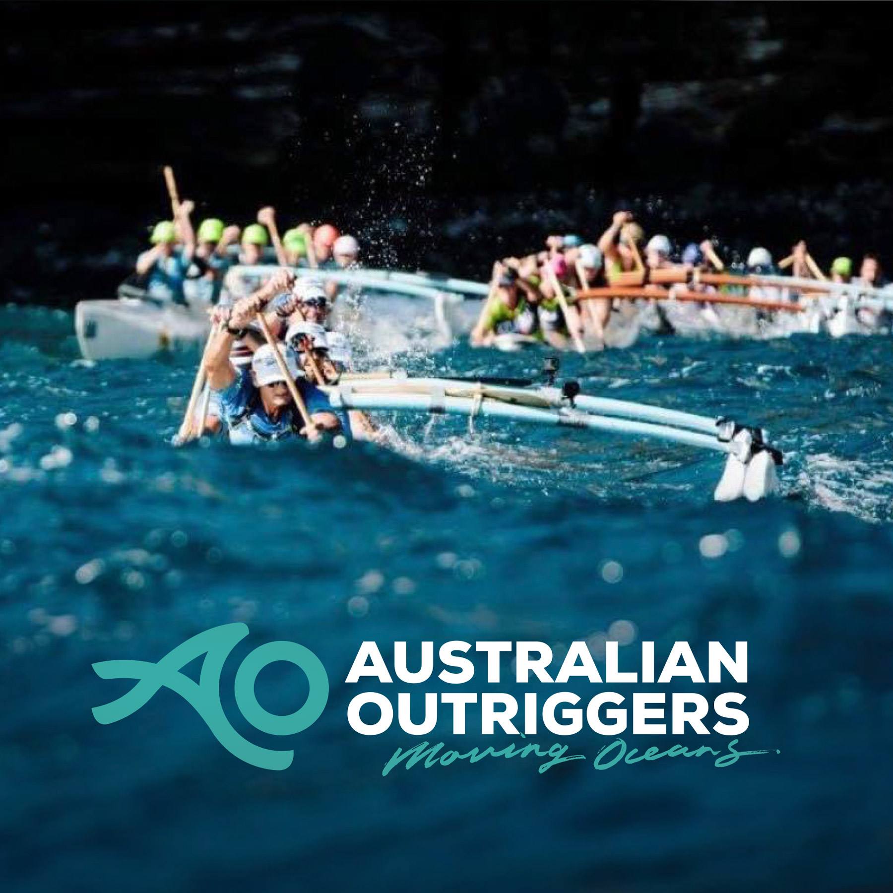
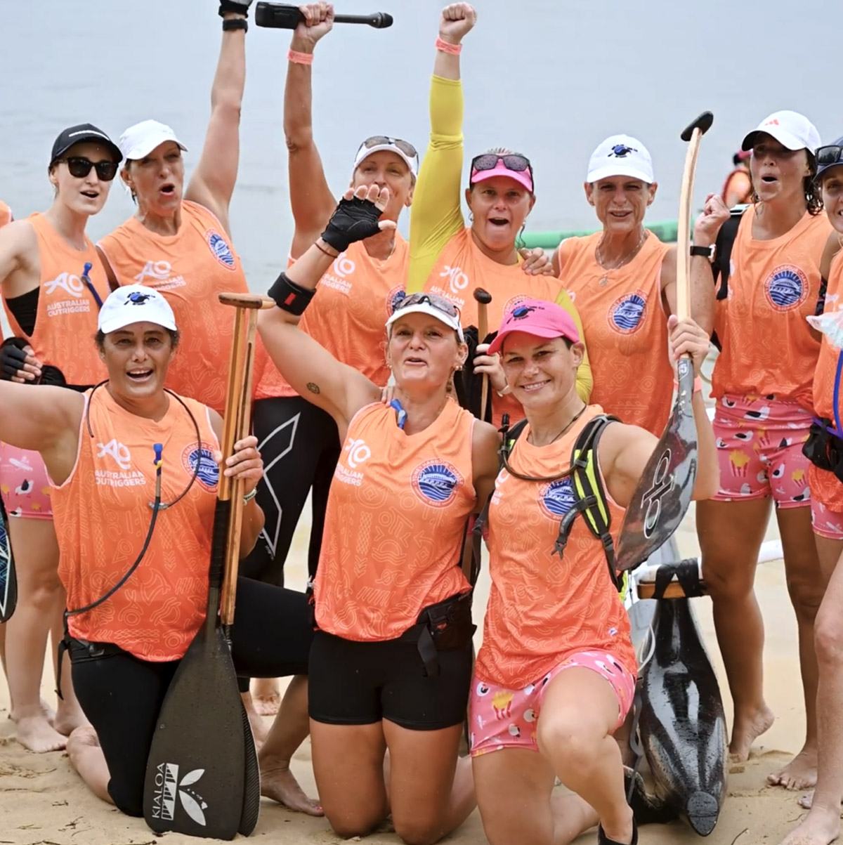
Once the brand identities were completed it was time to move onto the rollout phase of the project. From race shirts, merch & event decals to document design, socials and print comms, across the next few weeks and months we moved steadily through the list of collateral items in need of rebranding.
WELCOMING A NEW WAVE OF PADDLERS
With quick adoption by the AOCRA community, the new brand identities have proven a huge success at both a national and regional level. Equipped with cohesive brand packages, unique brand messaging and accessible design templates, the internal AOCRA team have stepped seamlessly into the roll of leading the charge.
"Kiel and the team went over and above to ensure we received the desired outcome. We are thrilled with the end result; the quality of work, excellent communication, and final design overall. They understood the brief clearly and took it way beyond our expectations to provide AOCRA with a fresh, innovative design that will last many decades to come."
KATHERINE COLE | PRESIDENT