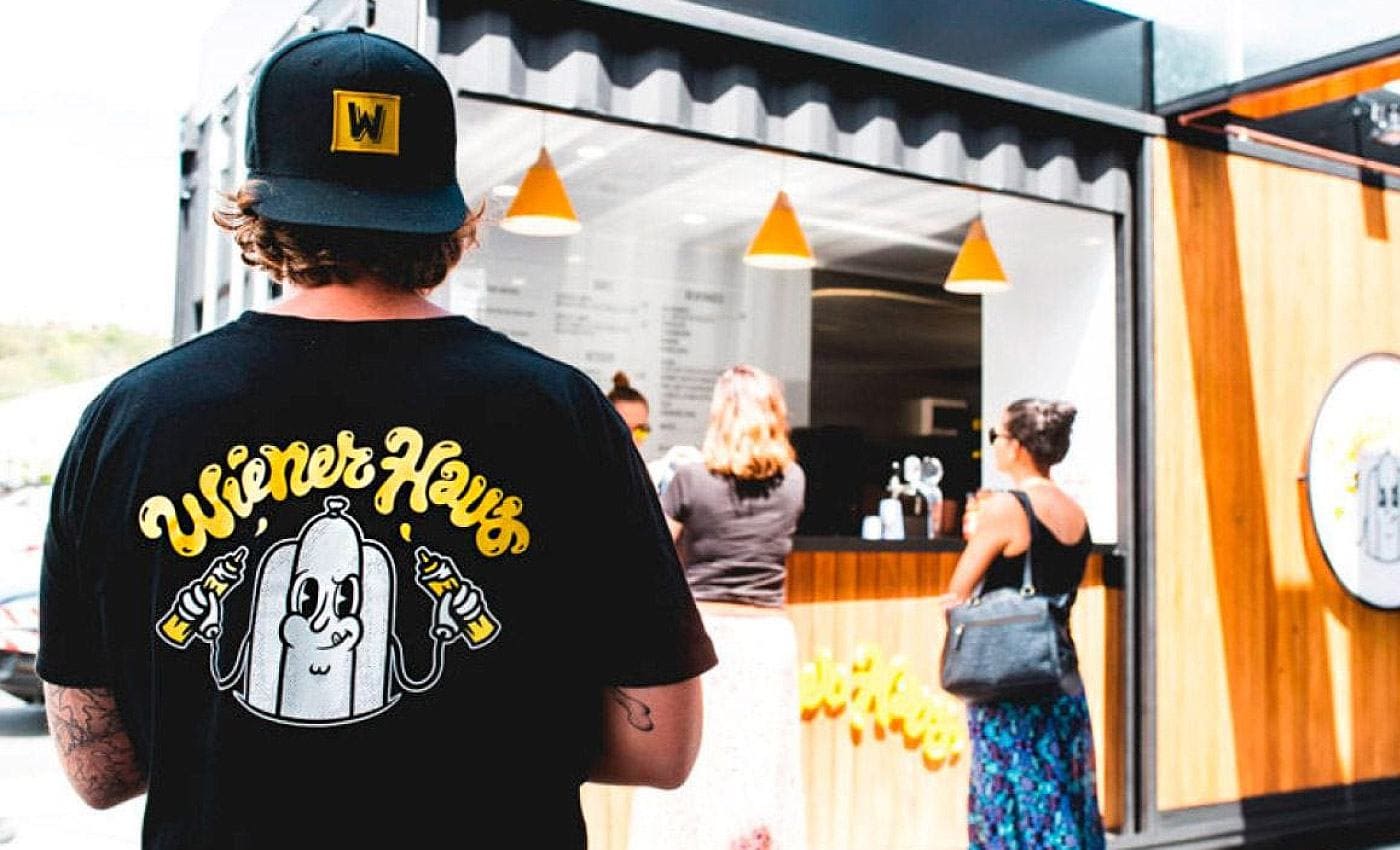
MOUTH WATERING MEDITERRANEAN
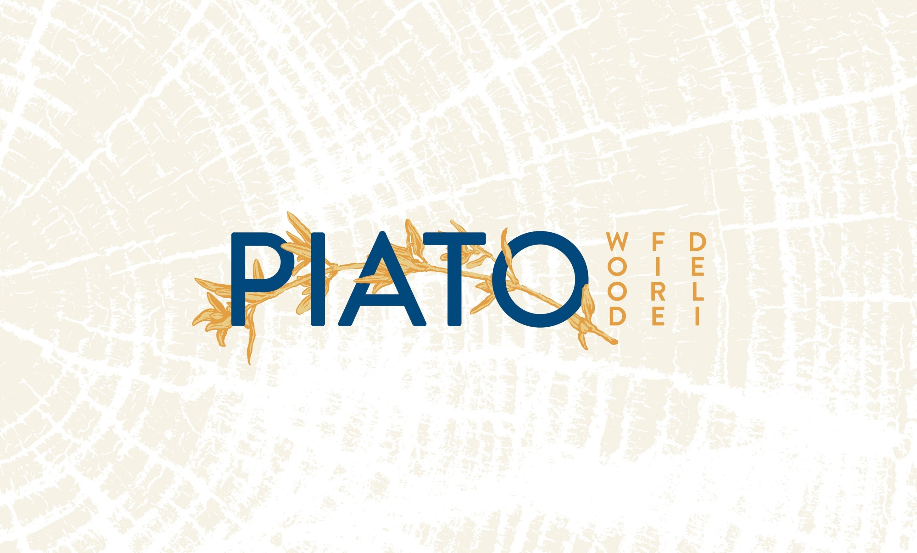
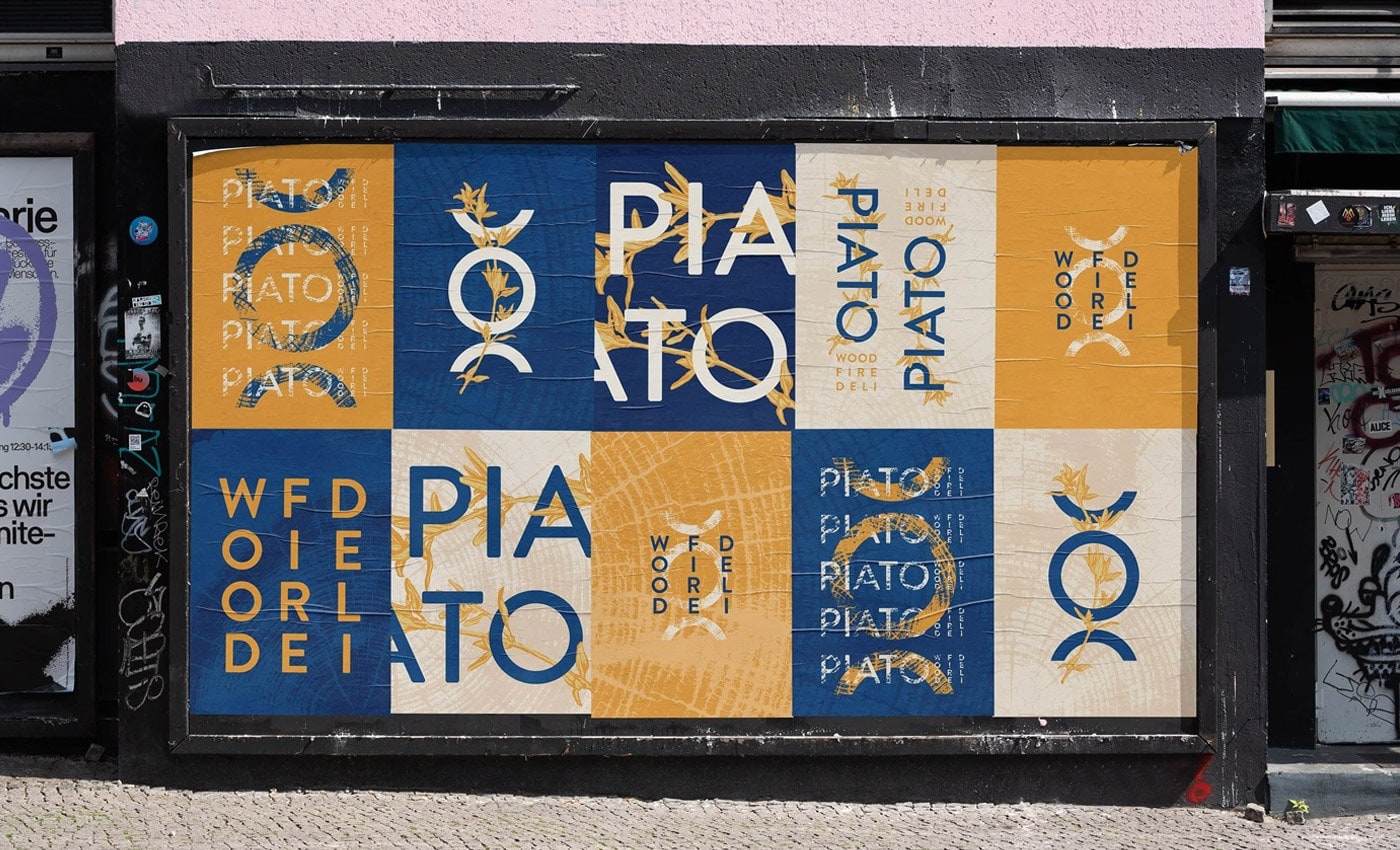
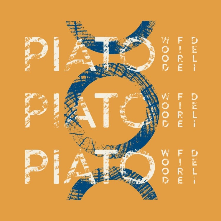
PIATO WOOD FIRE DELI
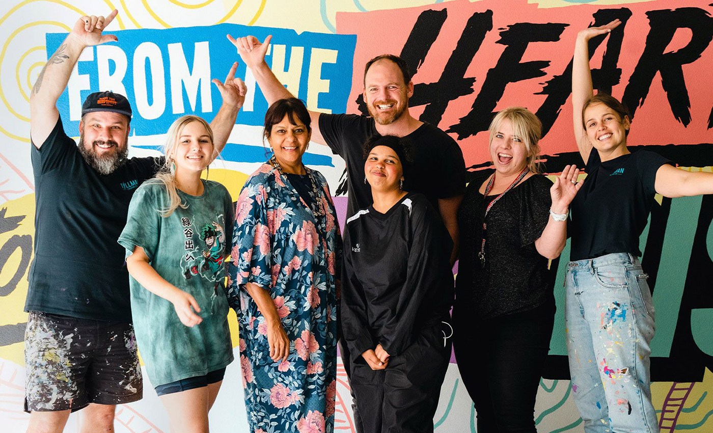
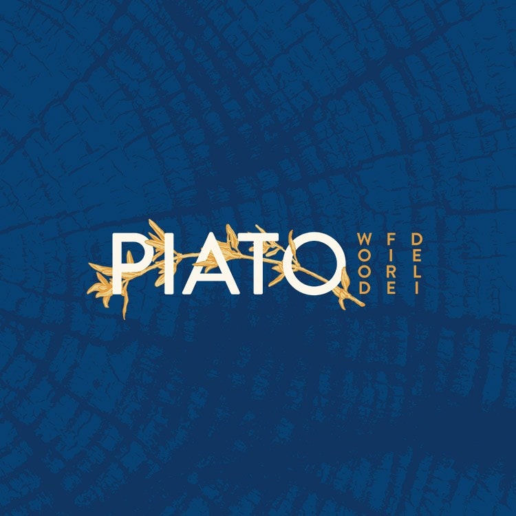
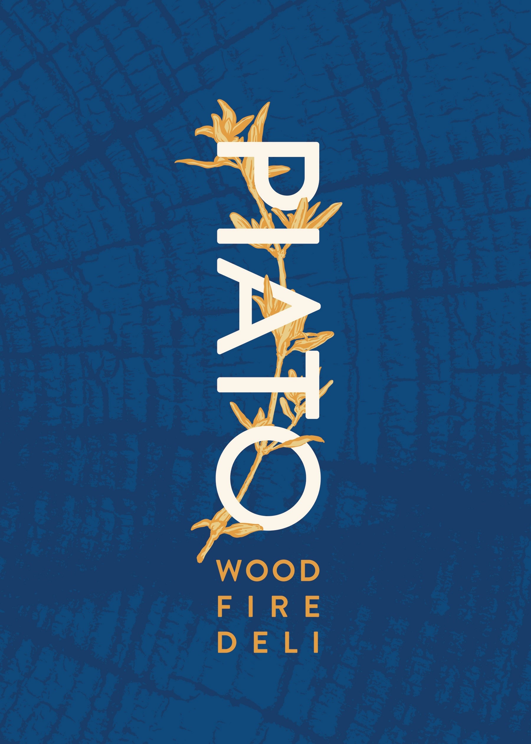
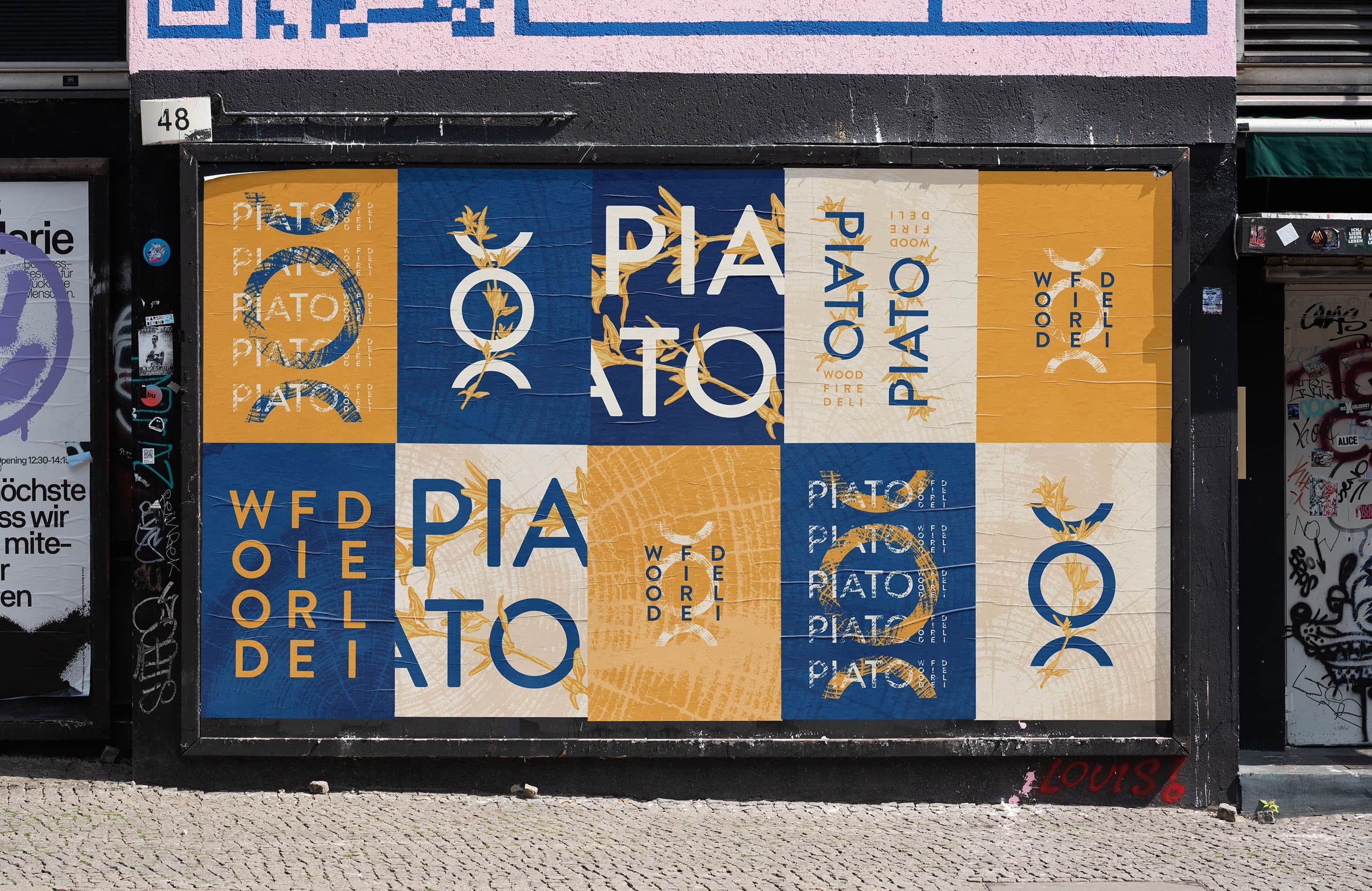
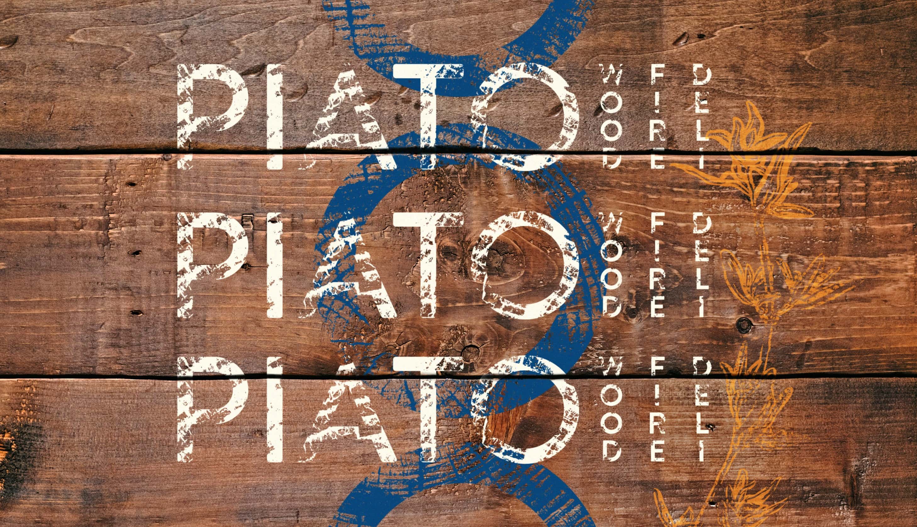
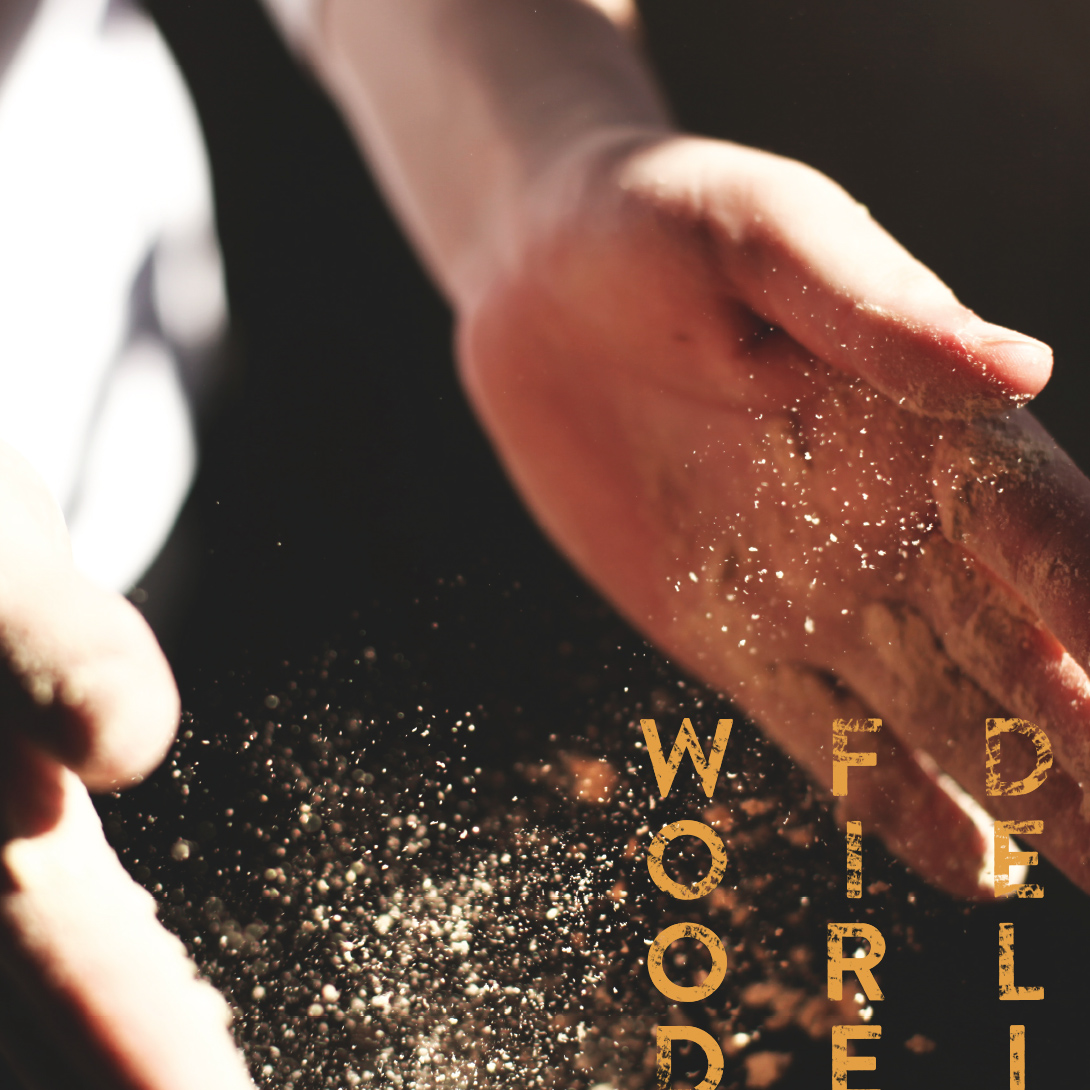
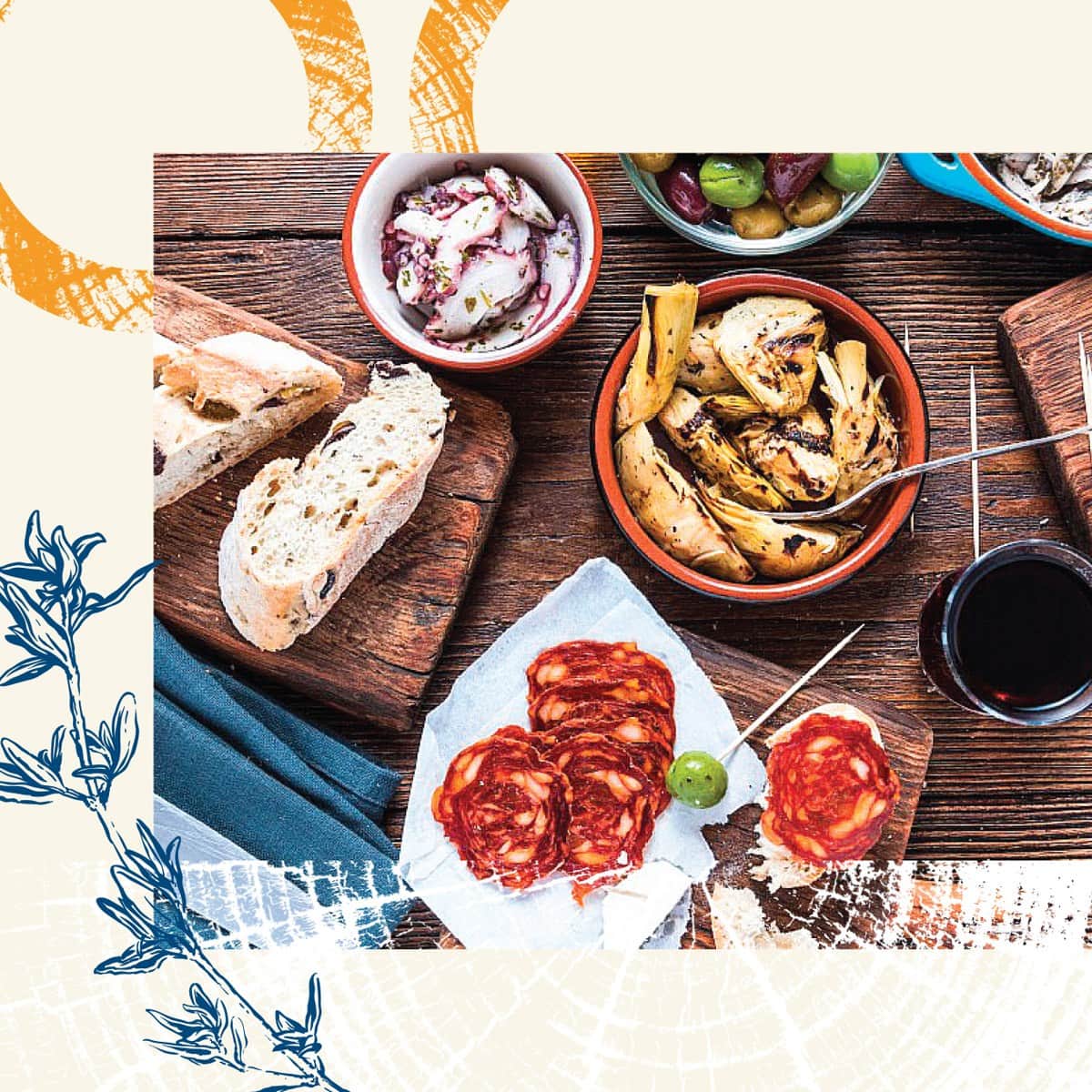
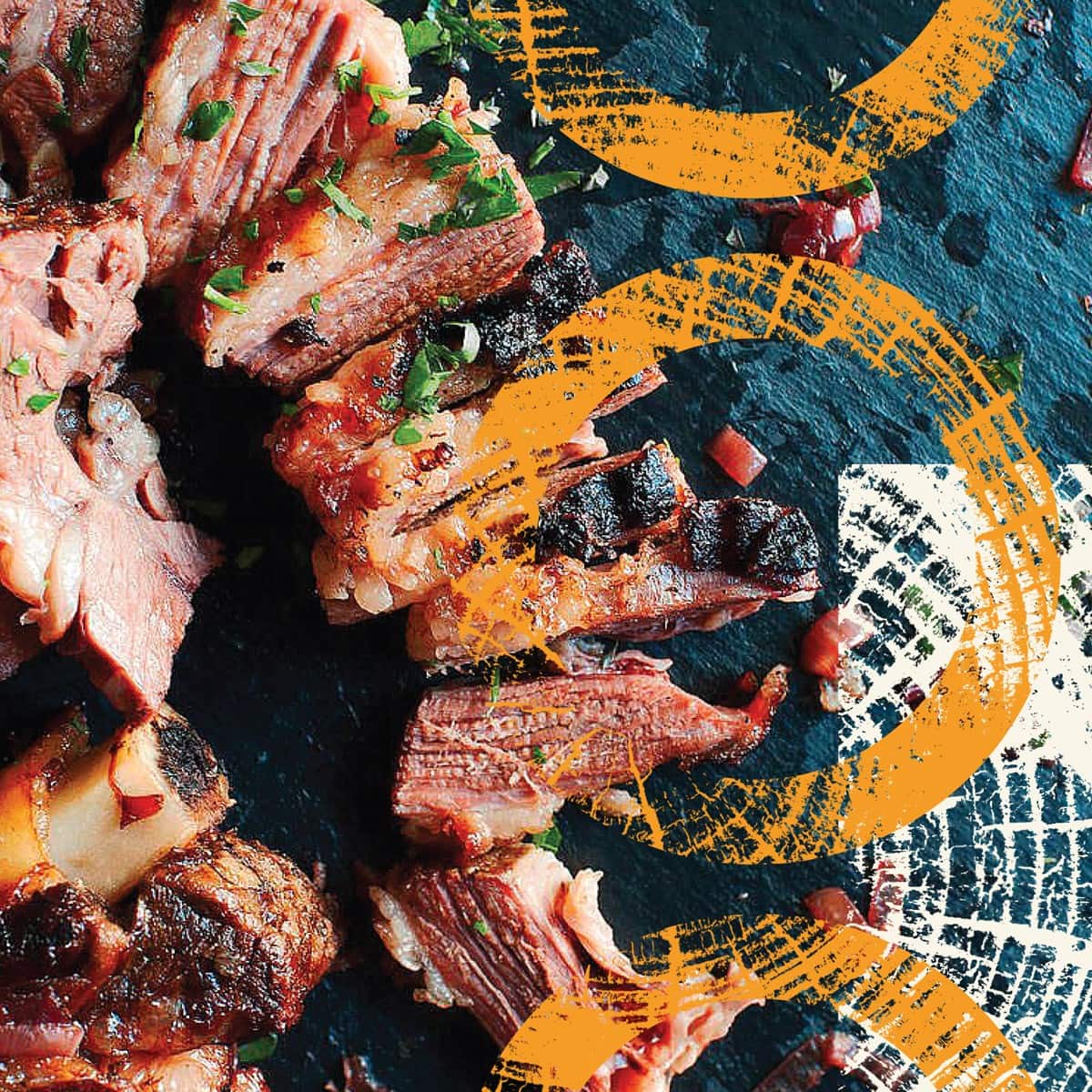
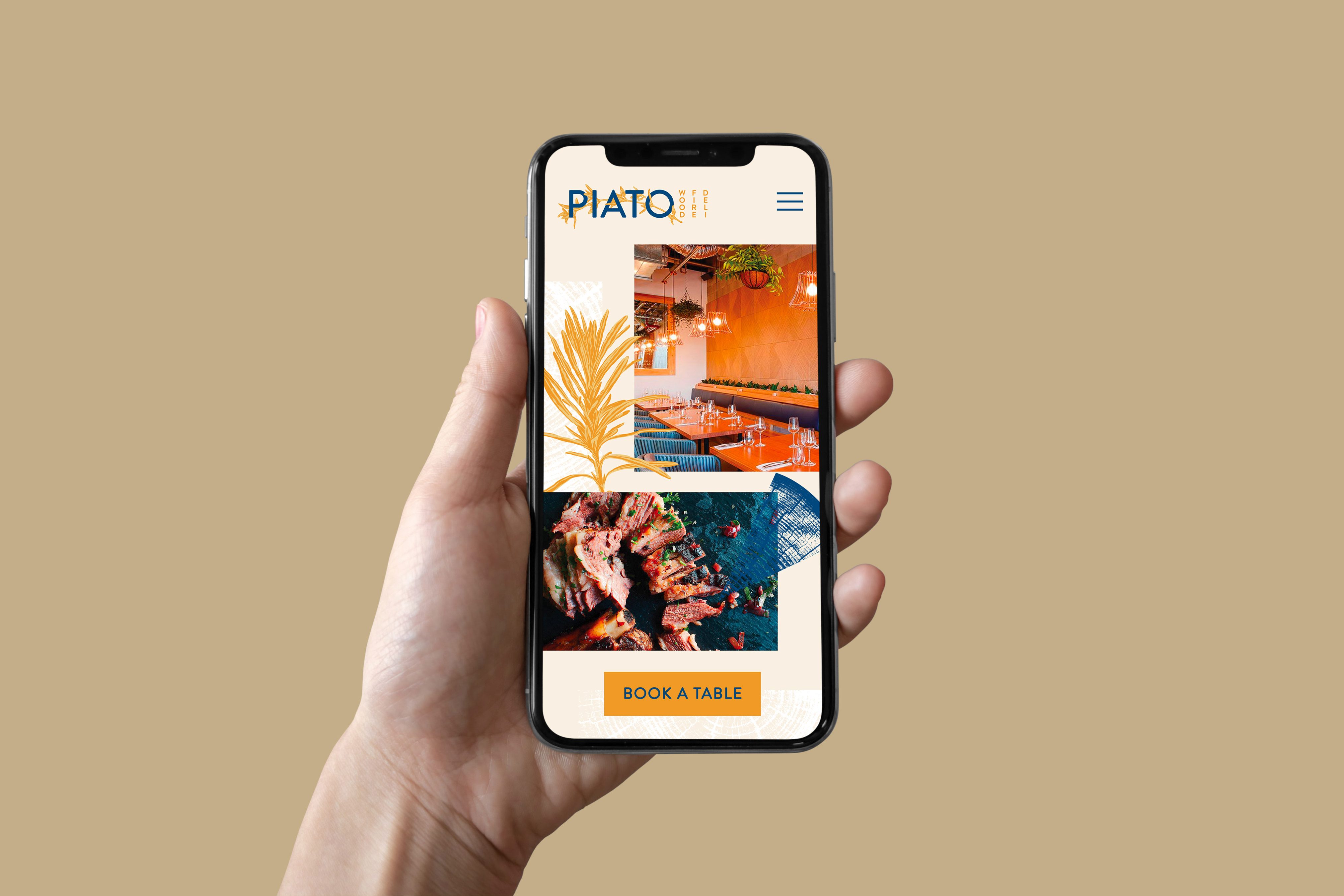
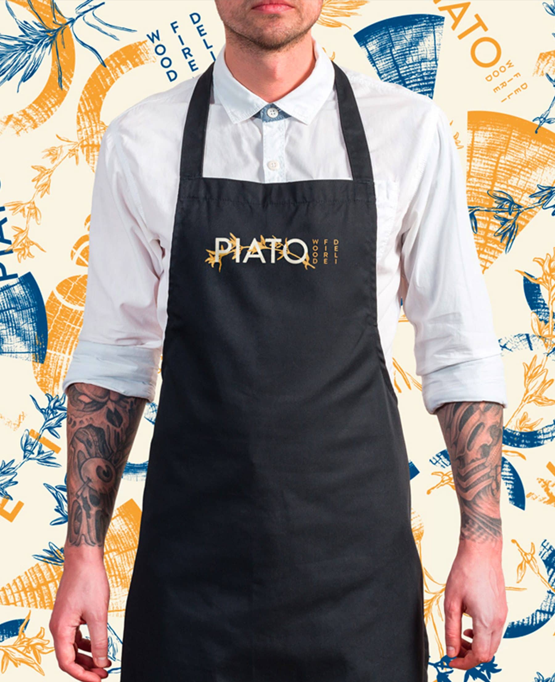
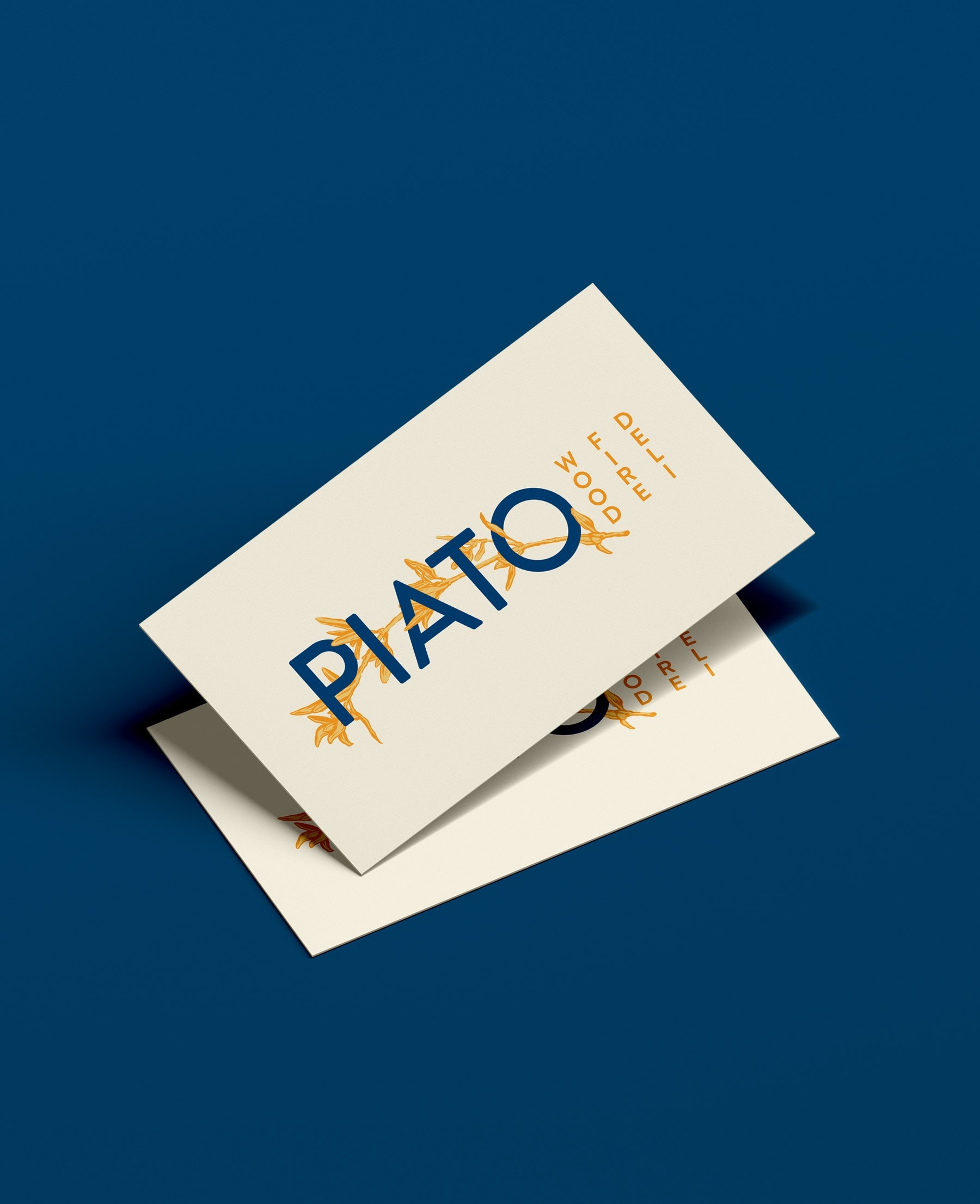
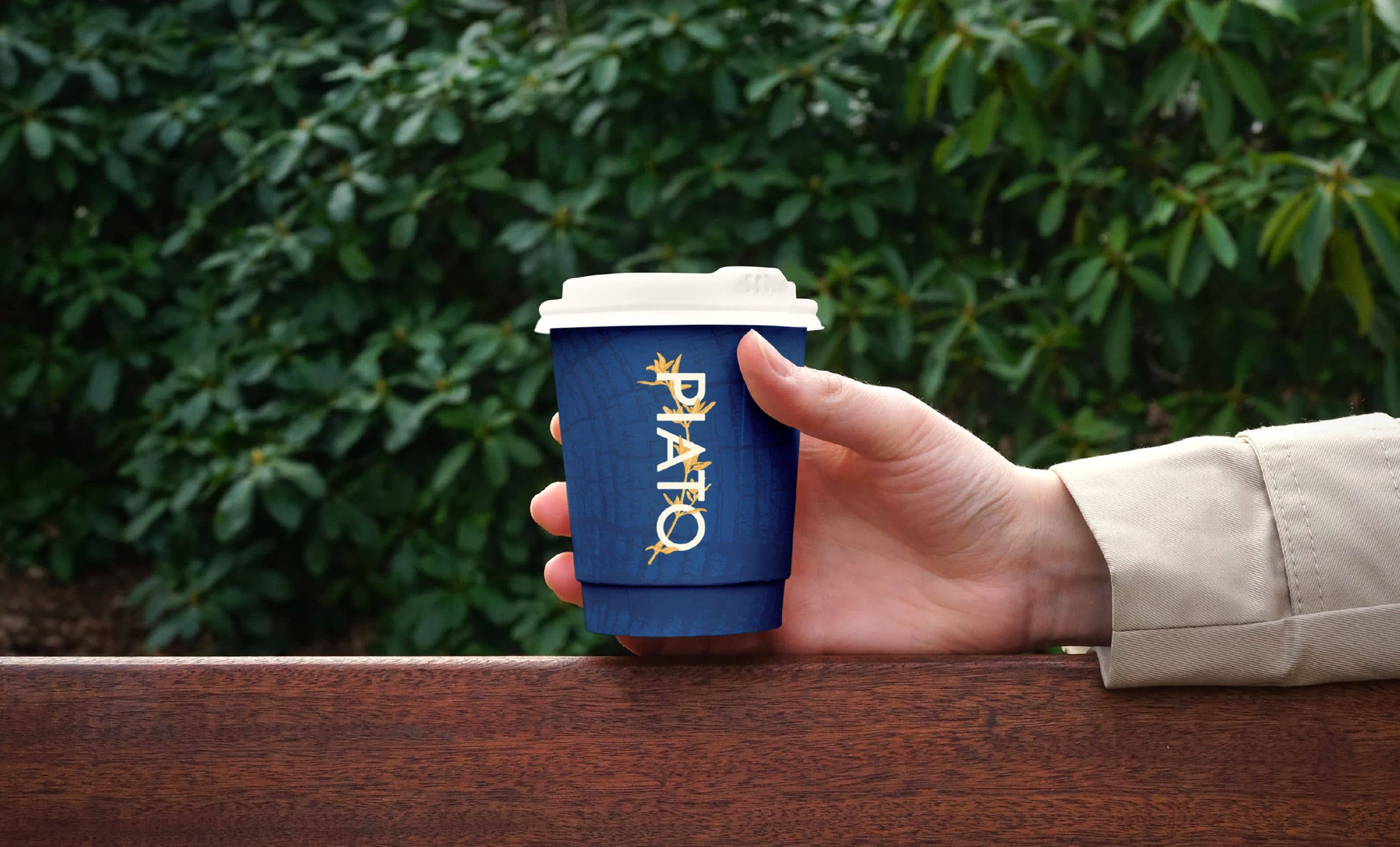
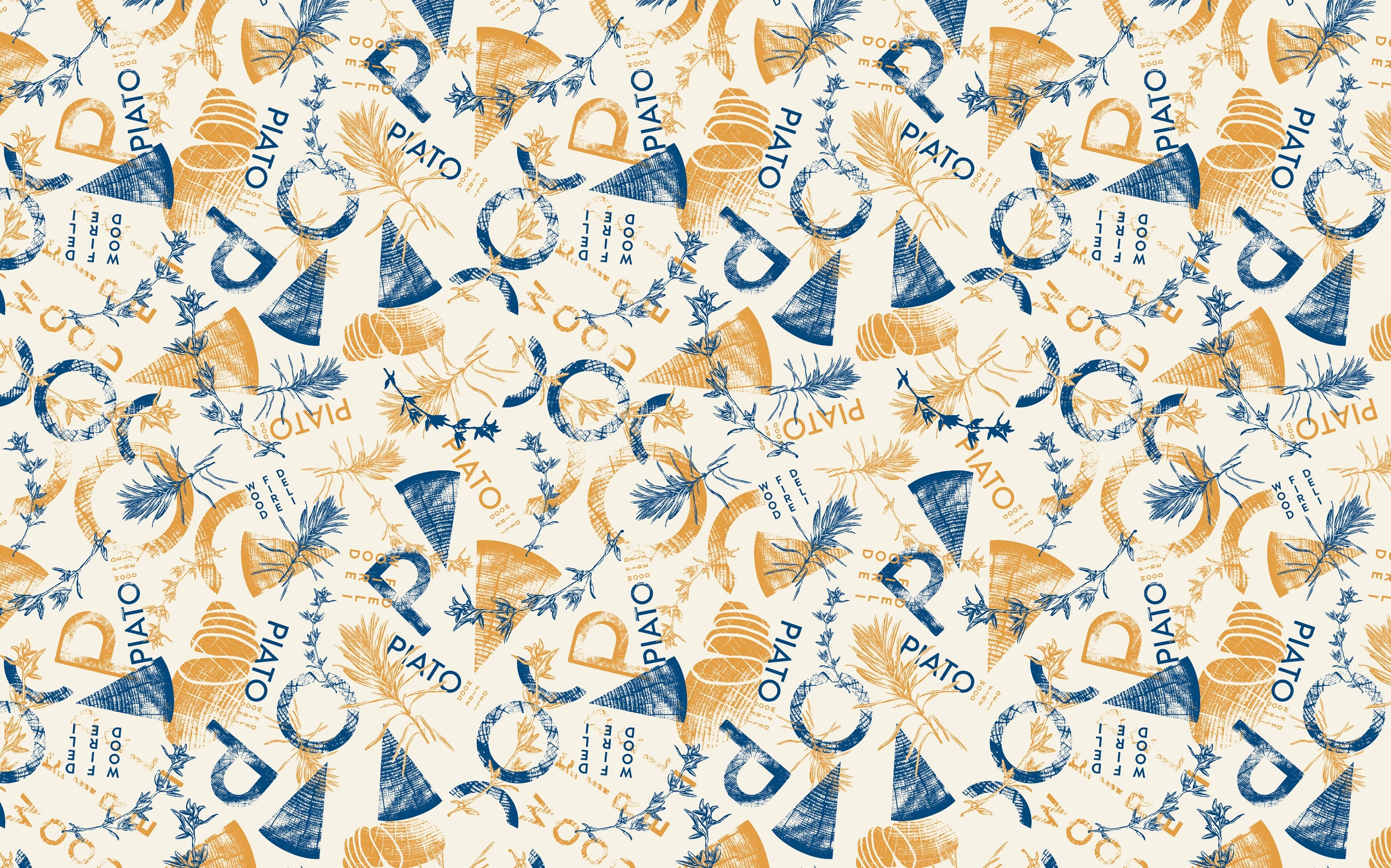
Piato engaged us to create a brand identity for their Mediterranean-inspired Wood Fire Deli. With mouthwatering food planned for the venue, a sophisticated, rustic and welcoming design was what we needed to create.
Bringing together clean typography with organic hand drawn elements, warm colours and woody textures achieved exactly this. Being involved from the very beginning allowed us to stretch out creatively with limitless possibilities to bring Piato's vision to life.
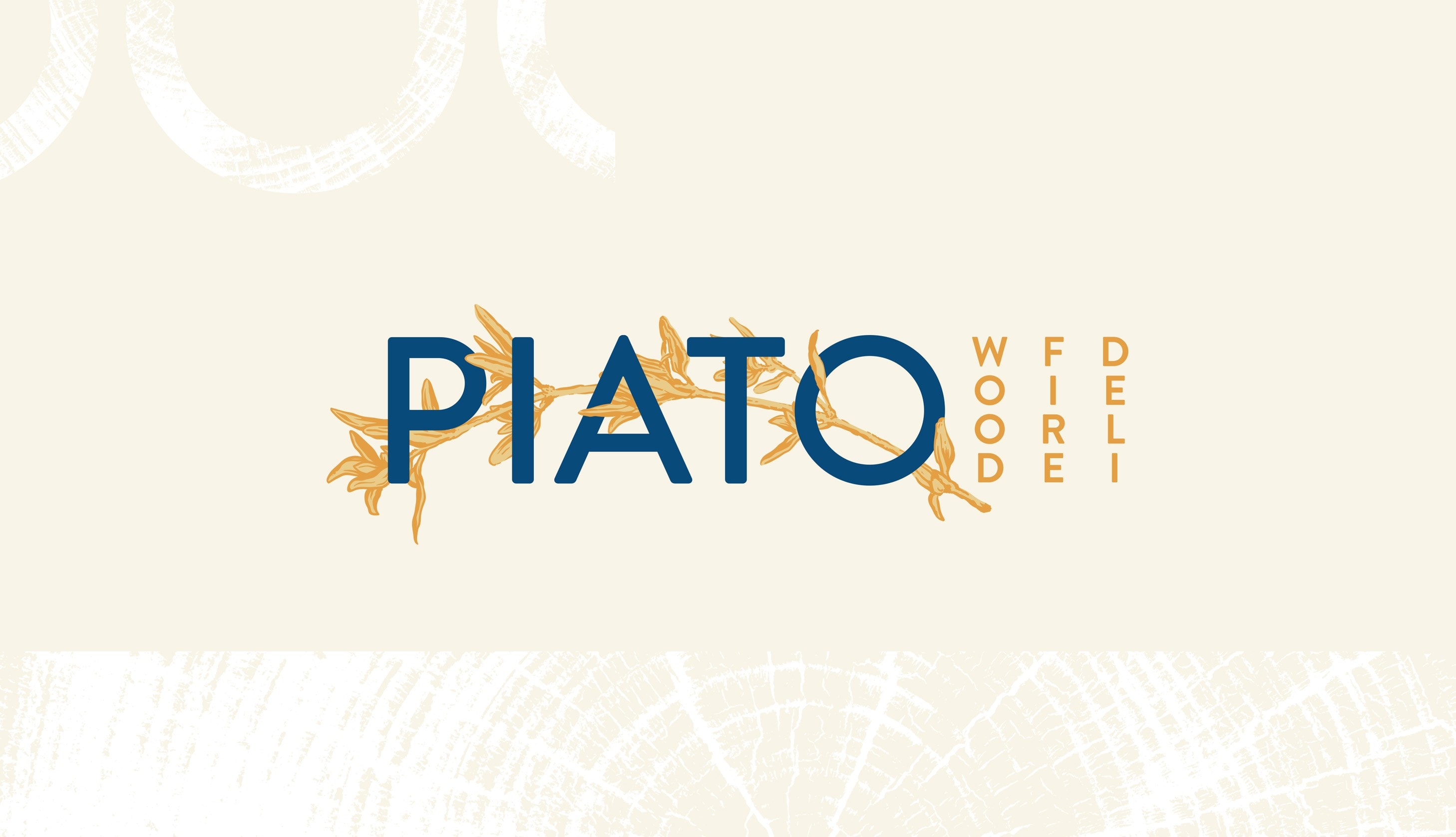
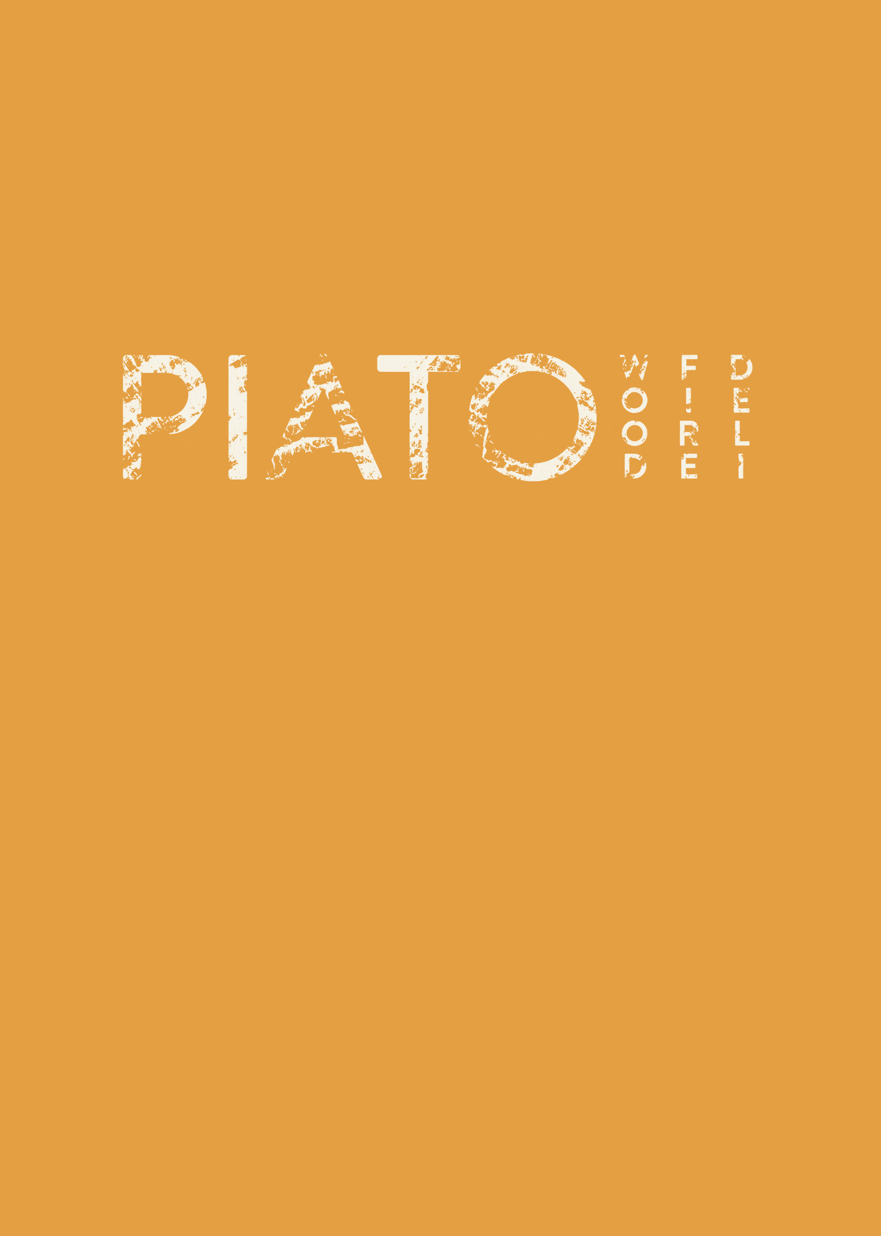
WHAT WE DID
BRAND IDENTITY
LOGO DESIGN
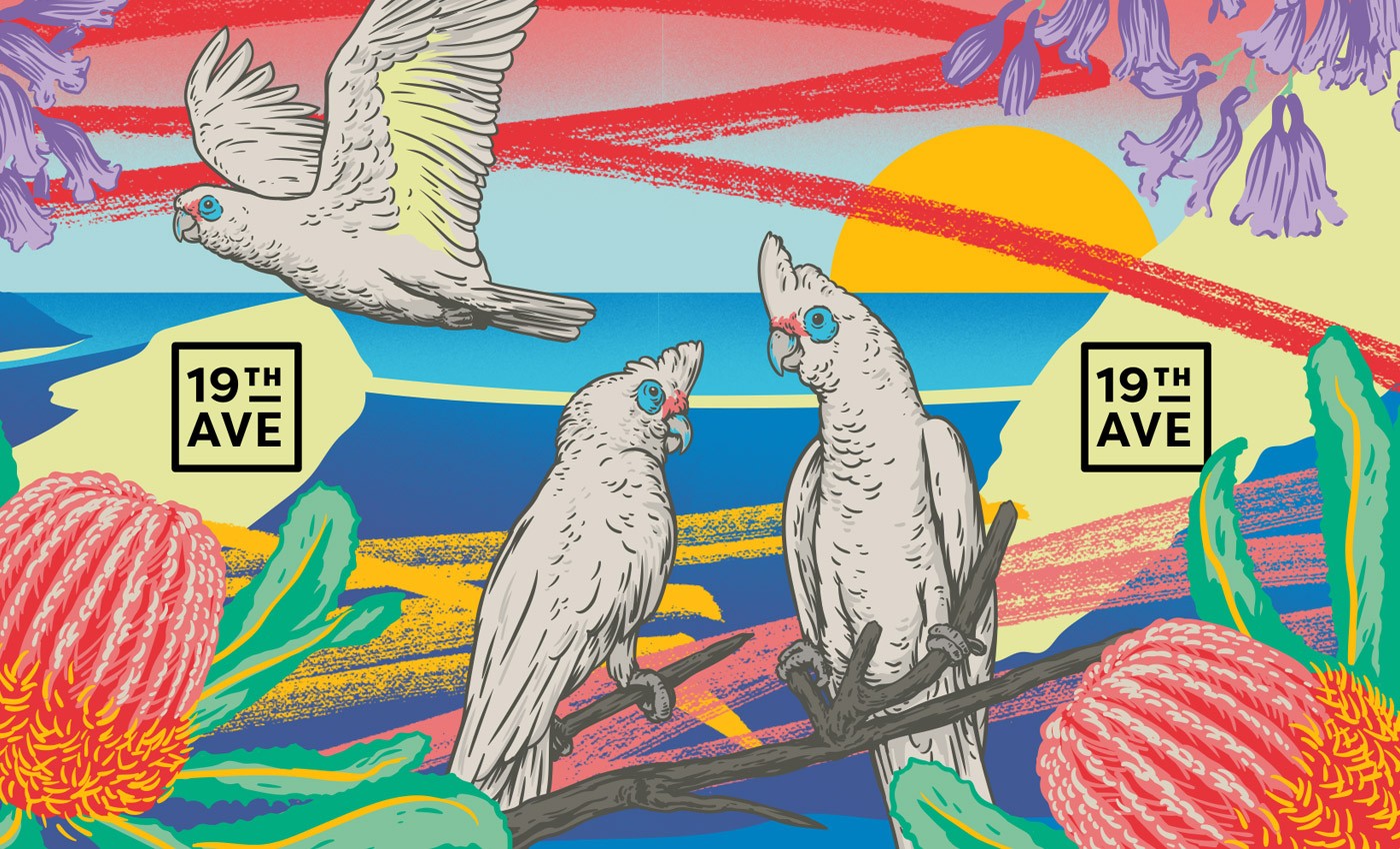
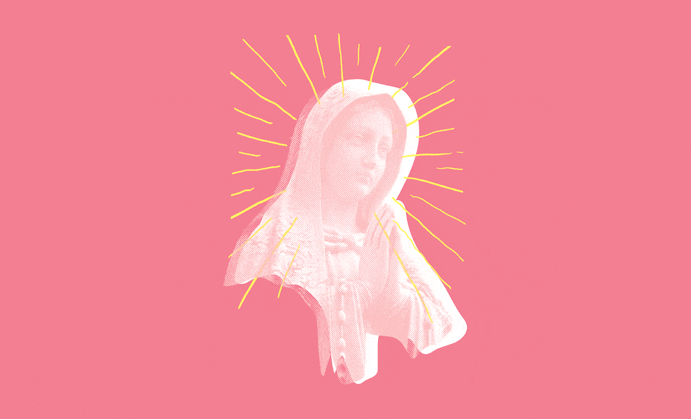
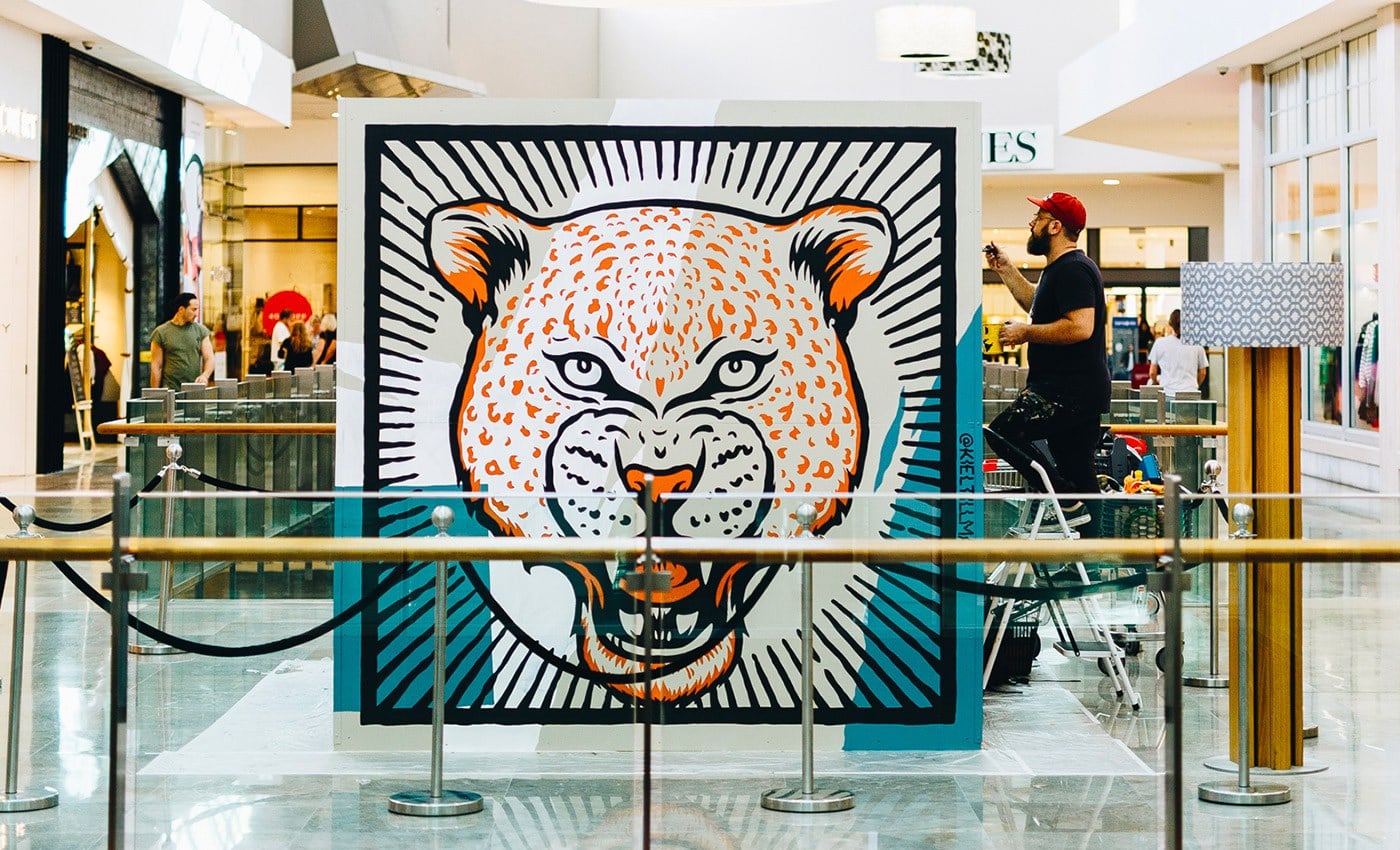
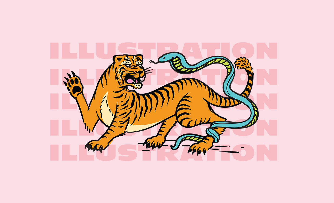
ILLUSTRATION
SIGNAGE
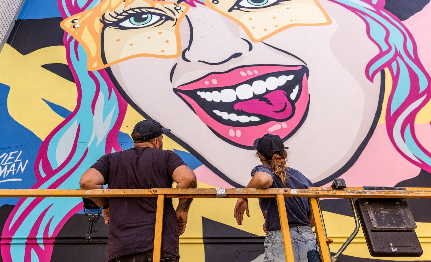
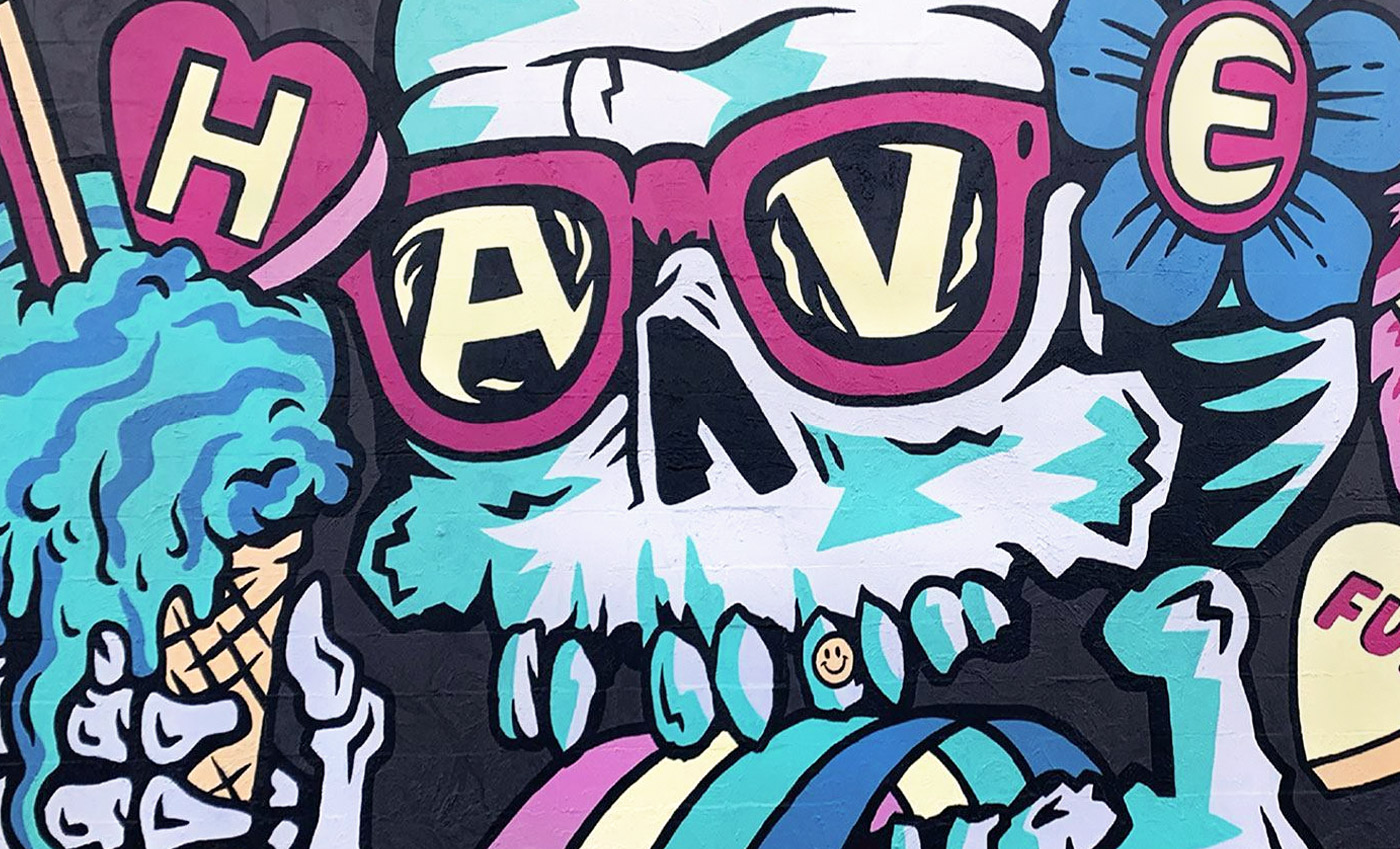
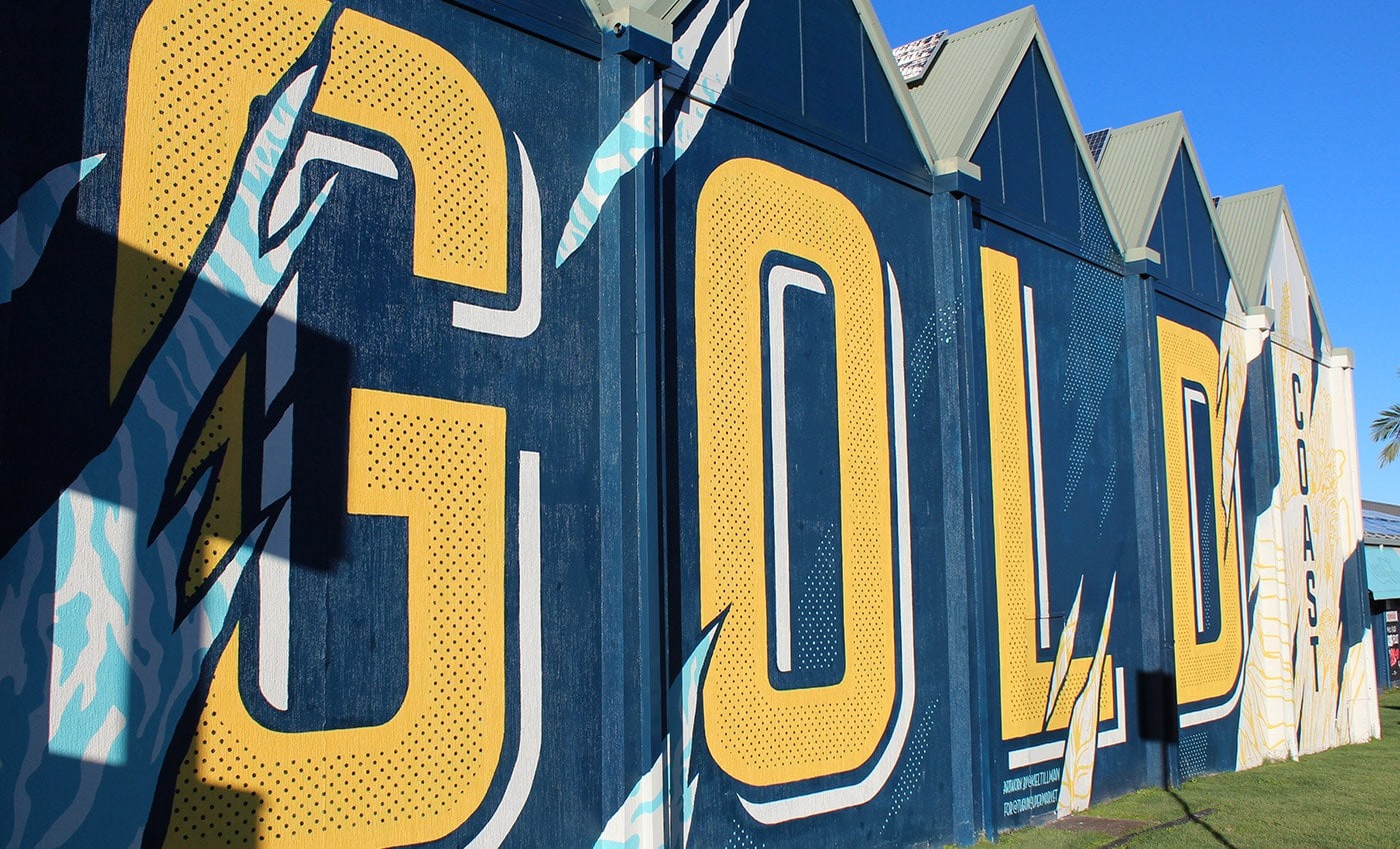
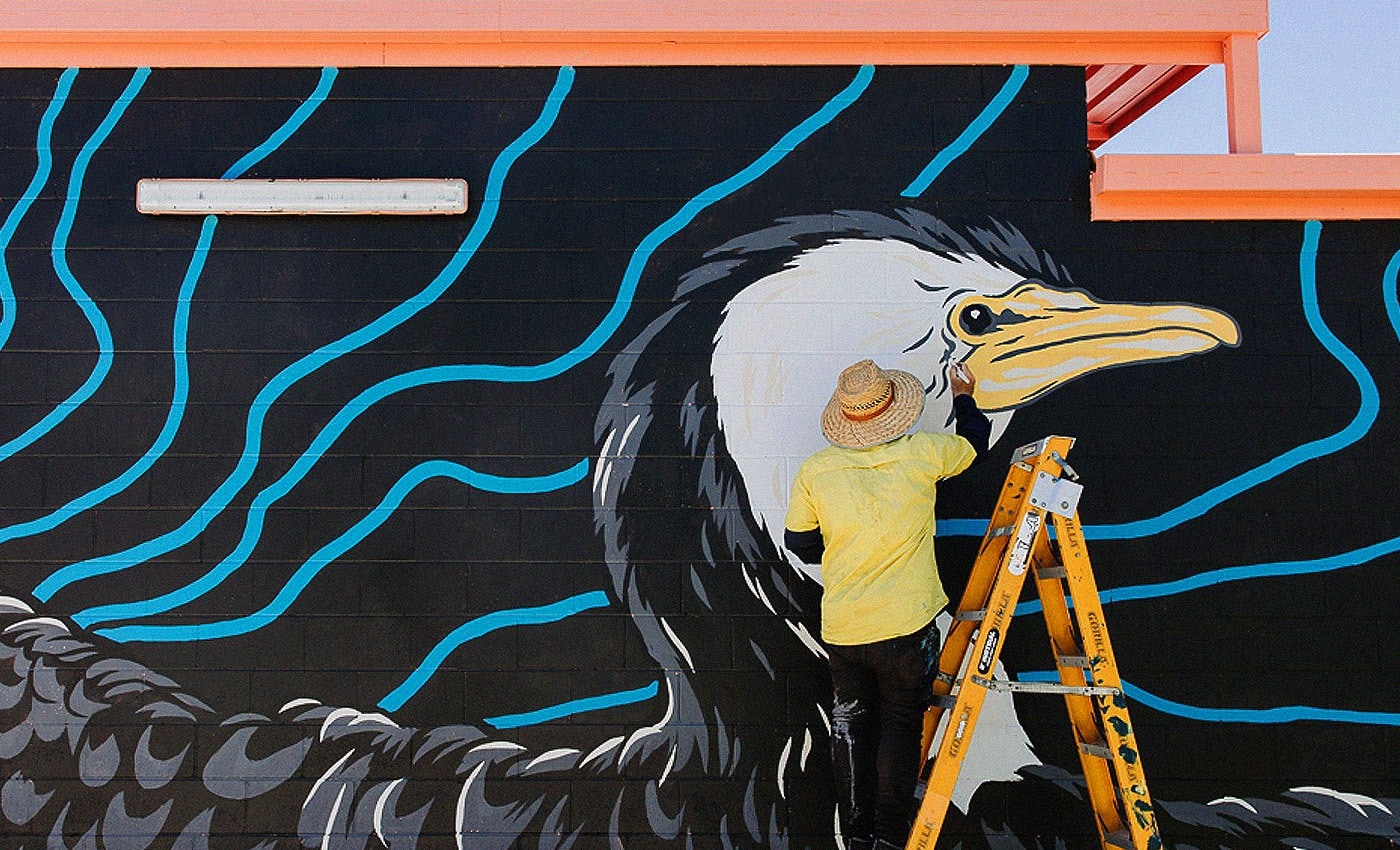
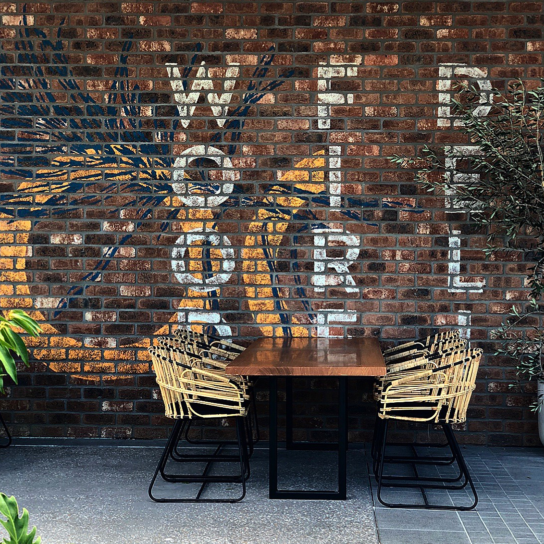
MURAL
PACKAGING
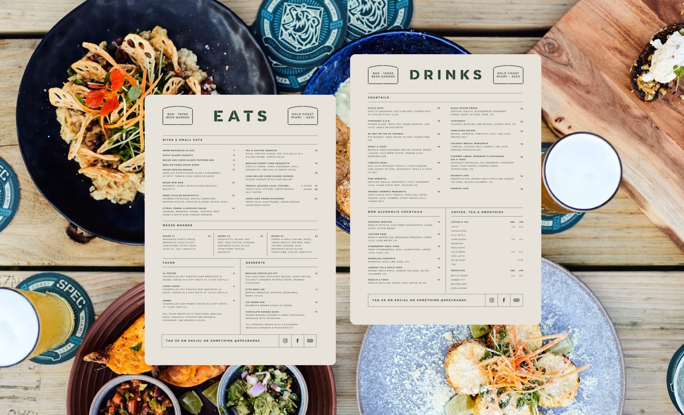
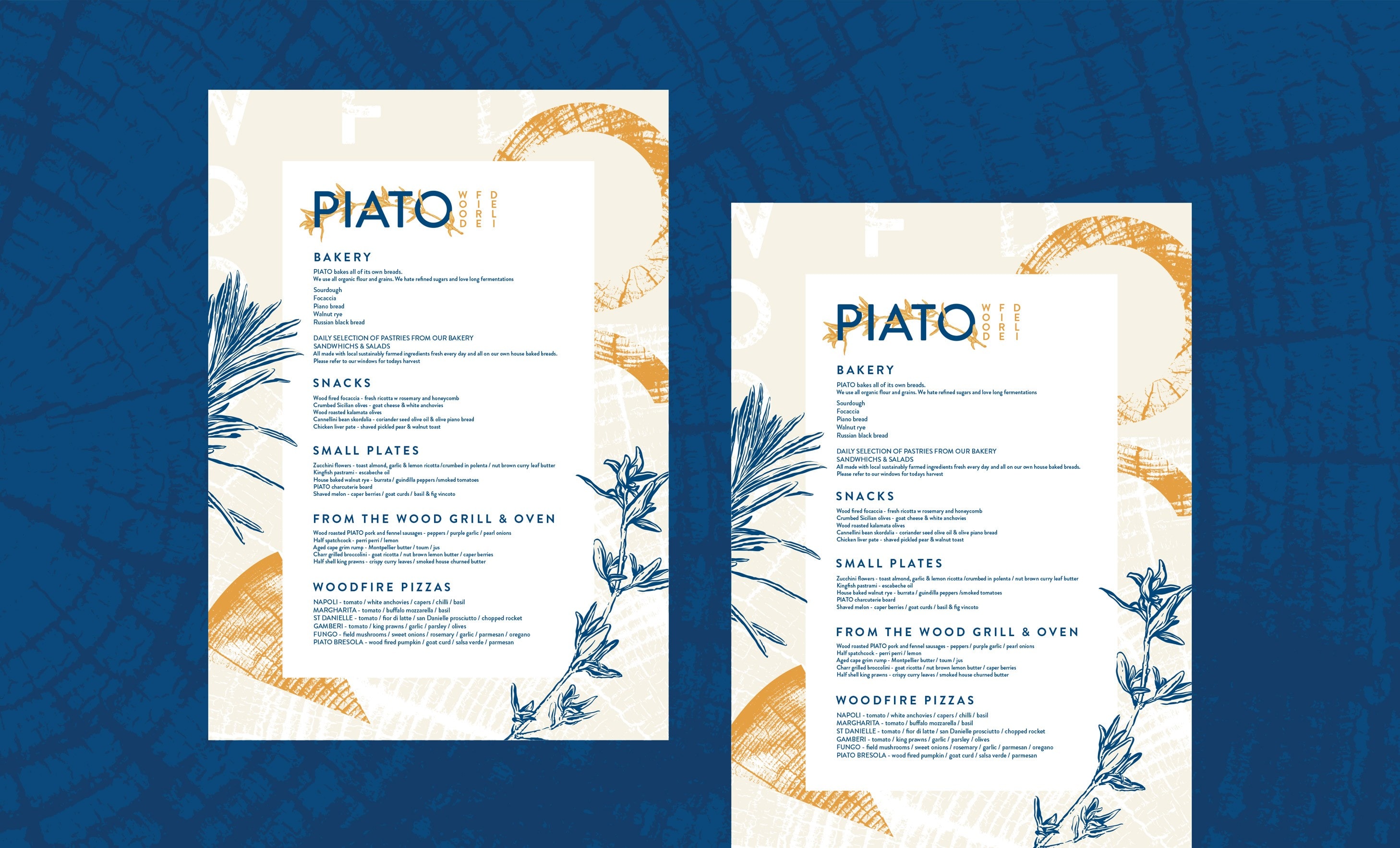
MENU DESIGN
BRAND IDENTITY
LOGO DESIGN
ILLUSTRATION
SIGNAGE
MURAL
PACKAGING
MENU DESIGN
BRAND IDENTITY
LOGO DESIGN
ILLUSTRATION
SIGNAGE
MURAL
PACKAGING
MENU DESIGN
BRAND IDENTITY
LOGO DESIGN
ILLUSTRATION
SIGNAGE
MURAL
PACKAGING
MENU DESIGN
BRAND IDENTITY
LOGO DESIGN
ILLUSTRATION
SIGNAGE
MURAL
PACKAGING
MENU DESIGN
“Tillman Creative Co’s communication and attention to detail was awesome! They took the time to listen to what we thought was important for our brand and how we wanted the final design to look and feel. They then took that and executed a solid brand that speaks clearly.”
“Tillman Creative Co’s communication and attention to detail was awesome! They took the time to listen to what we thought was important for our brand and how we wanted the final design to look and feel. They then took that and executed a solid brand that speaks clearly.”
“Tillman Creative Co’s communication and attention to detail was awesome! They took the time to listen to what we thought was important for our brand and how we wanted the final design to look and feel. They then took that and executed a solid brand that speaks clearly.”
“Tillman Creative Co’s communication and attention to detail was awesome! They took the time to listen to what we thought was important for our brand and how we wanted the final design to look and feel. They then took that and executed a solid brand that speaks clearly.”
“Tillman Creative Co’s communication and attention to detail was awesome! They took the time to listen to what we thought was important for our brand and how we wanted the final design to look and feel. They then took that and executed a solid brand that speaks clearly.”
BRENDON HARAS | Owner / Brand Manager